Typography for Social Media: Choosing Fonts That Pop
Typography for Social Media: Choosing Fonts That Pop
You can have the most brilliant copywriting in the world, but if your text is cramped, illegible, or visually boring, nobody is going to swipe to slide two.
Typography is the silent ambassador of your brand. On social media, where attention spans are measured in milliseconds, your fonts do the heavy lifting of establishing authority, conveying tone, and guiding the reader’s eye.
The Rules of Social Media Typography
Designing for a 1080x1350 pixel square on a mobile screen is different from designing a website or a brochure.
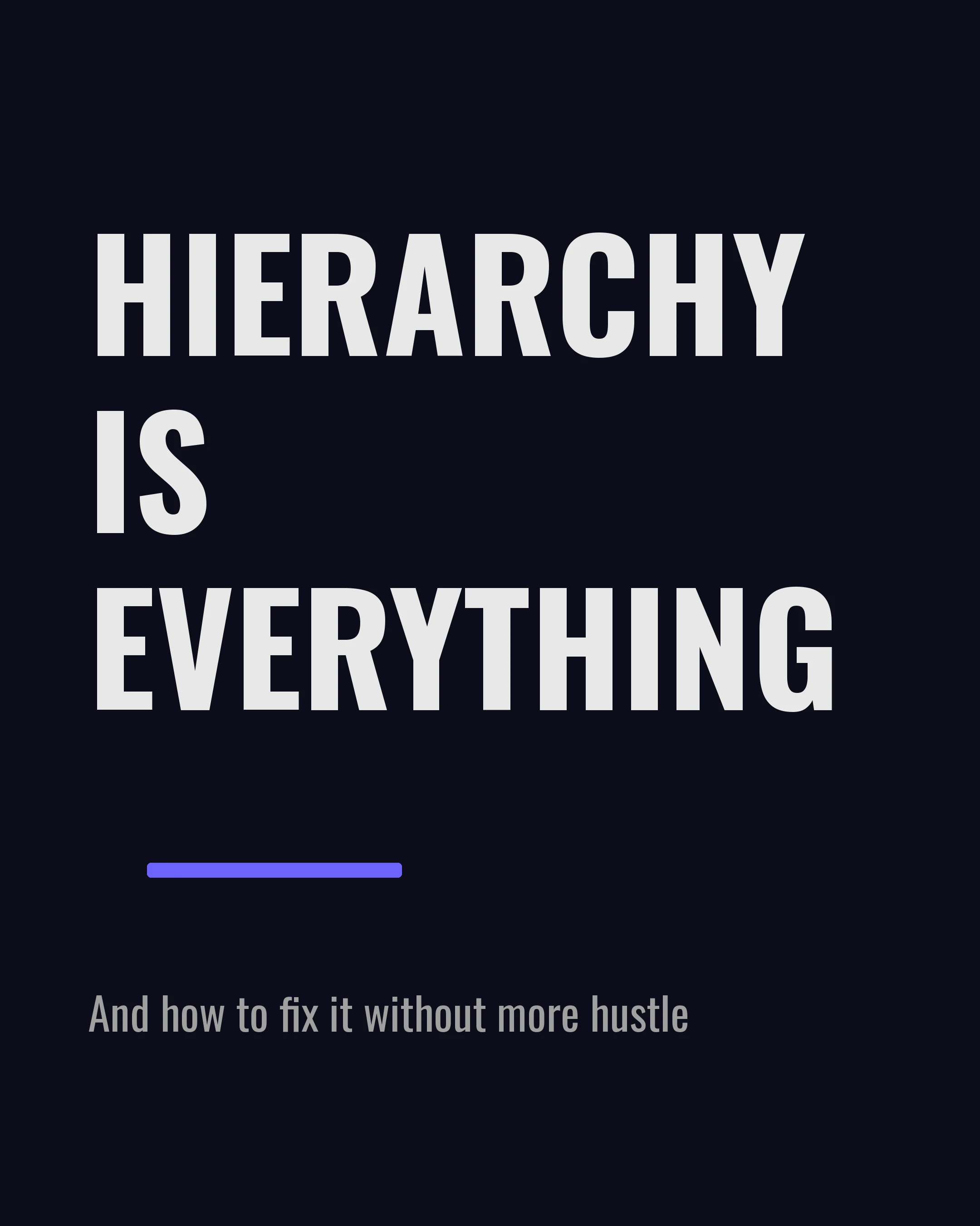
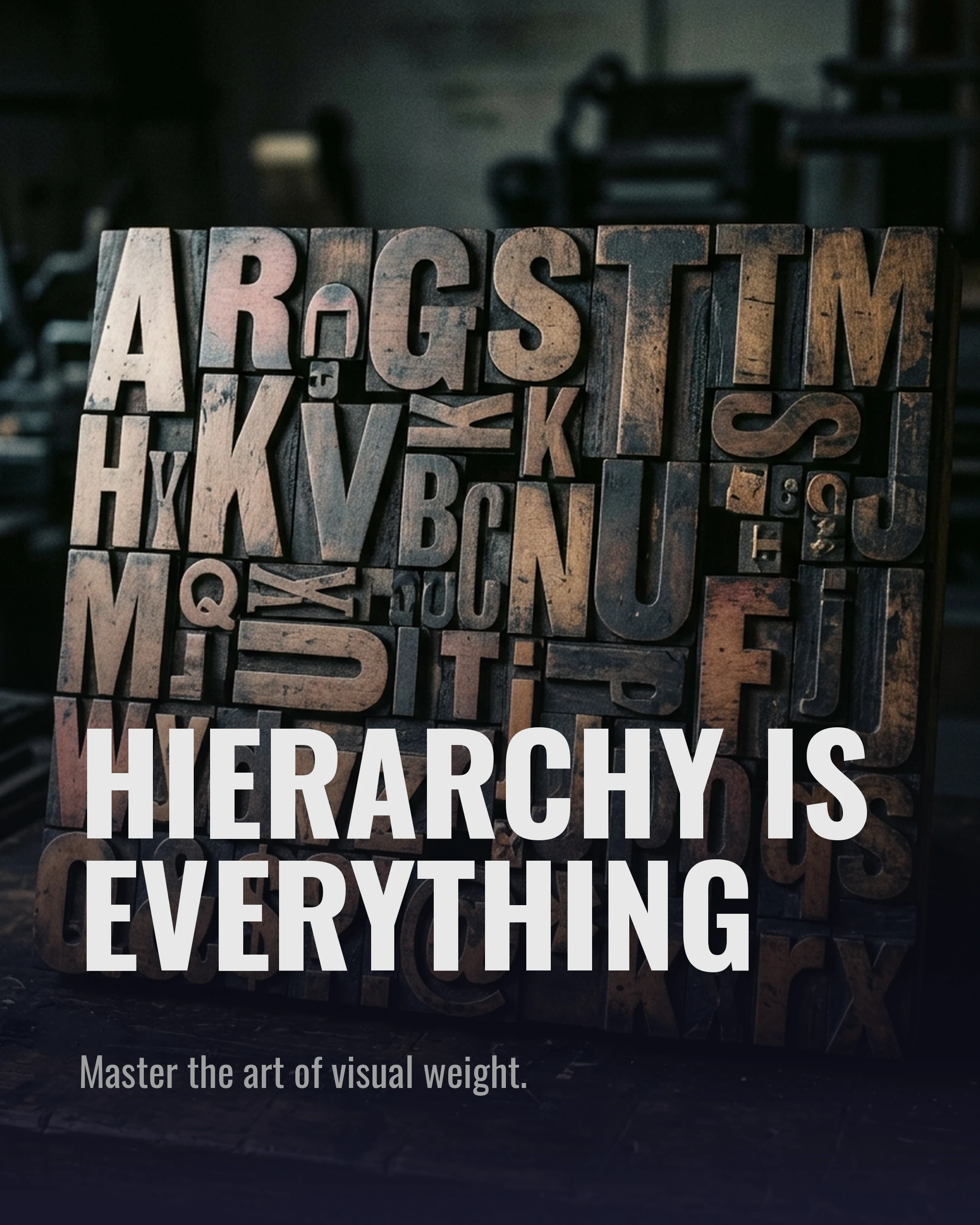
1. Hierarchy is Everything
Visual hierarchy tells the reader what to look at first, second, and third. You achieve this through size, weight, and color.
- Level 1 (The Hook): Massive, bold, and high-contrast. This is the first thing they see.
- Level 2 (The Subtitle): Smaller, perhaps a different color or a lighter weight.
- Level 3 (The Body Text): Clean, legible, and simple.
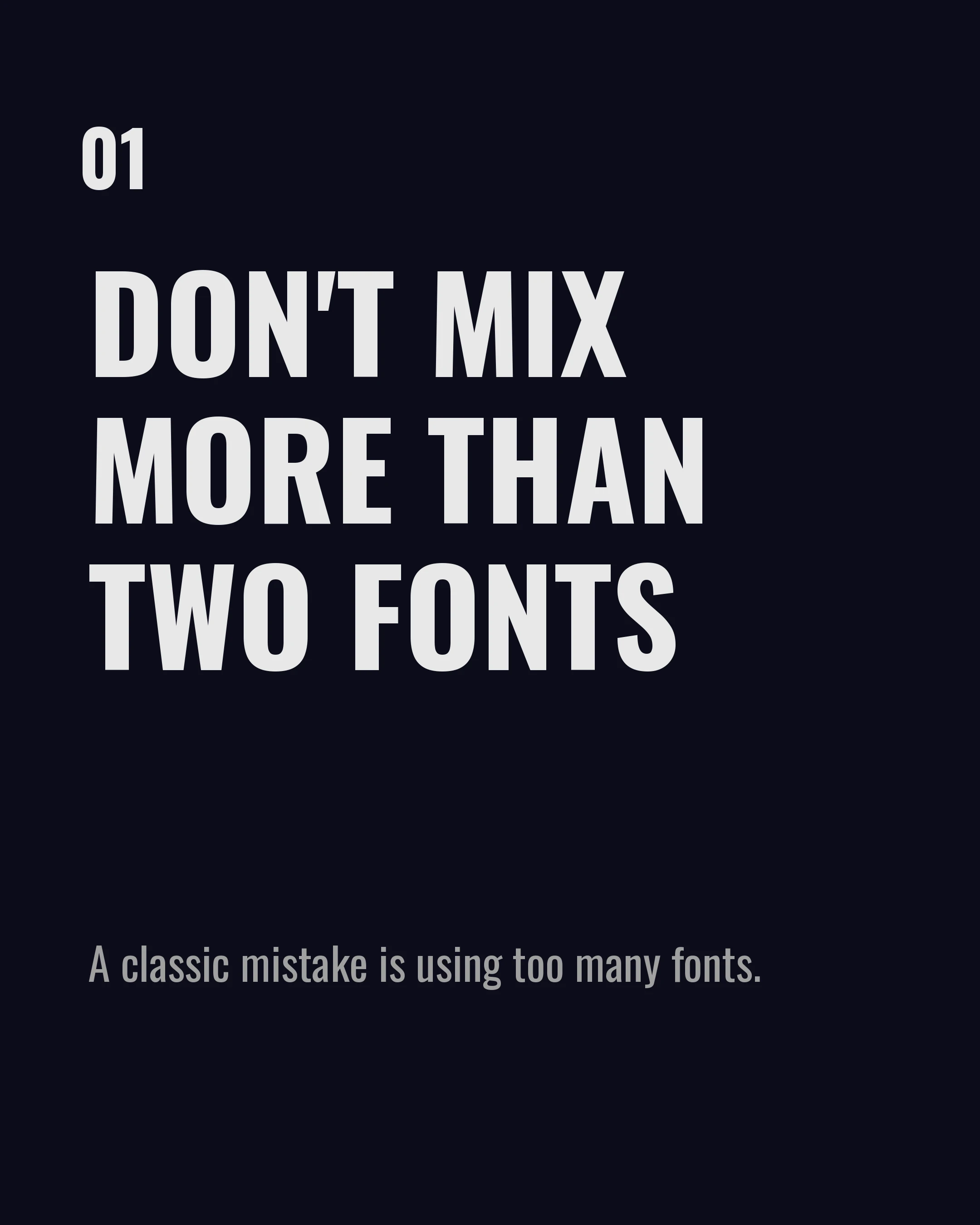
2. Don’t Mix More Than Two Fonts
A classic mistake is using too many fonts. Stick to two: a display font for your headlines, and a highly legible font for your body text. Sometimes, using a single versatile font family (like Montserrat) in different weights is the most elegant solution.
3. Embrace White Space
Text needs room to breathe. Don’t push your words right to the edges of the slide. Generous margins and comfortable line height (leading) make your carousel feel premium and easy to read.
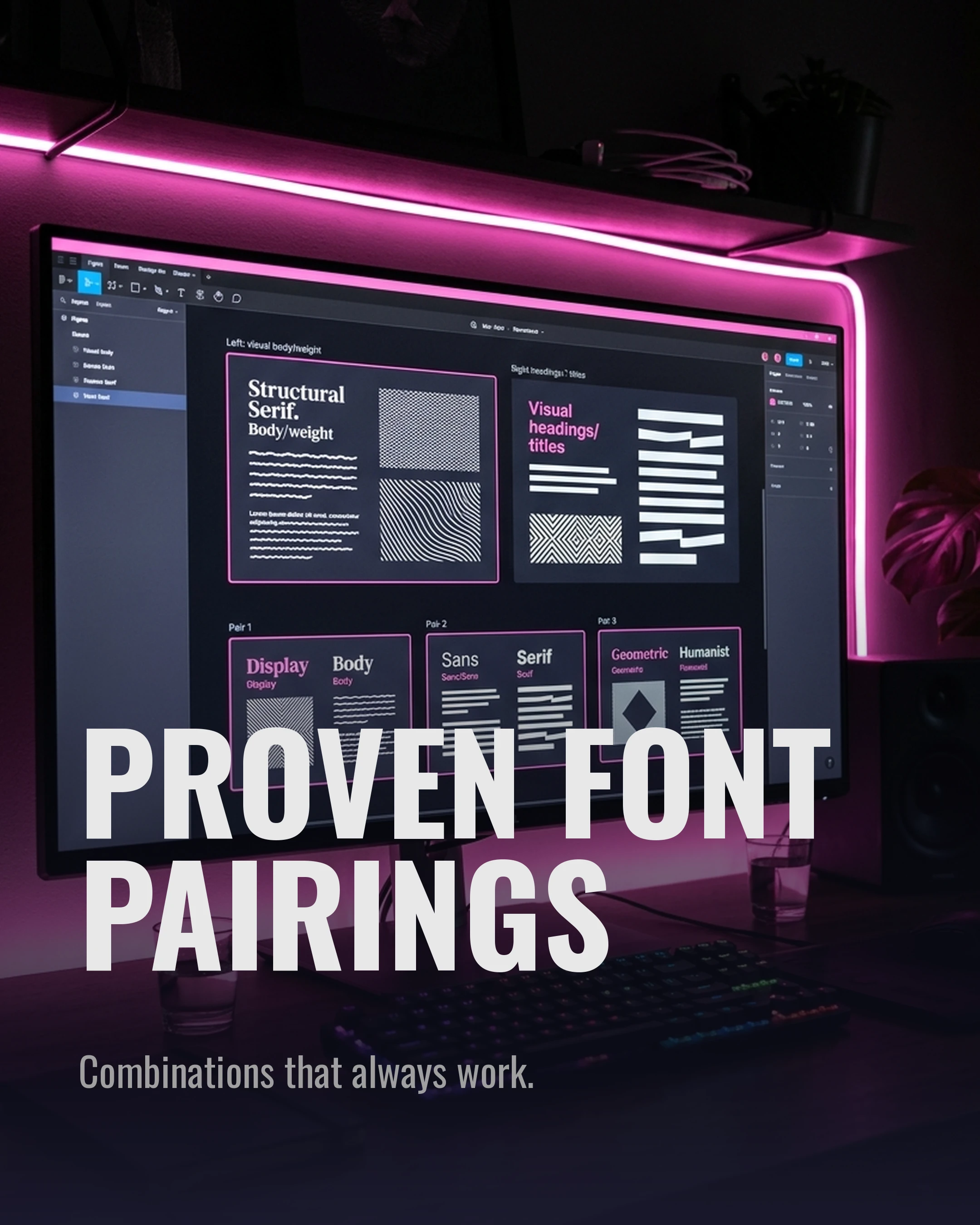
Proven Font Pairings for Carousels
Finding fonts that work well together can be tricky. Here are three reliable pairings that always look professional:
The Modern Authority: Oswald (Headline) + Nunito (Body) Oswald’s condensed, bold nature is perfect for striking hooks, while Nunito provides a soft, readable contrast for the details.
The Elegant Expert: Playfair Display (Headline) + Lora (Body) Ideal for coaches, wellness brands, and luxury real estate. The serif combination feels established and trustworthy.
The Tech Innovator: Space Grotesk (Headline) + DM Sans (Body) Clean, geometric, and forward-looking. Perfect for B2B, marketing, and tech insights.
How Carousel Makes This Easier
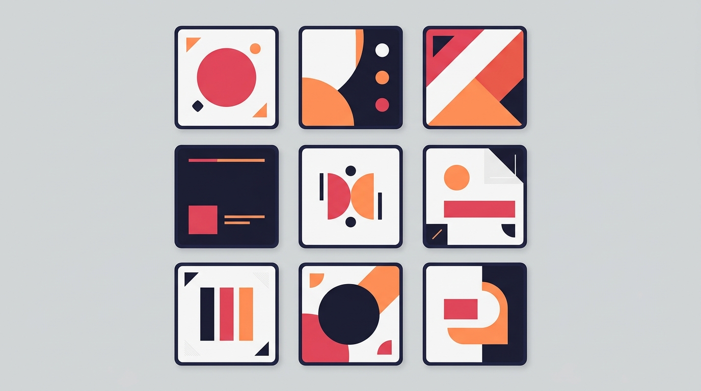
You don’t need a degree in graphic design to create beautiful type layouts. Carousel includes 14 carefully curated Google Fonts, including Poppins, Montserrat, Bebas Neue, and Sora.
Our 10 informative templates are pre-engineered with professional typographic hierarchy. The line heights, kerning, and margins are mathematically calculated to ensure perfect legibility on mobile screens. Just type your text, select a font pairing, and the app handles the rest.
Key Takeaways
- Prioritize legibility: If they have to squint, they will scroll.
- Establish clear hierarchy: Make it obvious what to read first.
- Limit your fonts: Stick to two fonts maximum per carousel.
- Use contrast: Pair bold, heavy headlines with clean, lighter body text.
Ready to elevate your carousel design? Download Carousel — free on the App Store.
Create your first carousel in 60 seconds — free
Pick a template, paste your text, export. It's that simple. No design skills needed.
Download Carousel