
The This or That Carousel Framework: Comparison Posts That Drive Saves
The This or That Carousel Framework: Comparison Posts That Drive Saves
People are wired to compare. Before we decide anything, we weigh options against each other, and that instinct is exactly what makes comparison content so sticky. A well-built “this or that” carousel does not just inform, it forces a small decision on every slide, and decisions keep people swiping.
Most creators reach for the same three or four frameworks and ignore one of the most engaging formats available. The This or That structure turns a flat list of tips into a series of choices, and choices generate comments, saves, and shares far more reliably than passive advice.
Why Comparison Posts Outperform Plain Tips
A standard tips carousel asks the reader to absorb information. A comparison carousel asks them to take a side. That shift from passive to active is the entire reason this format works.
When you put two options next to each other, three things happen. The reader evaluates which one fits their situation, which creates personal relevance. They often disagree with your verdict, which drives comments. And because the comparison is genuinely useful as a reference, they save it for later.
Comparison also creates clarity. “10 ways to improve your email open rates” is overwhelming. “Subject line A vs subject line B: which gets opened” is a single, concrete decision the reader can act on immediately. Specificity always beats volume.
How the This or That Framework Is Structured
The framework follows a clean, repeatable shape across the carousel:
- Slide 1, the hook: Name the debate. State the two options and promise a verdict.
- Middle slides, the comparisons: One comparison per slide. Show option A, show option B, and give a short reason one wins in a given context.
- Second-to-last slide, the nuance: Acknowledge when the “losing” option actually wins. This is what separates an expert from a hot take.
- Final slide, the CTA: Ask the reader which side they land on, and tell them to save the post for next time they face the choice.
The nuance slide matters more than people expect. A comparison that always picks the same winner reads like marketing. A comparison that says “A usually wins, but choose B when X” reads like genuine expertise, and that credibility is what earns the follow.
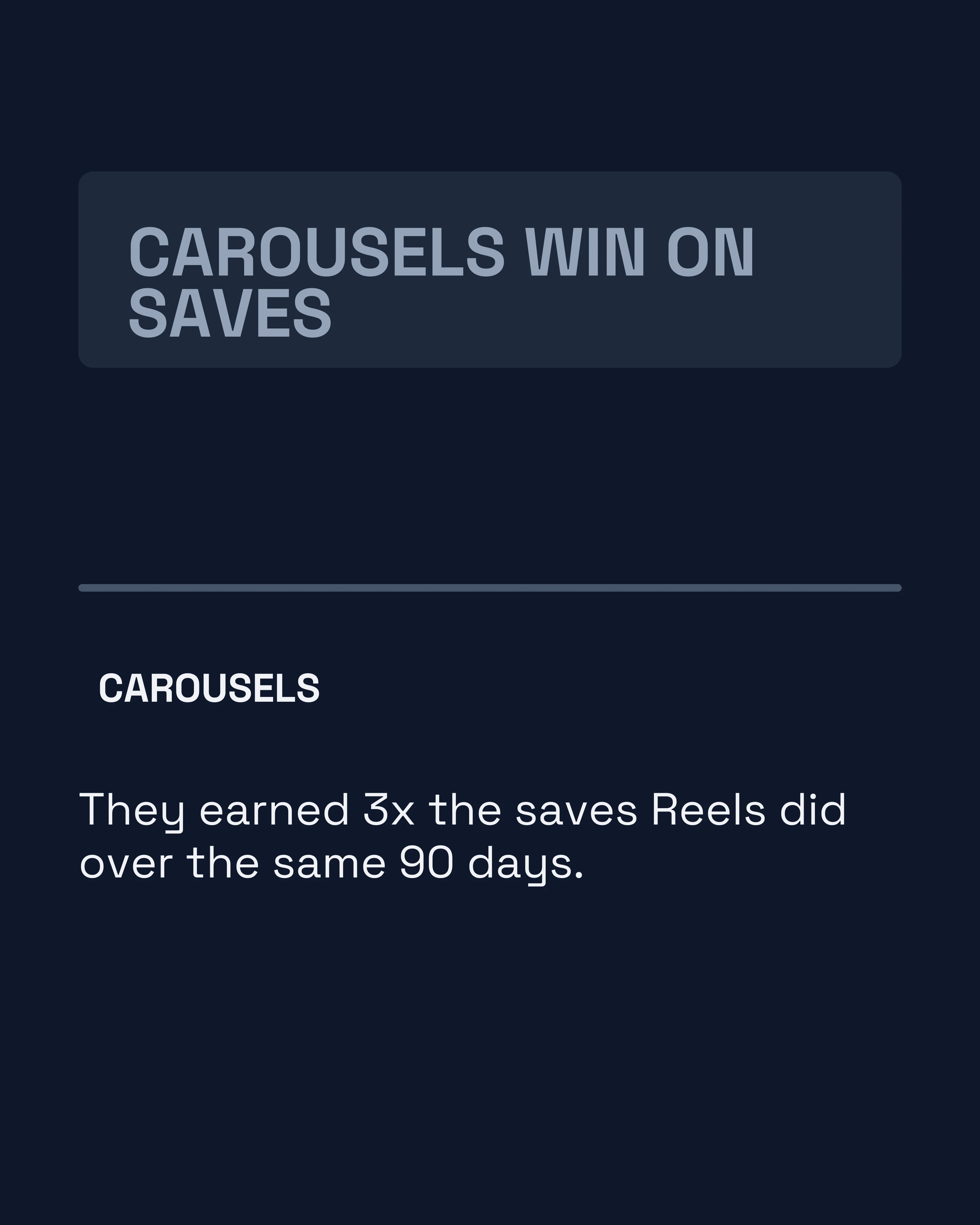
Here is that shape as a complete post: a strength coach settling morning versus evening training in eight slides. Hook naming the debate, five comparisons one per slide, the nuance slide, then the ask.
Watch what the nuance slide does to the whole thing. Without it, five slides of “morning wins” would read as a personality rather than a position.







Choosing Comparisons Worth Making
Not every pairing makes a good carousel. The best comparisons share a few traits.
The choice is real. Your audience genuinely faces this decision. A nutrition coach comparing “oats vs eggs for breakfast” hits a daily question. A vague “good food vs bad food” does not.
The answer is debatable. If one option is obviously correct, there is no engagement to capture. The tension between two defensible choices is what drives comments.
You have a clear point of view. Comparison content fails when the creator refuses to pick a side. Readers want your verdict, even if they end up disagreeing. A confident recommendation, properly caveated, beats a wishy-washy “it depends” every time.
If you are short on ideas, look at the questions your audience already asks. Every “should I do X or Y” question in your DMs or comments is a ready-made comparison carousel.
This or That vs Myth vs Fact
These two formats are cousins, and people often confuse them. The difference comes down to the relationship between the options.
Use This or That when both options are legitimate and the question is which fits a situation: standing desk vs sitting, morning workout vs evening workout, reels vs carousels. Both can be right.
Use Myth vs Fact when one claim is simply wrong and you are correcting a misconception. There is no genuine choice, only a correction.
Picking the right one matters. Framing a real choice as a myth makes you sound dogmatic. Framing a misconception as a fair choice makes you sound uninformed. When the two options are both valid, This or That is the honest, higher-engagement framing.
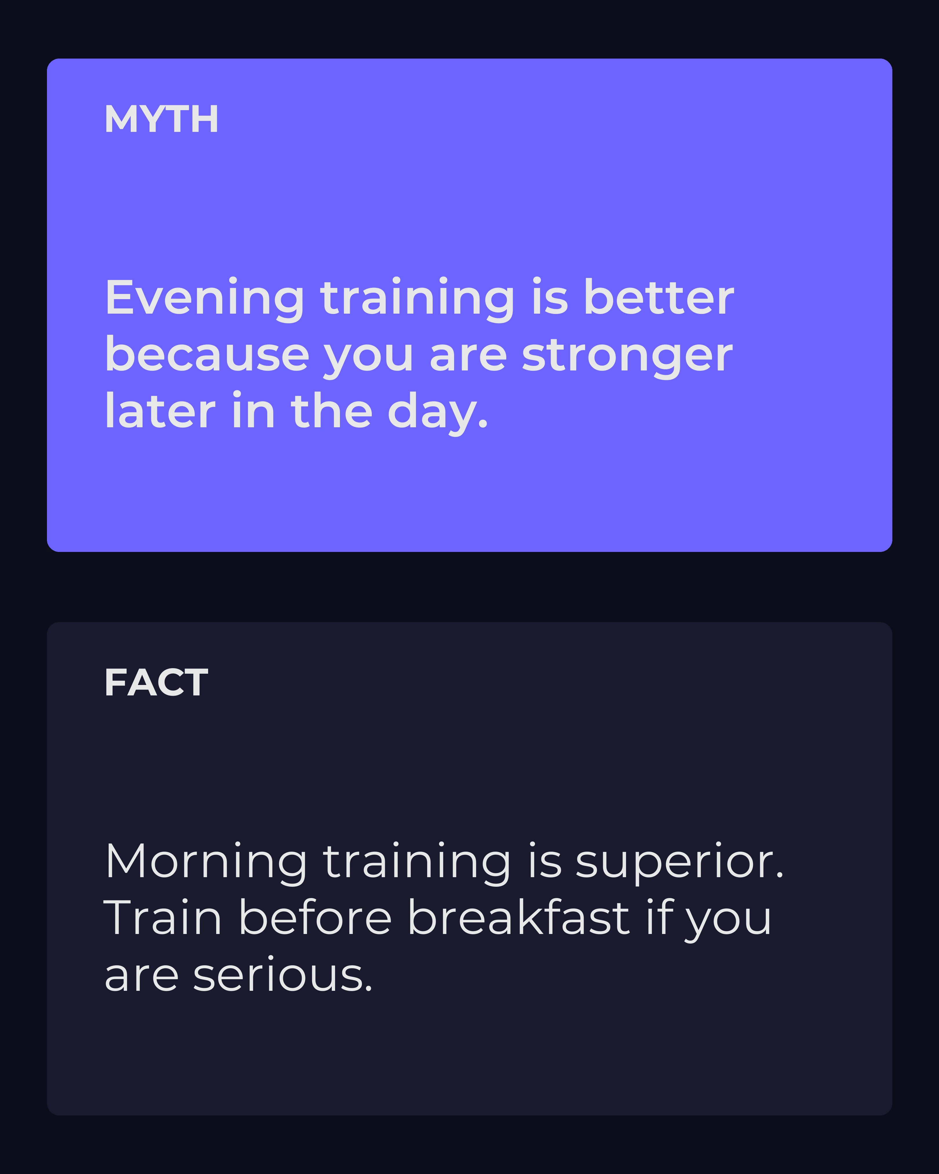
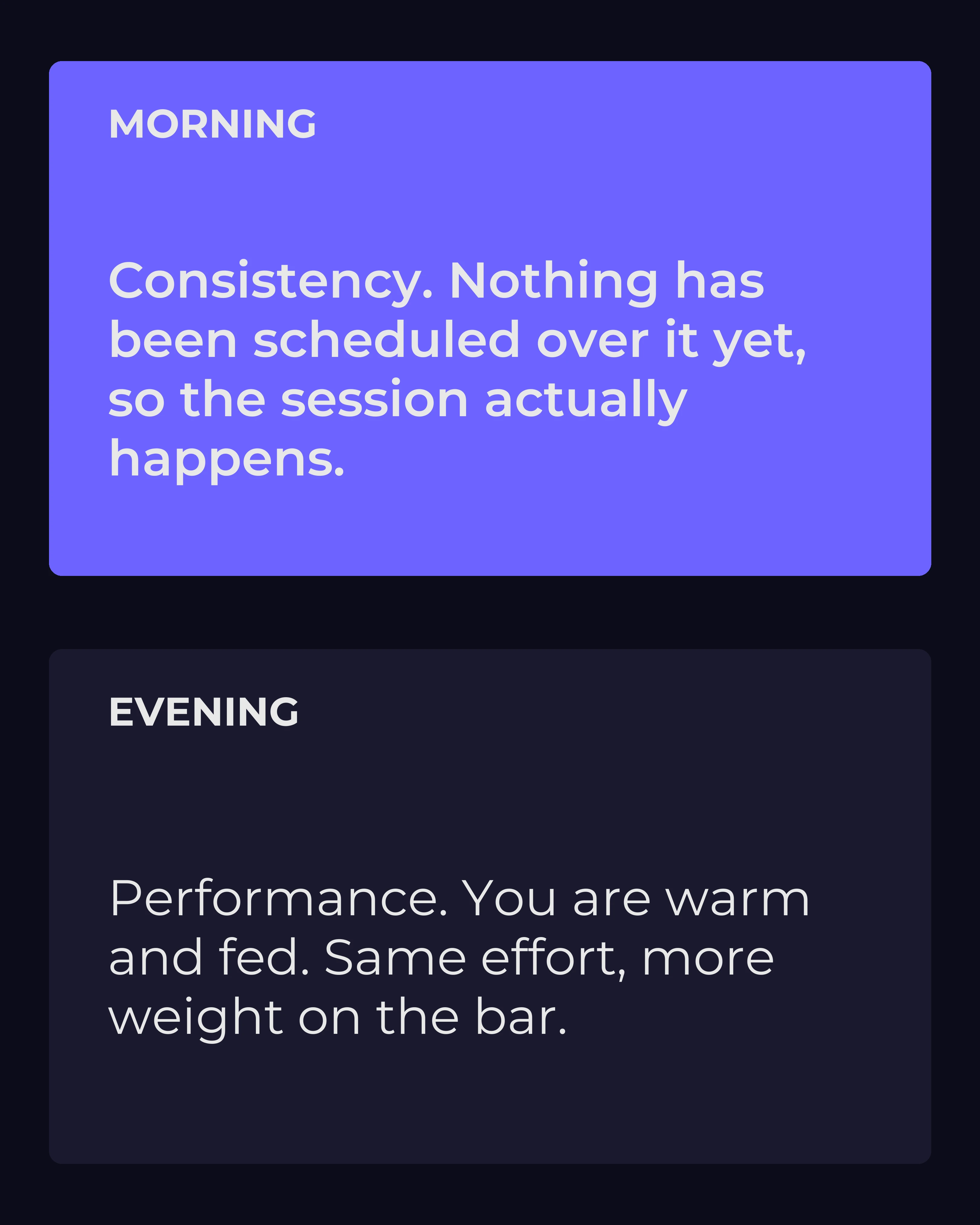
The same question, framed both ways. Two slides, not a carousel — the subject is identical and only the relationship between the options changes.
The first tells a reader who trains in the evening that they are wrong, about something that is genuinely a preference. The second lets them recognise themselves and pick. One of those gets argued with in the comments; the other gets saved.
Common Mistakes With Comparison Carousels
Too many comparisons. Five or six pairings is the sweet spot. Stack a dozen and each one gets too little space to land. Depth beats breadth.
No verdict. The reader came for your opinion. Give it, even when caveated.
Unfair fights. Pitting a strong option against a strawman is transparent. Both sides need a genuine case.
Forgetting the save prompt. Comparison content is reference content. Explicitly tell people to save it, and many will.
For more on writing the opening slide that earns the swipe in the first place, the carousel hooks guide pairs naturally with this format.
How Carousel Makes Comparison Posts Faster
The This or That format is one of seven copywriting frameworks built into Carousel. You give it the two options and your context, and it structures the hook, the per-slide comparisons, and the verdict for you, then lays them out across matching slides. Instead of fighting with formatting, you spend your time on the part that actually matters: choosing comparisons your audience cares about and picking the side you believe in.
It sits alongside AIDA, PAS, and the other built-in structures, so you can match the framework to the post instead of forcing every idea into the same shape.
Key Takeaways
- Comparison content converts passive readers into active decision-makers, which drives saves and comments.
- Structure it as hook, one comparison per slide, a nuance slide, then a save-focused CTA.
- Pick comparisons that are real, debatable, and where you hold a clear point of view.
- Use This or That for genuine choices and Myth vs Fact for correcting misconceptions.
- Always give a verdict, and always ask readers to save the post.