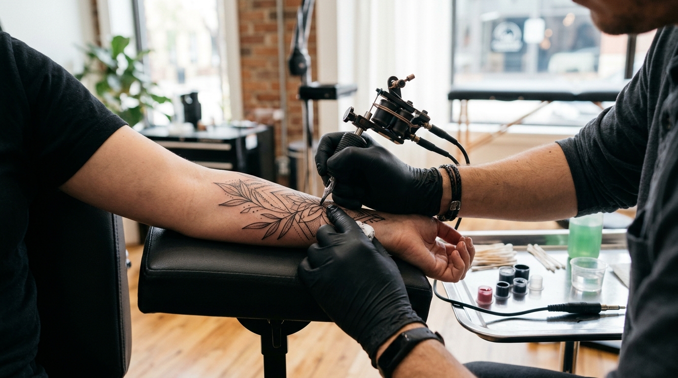
Tattoo Artist Carousel Posts: 7 Ideas That Fill a Books-Open Week
Tattoo Artist Carousel Posts: 7 Ideas That Fill a Books-Open Week
Tattooing has an unusual content problem. The work photographs beautifully, artists post constantly, and most feeds still convert badly. The reason is that a grid of finished pieces answers only one question — can you draw — while the questions that actually stop someone booking are entirely different.
Will it hurt more than I can handle. What happens if I hate it. How much is this going to cost, honestly. Can you cover the thing I already regret. Is this person going to make me feel stupid for asking.
A single photo cannot answer any of those. A carousel can answer all of them, and that is the whole argument for using them.
This guide covers seven post ideas with example slides, plus the palettes and tone that make a tattoo feed read as a working studio rather than a portfolio dump.
Why Carousels Work for Tattoo Artists
Tattoos are a high-commitment, high-anxiety purchase with a long consideration window. People follow an artist for months before they message. The account that gets the message is the one that reduced the most uncertainty in the meantime.
Carousels are the format for reducing uncertainty. They let you show process rather than outcome, which is where trust is built. A finished sleeve says “I am good.” A sequence showing the stencil, the linework, the second session, and the healed result says “here is exactly what booking me involves, and nothing about it will surprise you.”
There is also a practical distribution reason. Instagram re-serves a carousel starting from later slides to people who scrolled past the first one, which means a multi-slide post gets more than one chance to land. A single photo gets one.
The Before-After-Bridge framework fits transformation work almost perfectly, and Myth vs Fact handles the aftercare and pain questions that clog your DMs.
Seven Carousel Ideas for Tattoo Artists
1. The Cover-Up
The highest-value post a tattoo artist can make, and the one most artists compress into a single before-and-after pair. Cover-up clients are the least confident buyers in the market and the most likely to spend serious money once they trust you.
Shown below as a full nine-slide post: the regret, the stencil, the linework, the shading, the second session, and the reveal. The before shot is the cover, because the mess is the hook and the finished piece is what people swipe for.
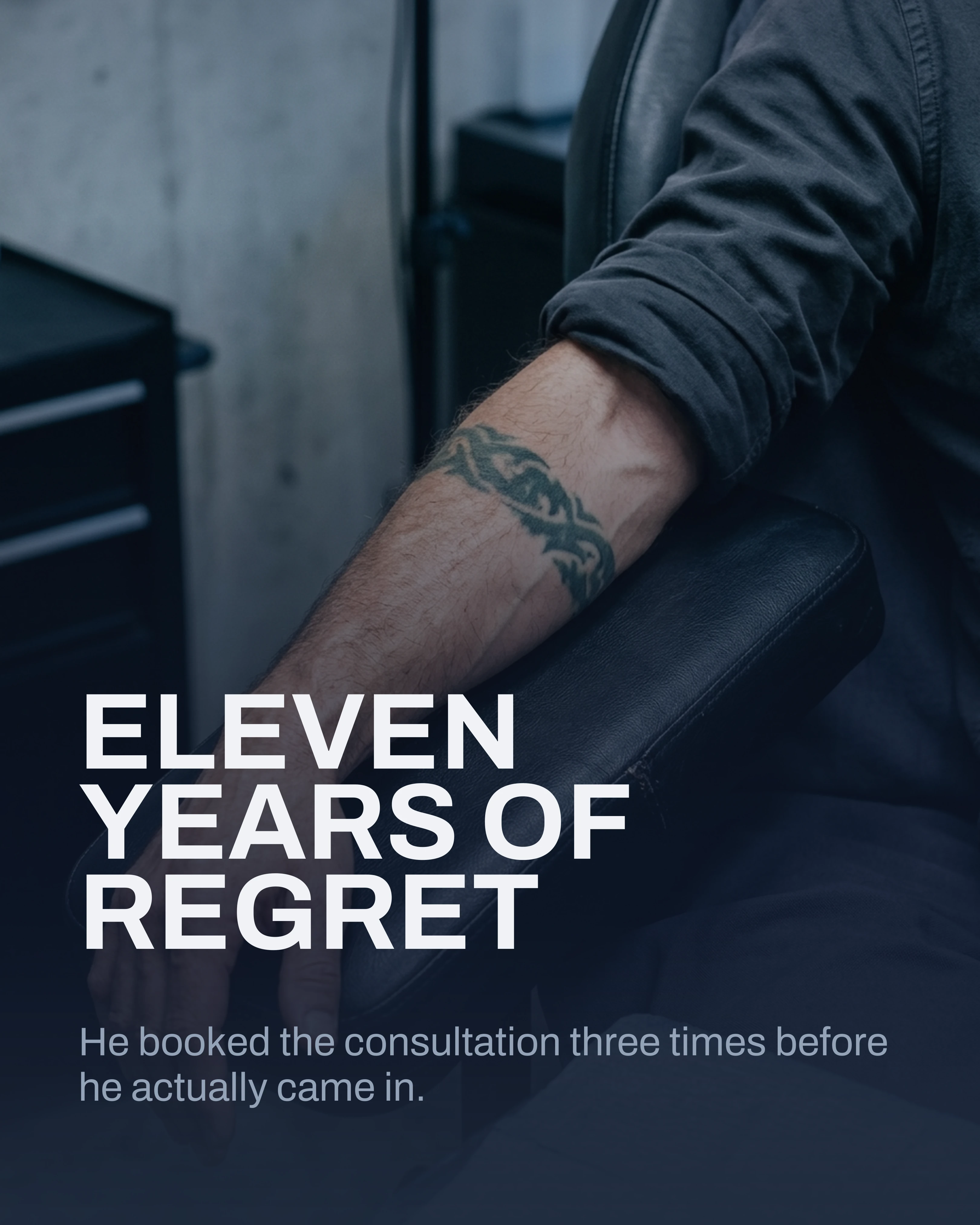
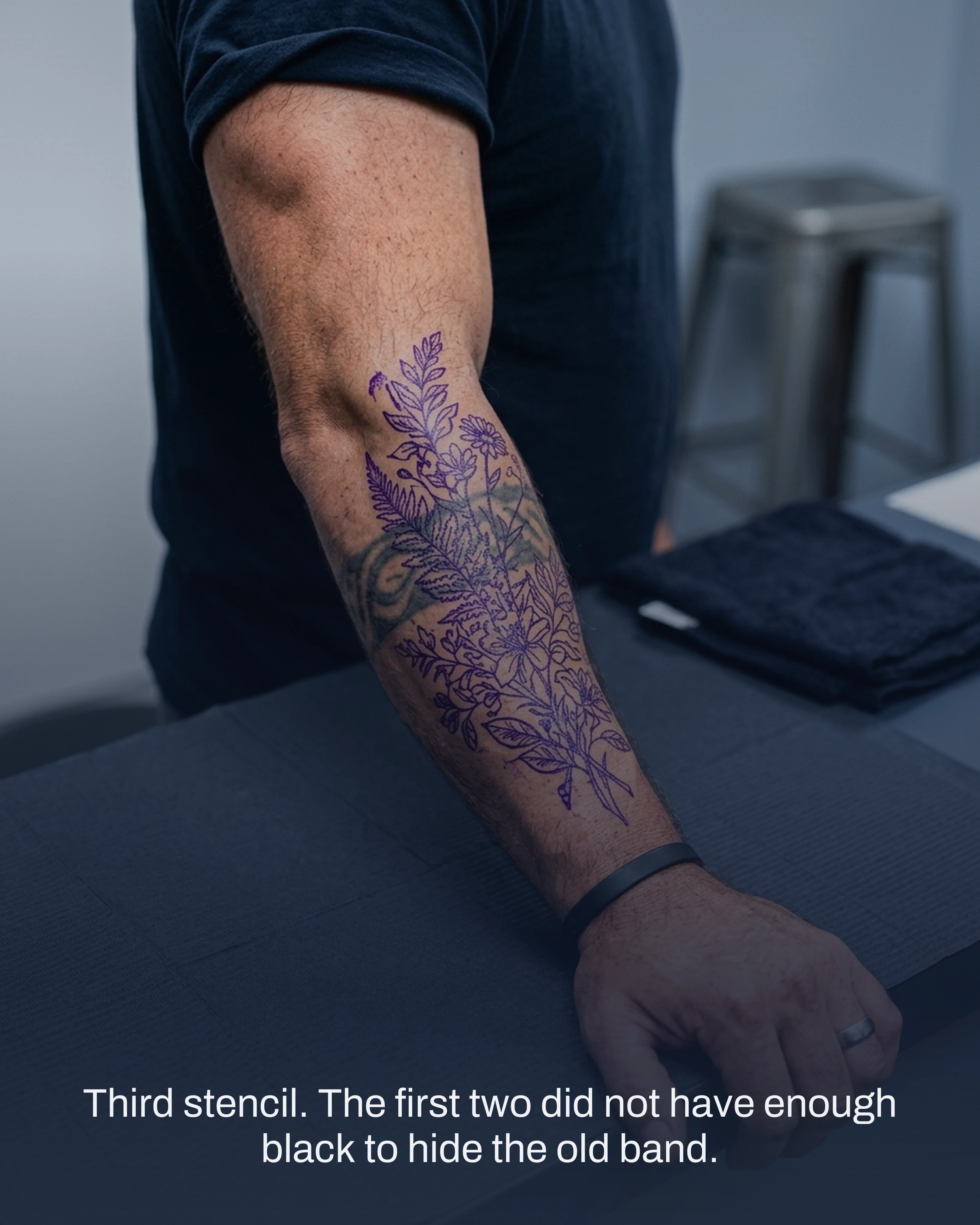
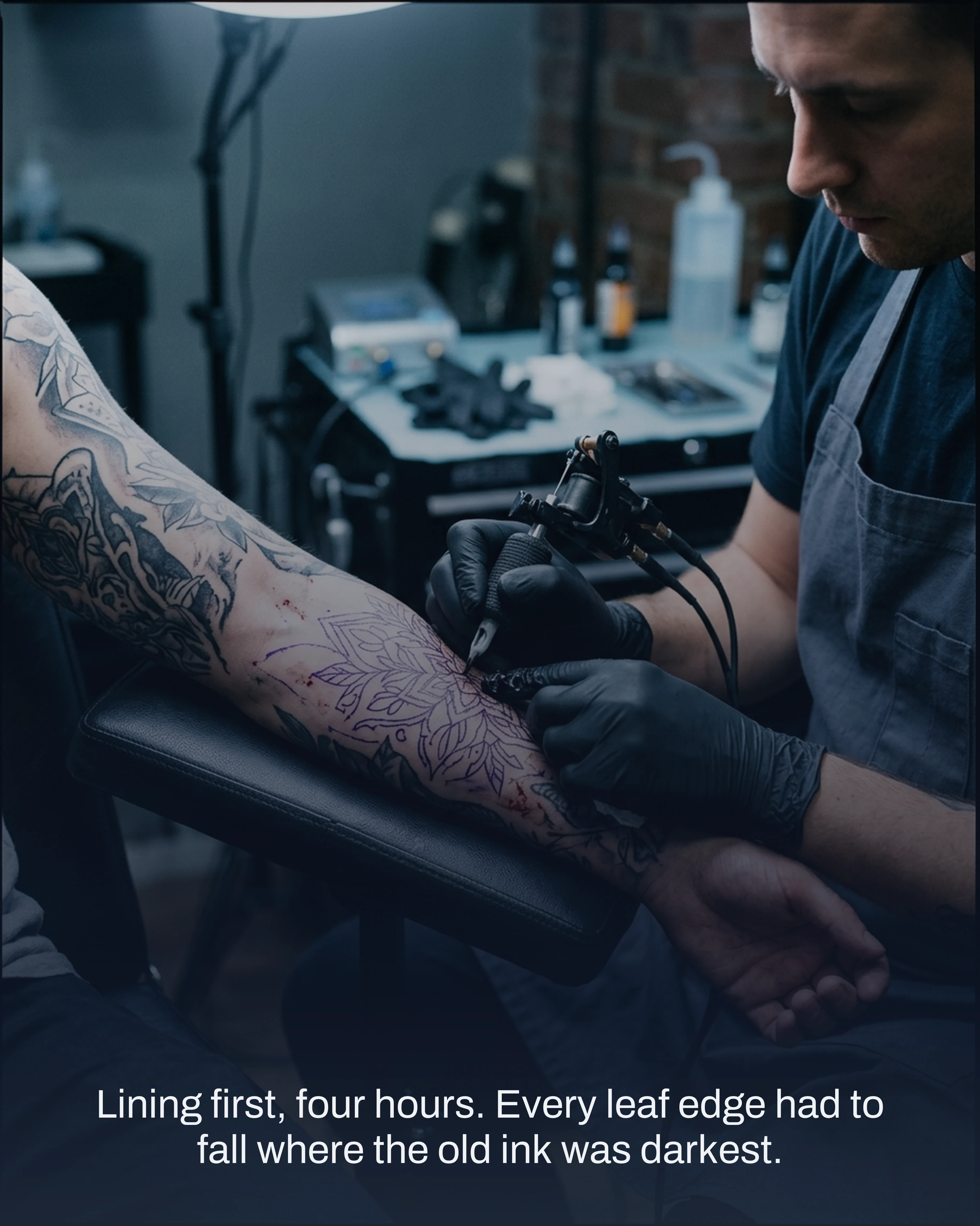
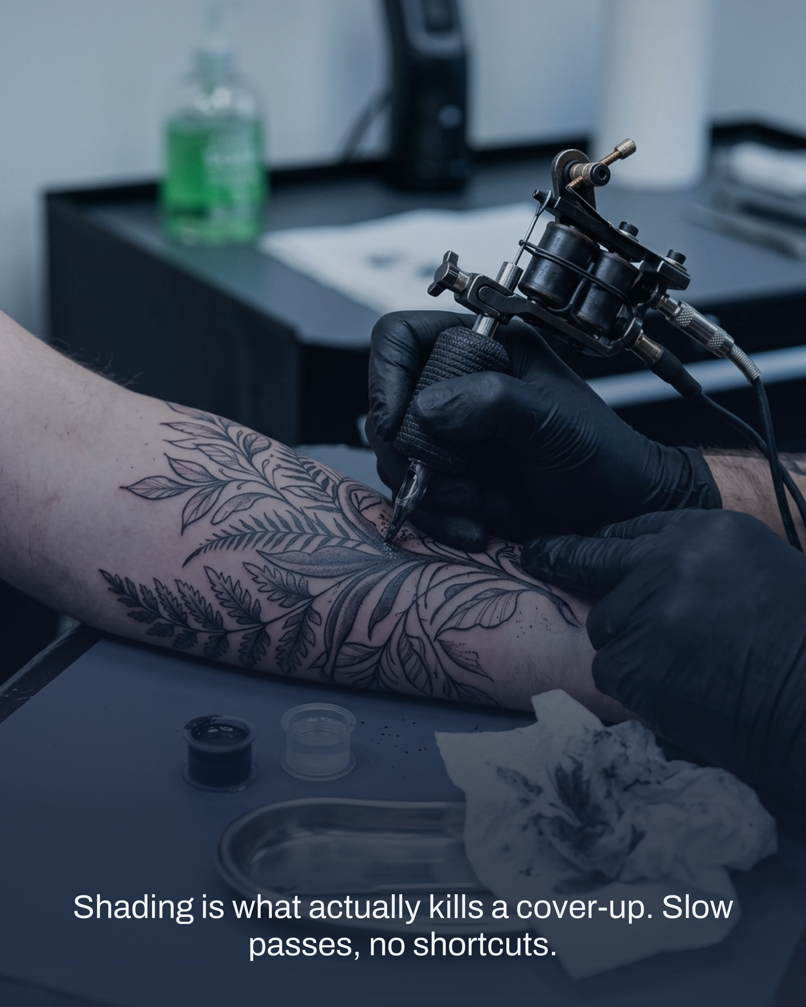
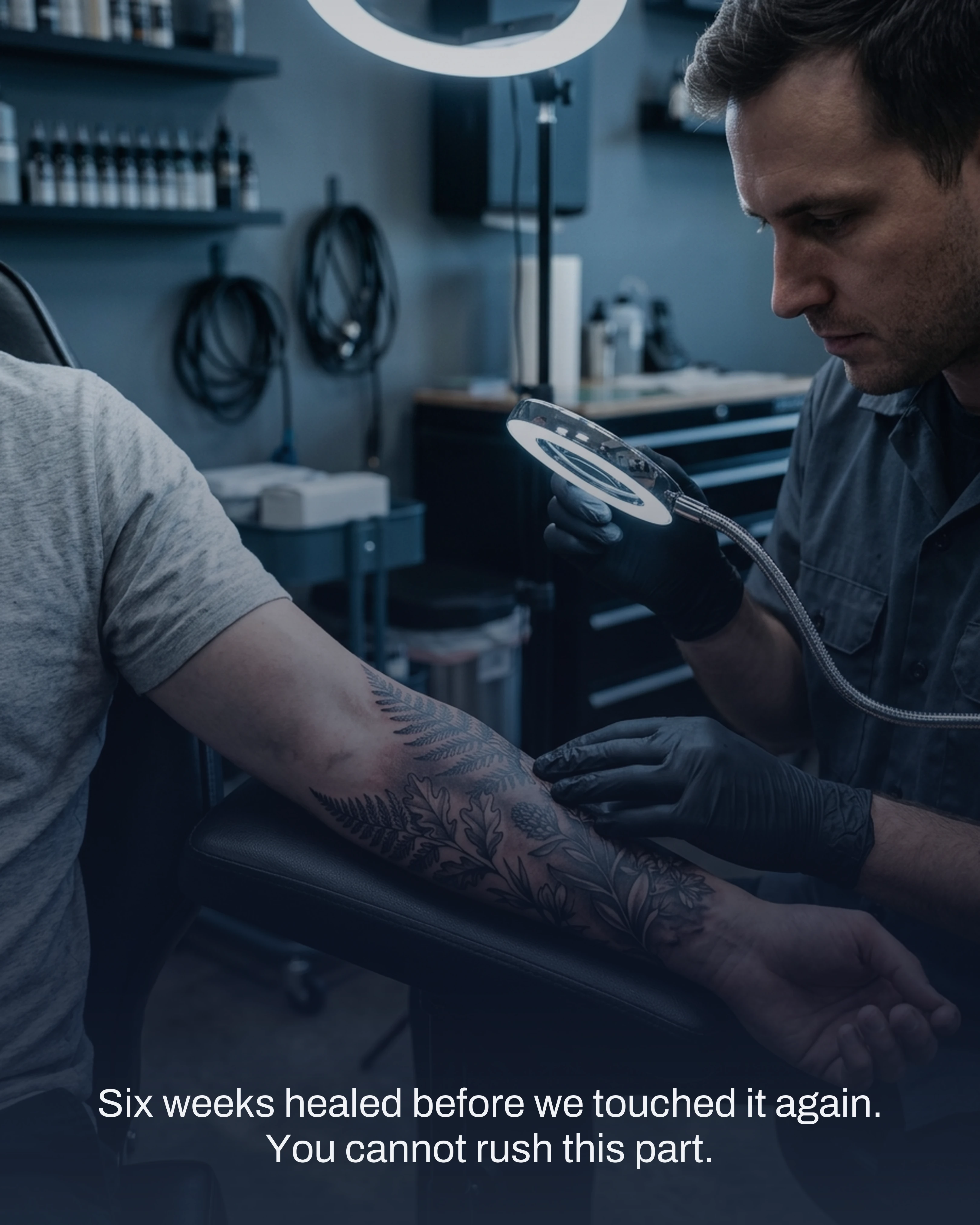
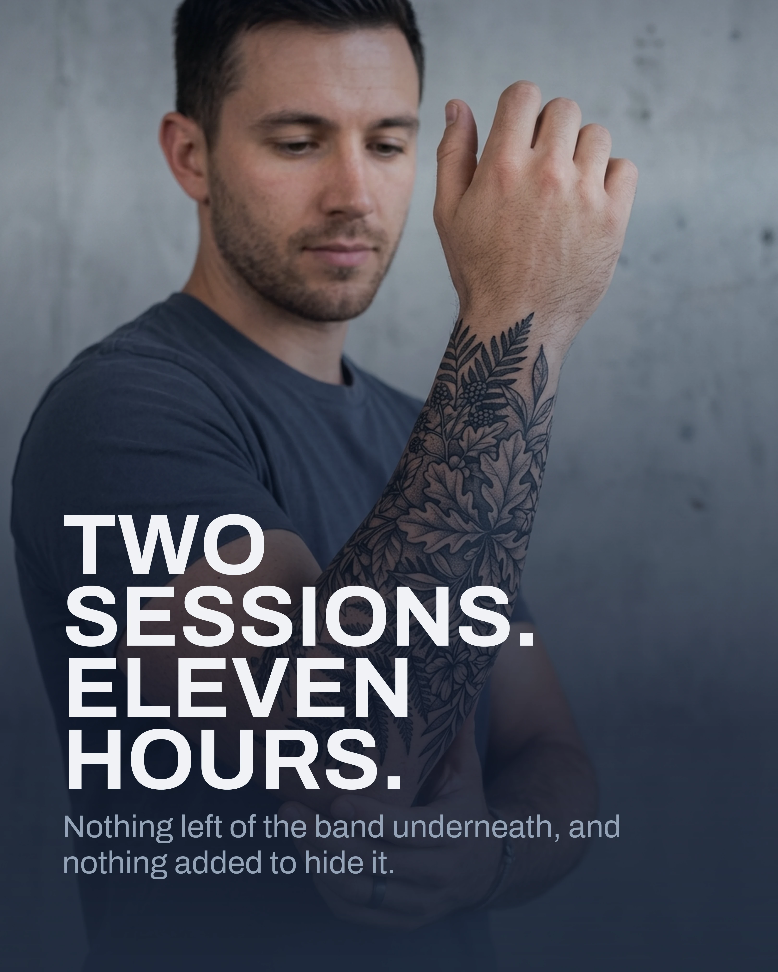
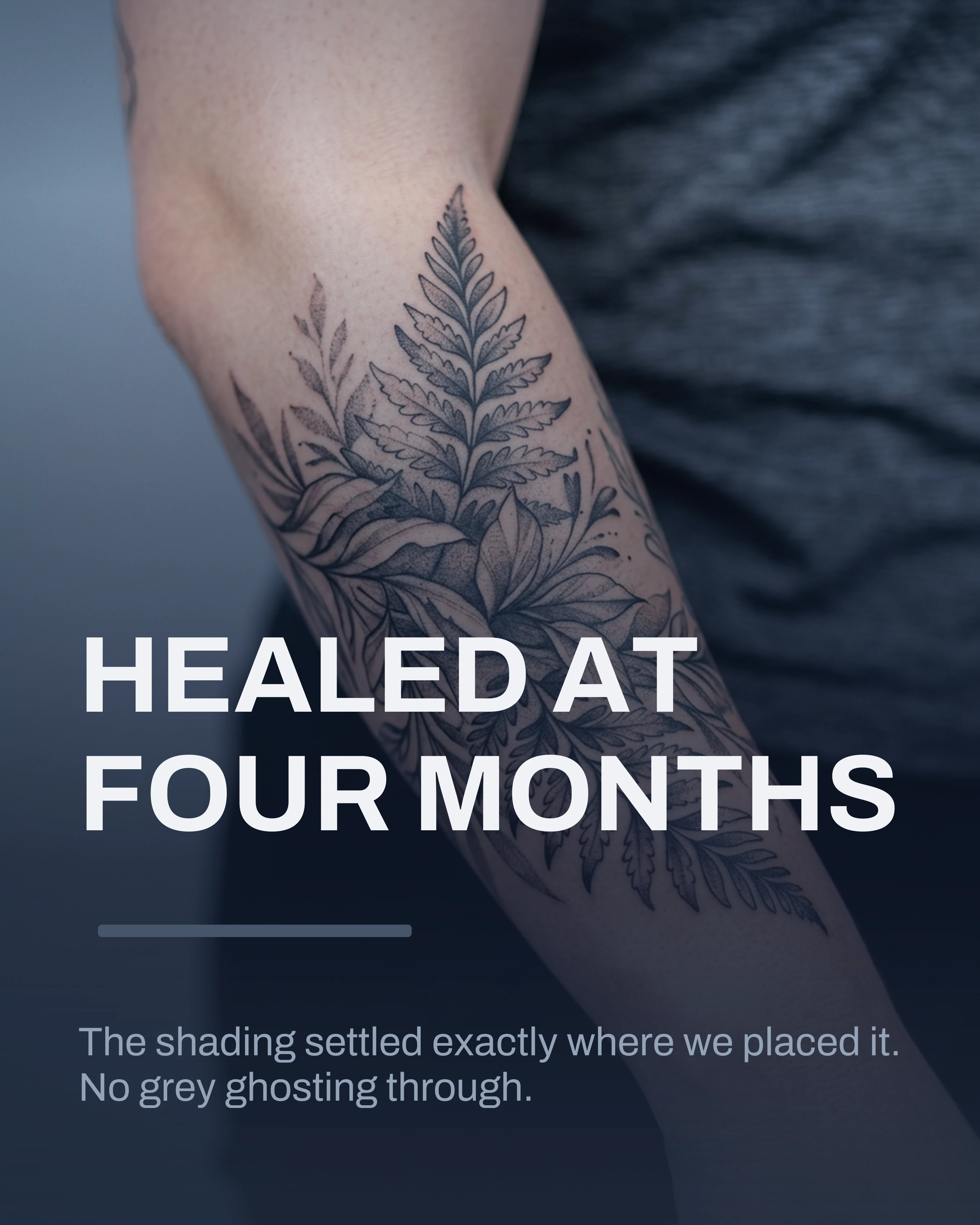
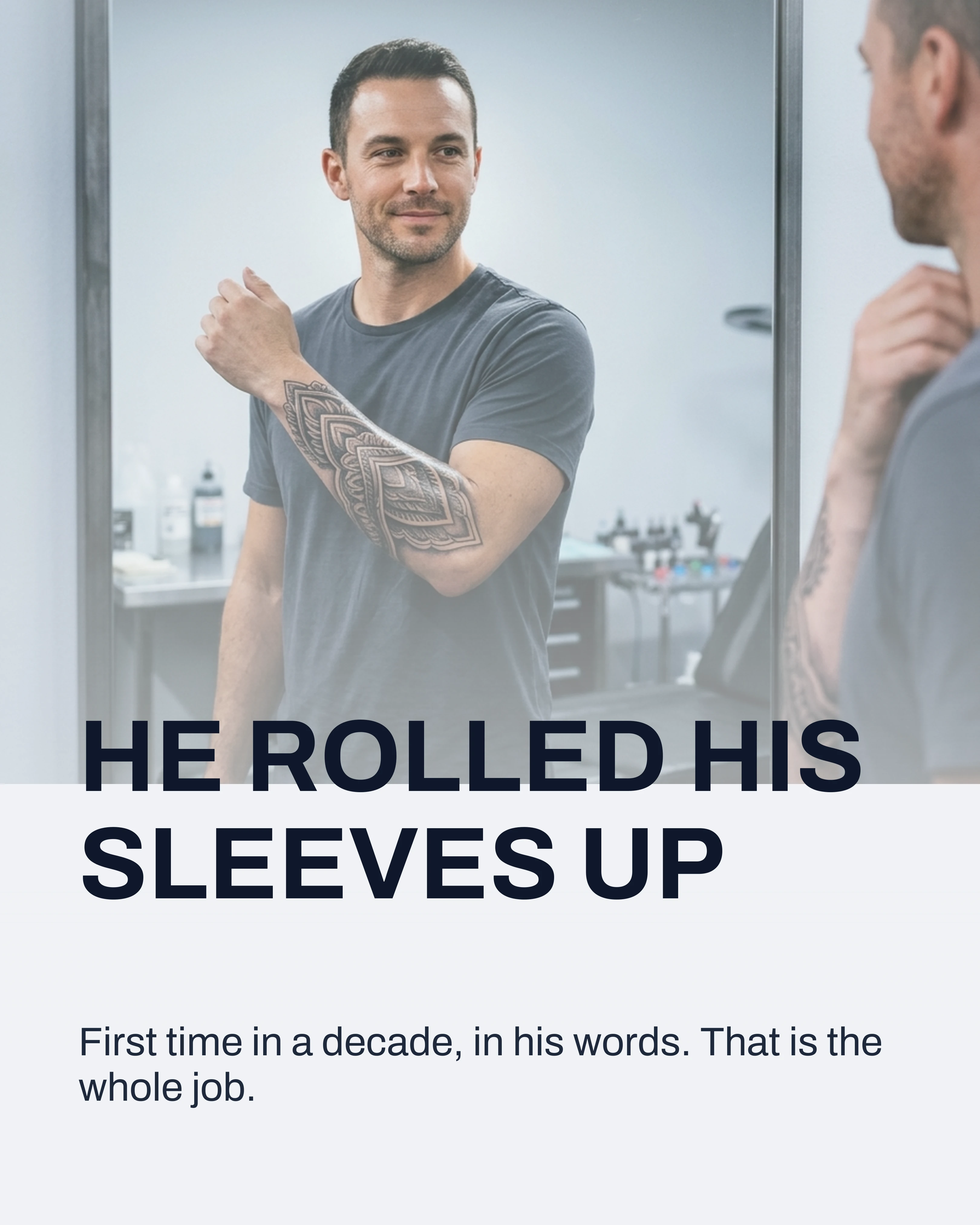
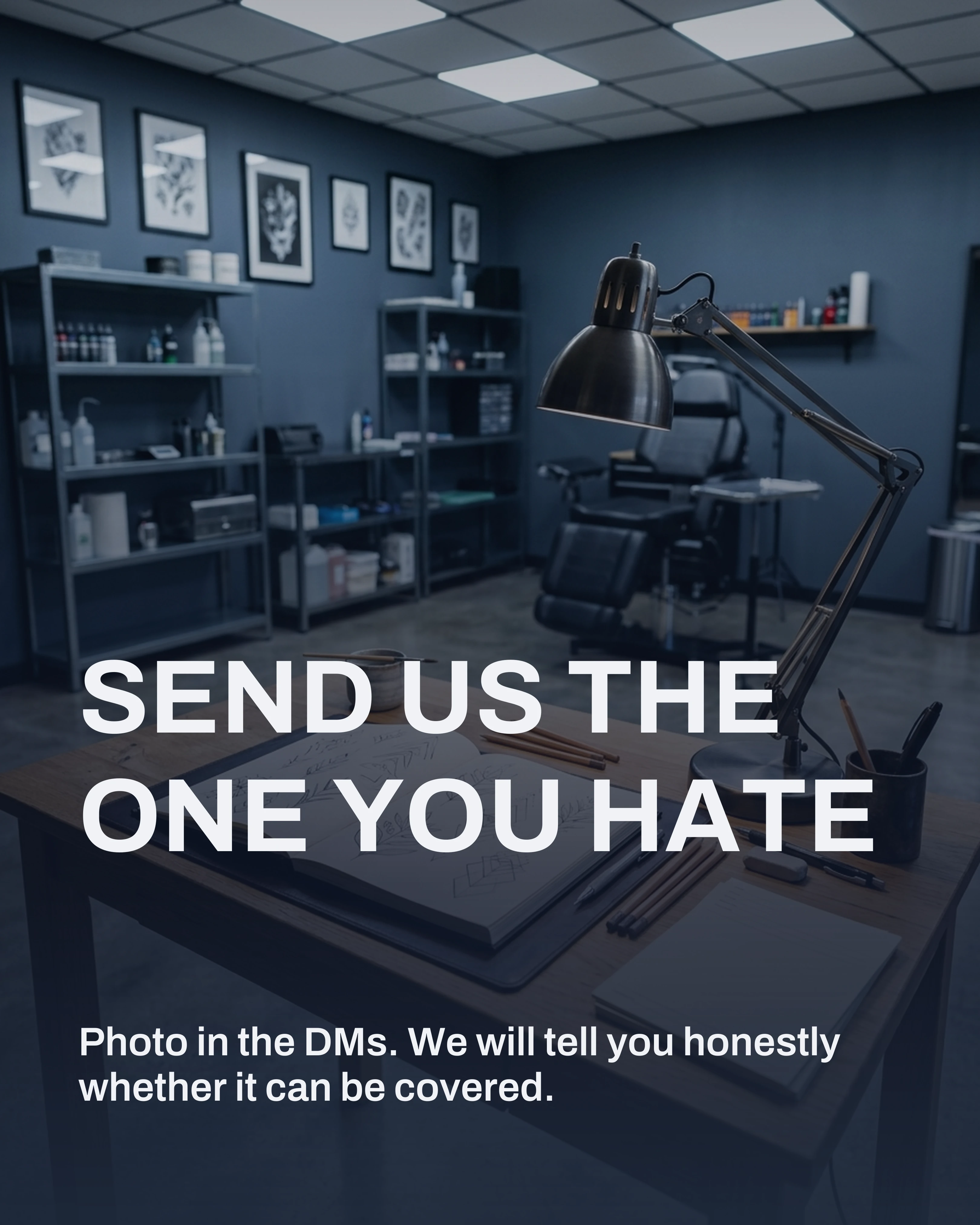
The remaining ideas below carry one representative slide each, so the set stays readable rather than turning into a gallery.
2. Healed, Not Fresh
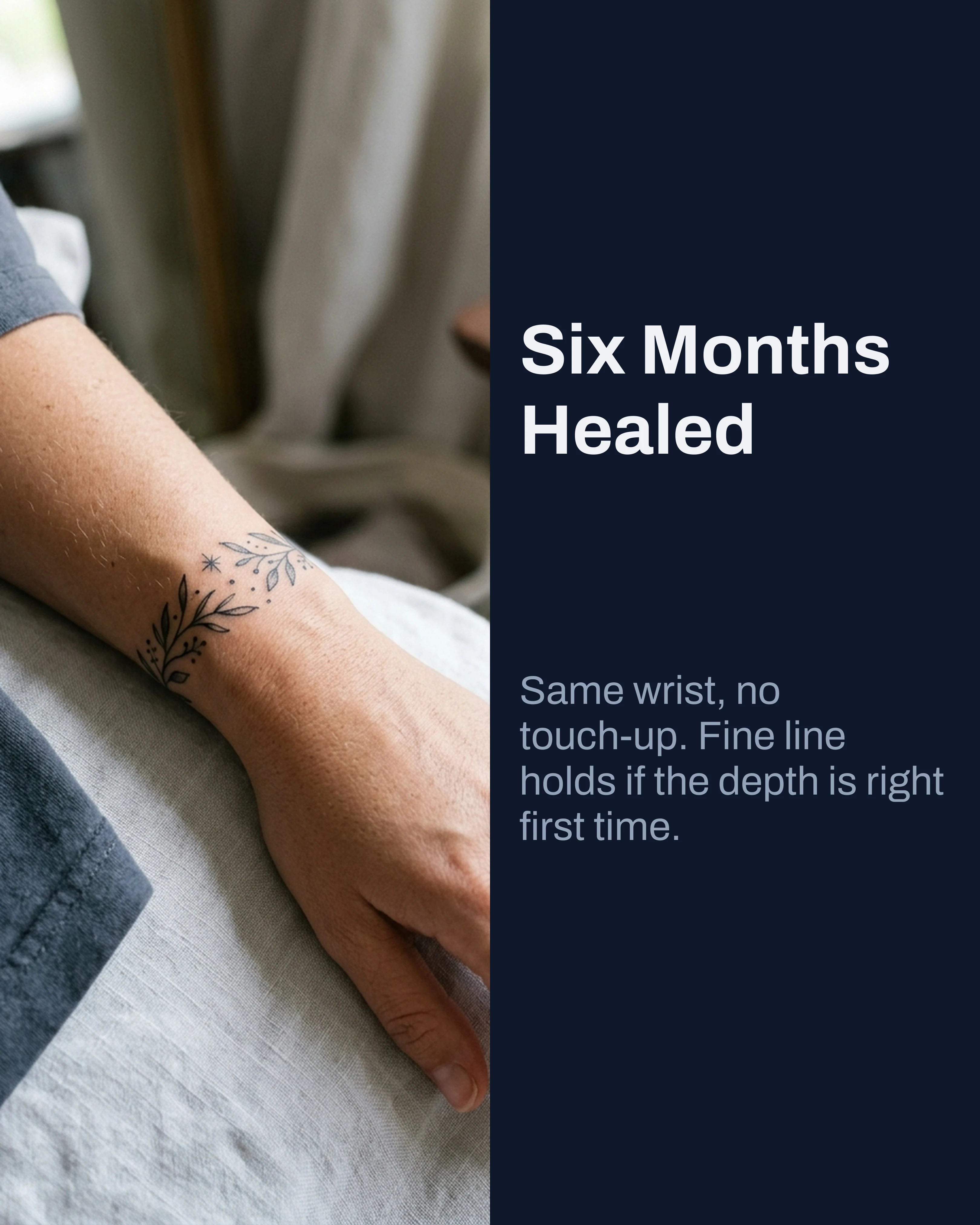
Fresh tattoos photograph better and heal into something different. Posting the same piece at six months is the most underrated credibility move in the trade, because it is the only proof that your linework holds and your shading does not blow out.
Caption it with the timeframe and the placement. Clients who have been burned before are specifically looking for this post.
3. The Flash Drop
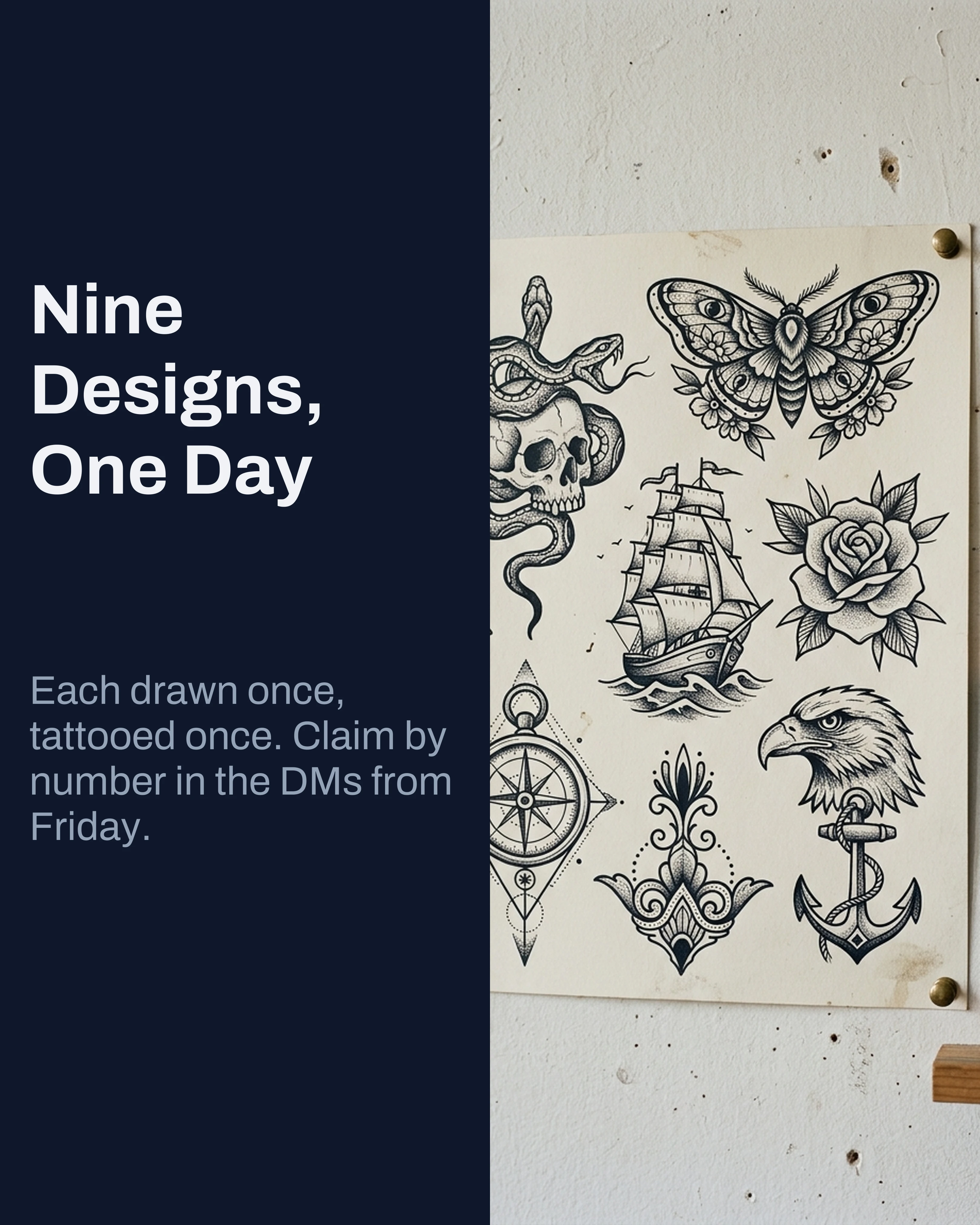
Carousels are the natural format for a flash release: one design per slide, sizes and prices on the slide, placement noted. It reads as a catalog rather than an announcement, and it gets saved and screenshotted, which is exactly how flash gets claimed.
Number your designs on the slides. It makes the DM easy — people message “number four” instead of describing a drawing back to you.
4. Placement and Flow
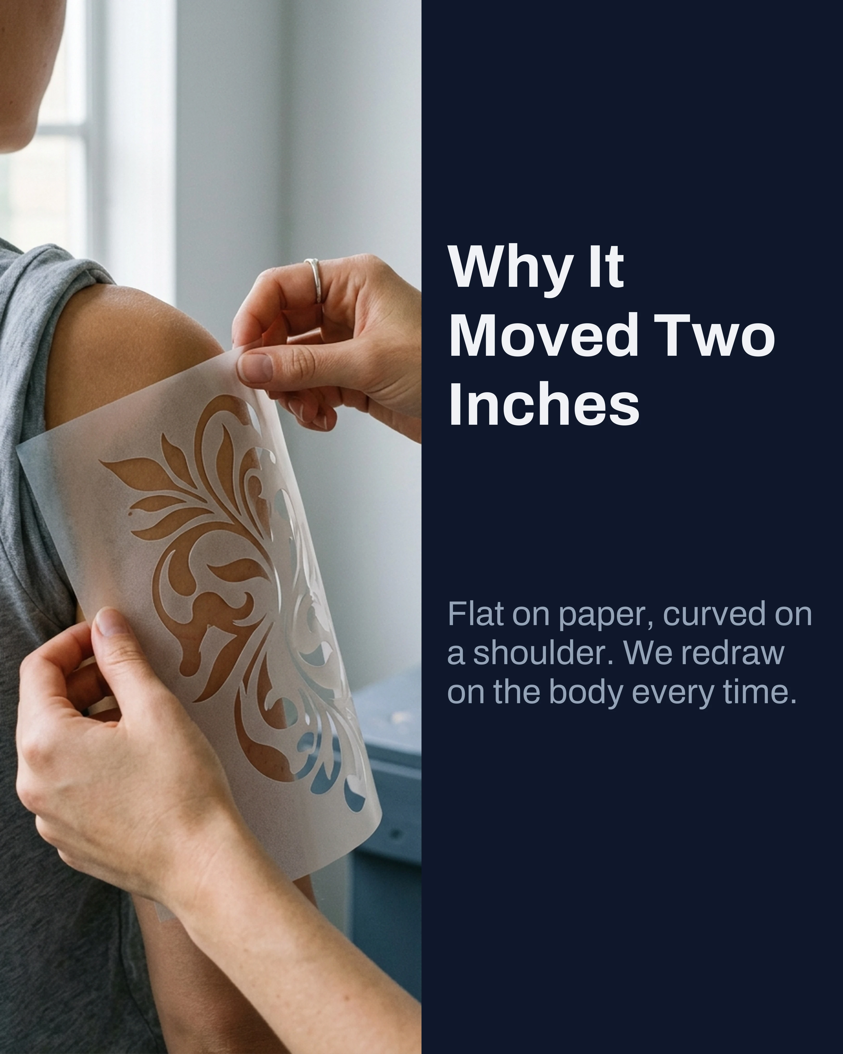
An educational post that costs you nothing and positions you as the person who knows what they are doing. Why a design that looks right on paper sits wrong on a forearm. Why the same piece needs redrawing for a calf.
This is the post that changes a client from someone arriving with a Pinterest screenshot into someone arriving with a brief.
5. Aftercare, Properly
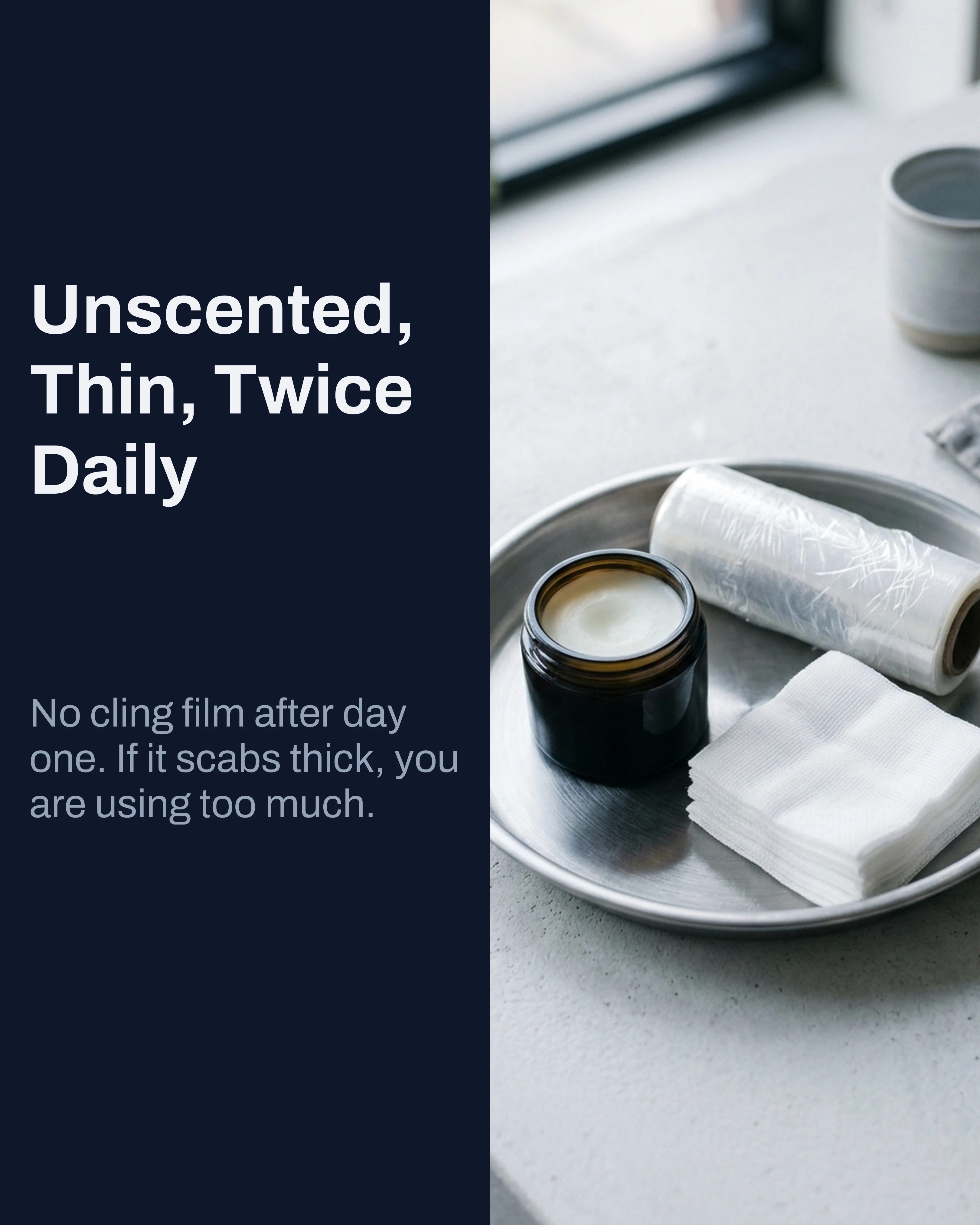
Every artist explains aftercare at the end of a session, when the client is tired and not listening. Publish it as a carousel and you have something to send afterwards, something new clients can read before booking, and a post that quietly demonstrates that you care what happens after they leave.
Myth vs Fact is the right frame here. Most aftercare advice people arrive with is wrong, and correcting it politely on a slide is easier than correcting it in person.
6. What It Actually Costs
Publish your day rate, your minimum, and what changes the number. Artists resist this and it is the single most requested piece of information in the DMs.
Being the studio that says it plainly filters out the people who were never going to book and dramatically shortens the conversation with the people who were. It also stops the “how much for a small one” message, which no one has ever enjoyed receiving.
7. A Day in the Chair
The consultation, the drawing time nobody sees, the setup, the breaks. Prospective clients, particularly first-timers, have no mental model of what a session is like, and that gap is where nerves live.
This is also the post most likely to reach people who are not yet looking for a tattoo, which is how you build a following rather than a waiting list.
Palette and Tone for Tattoo Content
Dark palettes suit the work and the environment. Slate and Midnight both read as a modern studio and let black and grey work sit naturally against the background rather than fighting a bright frame. For color-heavy portfolios, Coral or Rose gives you a warmer frame that does not compete with the ink.
On typography, avoid the gothic and script faces that appear on every tattoo flyer. Something clean and confident — Archivo, Space Grotesk, Oswald for headlines — makes the work look contemporary and the studio look organized. Save the decorative lettering for the tattoos.
On tone, the biggest opportunity is warmth. The stereotype of the intimidating studio still costs the industry a fortune in bookings that never happen. Writing like a person who wants to answer questions is a genuine competitive advantage, and it shows up in your slide copy before it shows up anywhere else.
Credit your clients, name the healing time, and be specific about sessions. “Two sessions, eleven hours total” is far more useful than “swipe for the finished piece.”
How Carousel Helps Between Clients
Realistically you are posting from the studio, between sessions, on a phone. Carousel turns a few notes about the piece into structured slides in minutes, with Before-After-Bridge and Myth vs Fact frameworks ready for cover-ups and aftercare posts. Save a Slate or Midnight brand kit once and every post looks like it came from the same studio, even the ones you build while a stencil is drying.
Key Takeaways
- Finished-piece photos prove you can draw. They do not answer the questions that stop people booking.
- The cover-up sequence is the highest-value post available to a tattoo artist. Build it out fully.
- Post healed work at six months. It is the only real proof your linework holds.
- Publish your pricing structure. It shortens every conversation worth having.
- Use Slate or Midnight, avoid gothic display fonts, and write with warmth.
Create your first carousel in 60 seconds — free
Pick a template, paste your text, export. It's that simple. No design skills needed.
Download Carousel