Semantic Color Palettes: The Secret to Consistent Carousel Design
You have just created a 7-slide carousel. Slide 1 looks great. By slide 4, the blue you picked is slightly different. Slide 6 uses a grey that clashes with your accent color. The last slide has a CTA button in a shade of orange you have never used before.
Sound familiar? This is the most common design problem in carousel creation. Not poor fonts. Not bad layout. Inconsistent color.
And the cost is real: color consistency increases brand recognition by up to 80%, according to research from the University of Loyola, Maryland. Every carousel you post with mismatched colors is a missed opportunity to build visual recognition with your audience.
The fix is not “be more careful with hex codes.” The fix is a system.
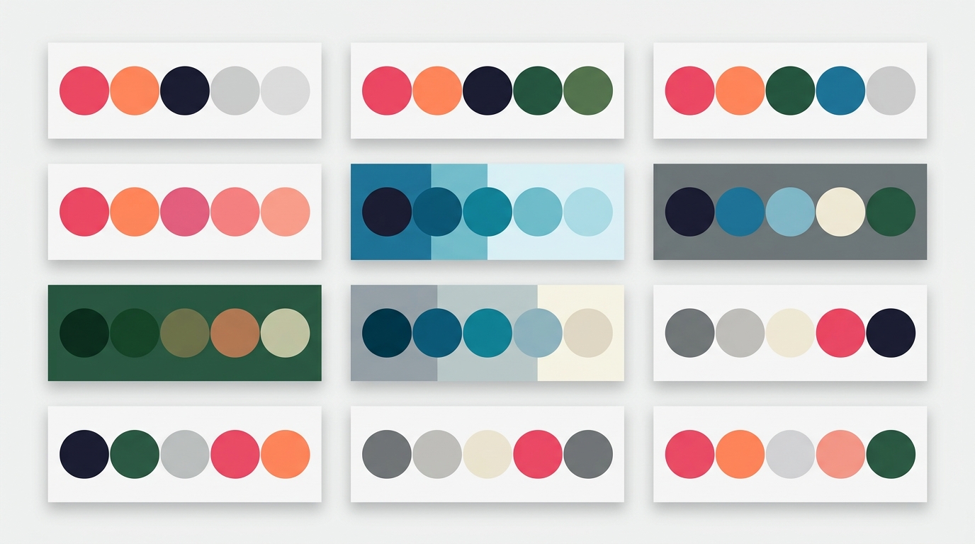
What Are Semantic Color Roles?
Instead of picking individual hex values for each element on each slide, you define a small palette of 5 colors, each with a clear purpose:
| Role | Purpose | What It Colors |
|---|---|---|
| Primary | The strongest visual — draws the eye | Headlines, key numbers, CTA buttons |
| Secondary | Supporting content | Body text, subtitles, captions |
| Accent | Highlights and decorative touches | Dividers, bullets, borders, badges |
| Background | The canvas | Slide background color |
| Surface | Cards, overlays, containers | Quote boxes, content cards, panels |
This is the same approach used by professional design systems at companies like Microsoft (Fluent), Google (Material Design), and Atlassian. The principle is simple: elements reference a role, not a specific color. “This is a heading” means “use the primary color” — whatever primary happens to be.
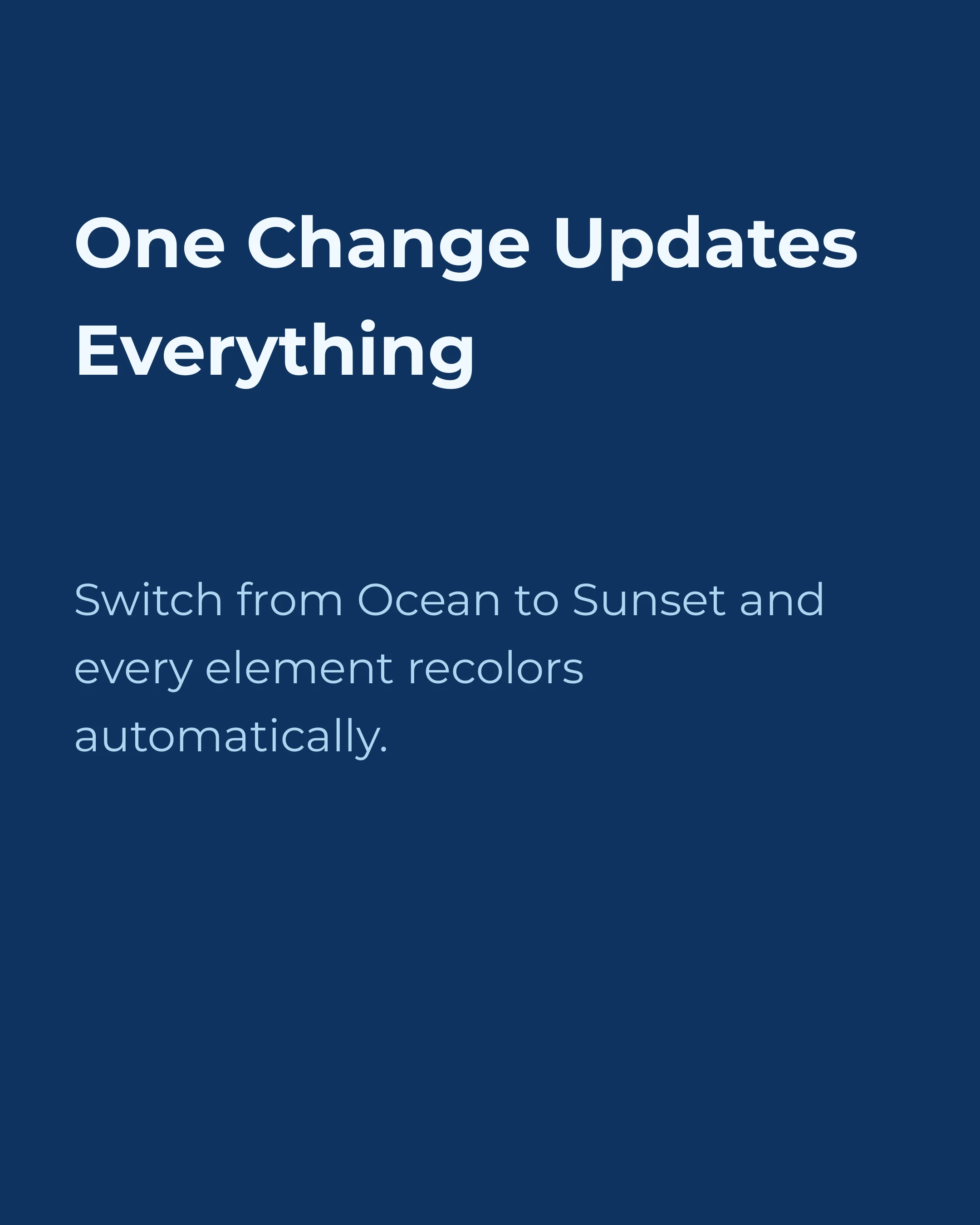
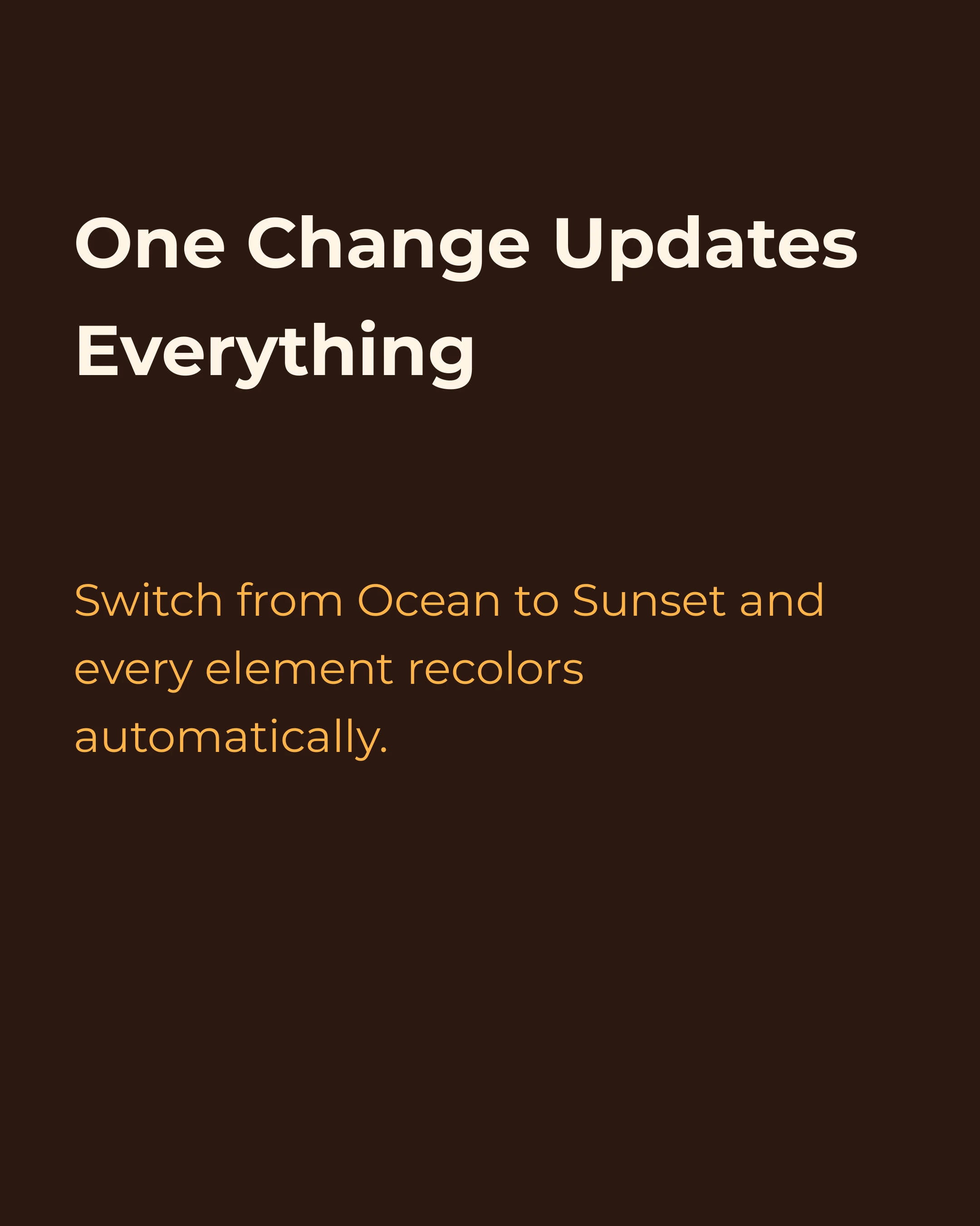
When you change your palette, every element that references a role updates automatically. One change, every slide stays consistent.
Why 5 Roles?
You might wonder why not 3 or 10. Five is the sweet spot for carousel design:
Too few (3 colors): You lack the range to create visual hierarchy. Headlines and body text end up the same color. Cards blend into backgrounds.
Too many (8+ colors): Decision fatigue. Every element becomes a choice between too many options. The palette stops feeling cohesive.
Five gives you:
- Clear hierarchy (primary vs secondary text)
- Visual interest (accent for highlights)
- Structural depth (background vs surface for layering)
- Complete coverage (every element type has a natural home)
Professional designers intuitively work with roughly 5 color stops. A semantic system makes this explicit and teachable.
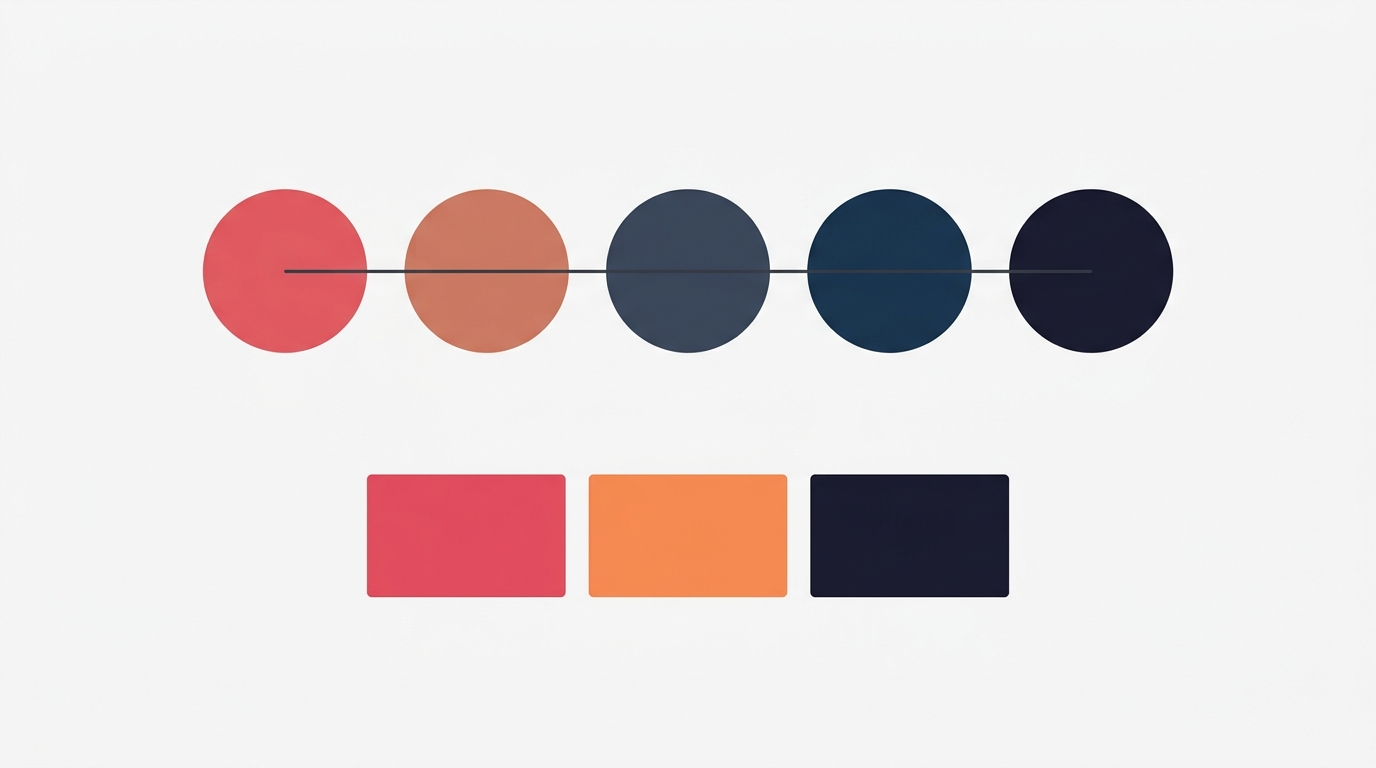
The Power of Role Swapping
Here is where semantic colors become genuinely powerful for carousels: you can swap roles between slides to create contrast without breaking consistency.
In a 7-slide carousel, reading 7 identical-looking slides feels monotonous. But if you manually pick new colors for “contrast” slides, you risk inconsistency. Role swapping solves this elegantly.
How It Works
Take a carousel using the Ocean palette:
- Primary: dark navy (#0F3460)
- Background: light blue-white (#F0F8FF)
On a normal slide, you have dark text on a light background. For a contrast slide, you swap them:
- Background becomes dark navy
- Primary (text) becomes light blue-white
The colors are identical. The palette is unchanged. But the visual impact is completely different — and it creates rhythm in your carousel.
Common Swap Patterns
| Pattern | What Swaps | Effect |
|---|---|---|
| Dark/Light alternation | primary and background | Every other slide inverts. Strong visual rhythm. |
| Accent spotlight | background becomes accent | One slide pops with color. Perfect for the key insight or CTA. |
| Surface emphasis | background becomes surface | Subtle shift. Good for “pause” slides or quotes. |
The best carousel templates use these swaps strategically:
- AIDA carousels: Alternate dark/light on the interest slides, use accent background for the action slide
- Tip lists: Title slide inverted (dark bg), tip slides normal (light bg), CTA slide in accent
- Myth vs Fact: Myths on dark background, facts on light — the visual shift reinforces the content shift
Color Psychology in Carousel Context
The palette you choose communicates before anyone reads a word. Research from a 2026 Meta Advertising study found that full-color ads with high-saturation palettes achieved 47% higher click-through rates compared to monochrome equivalents.
Here is how common palette moods map to content types:
| Palette Mood | Best For | Psychology |
|---|---|---|
| Cool blues and navy | Business tips, thought leadership, LinkedIn | Trust, authority, professionalism |
| Warm corals and amber | Lifestyle, coaching, motivation | Energy, warmth, approachability |
| Forest greens | Wellness, sustainability, finance | Growth, stability, calm |
| Deep purples | Luxury, creativity, personal branding | Premium feel, imagination |
| High contrast B&W | Bold statements, typography-focused | Impact, urgency, modernity |
The key insight: choose a palette that matches your content mood, not just your brand colors. A financial advisor sharing market insights wants navy and slate. The same advisor sharing team culture photos wants warmer tones.
The Practical Problem (And How to Solve It)
Most carousel tools handle color in one of two broken ways:
1. Per-element color picking: You choose a color for every text box, every shape, every background. Across 7 slides with 3-4 elements each, that is 20+ color decisions. Consistency is nearly impossible.
2. Rigid templates: The template locks colors. You get consistency, but you cannot adapt the palette to your brand.
Semantic roles solve both problems. Elements reference roles (“this text is primary”), and you control the palette separately. Change the palette, everything updates. The template provides structure; the palette provides your brand.
This is exactly the approach the Carousel app takes. When you create a carousel, you pick a palette and a template independently. The template defines where each color goes. The palette defines which colors those are. Swap the palette from Ocean to Sunset, and every element recolors instantly — no manual adjustments needed.
Building Your Own Semantic Palette
If you are creating a palette from scratch, here is a reliable process:
Step 1: Start with your primary. This is your brand’s dominant color. It should be the color people associate with you.
Step 2: Choose your background. Light backgrounds (white, off-white, light grey) work for most content. Dark backgrounds work for premium or dramatic content.
Step 3: Derive your secondary. Take your primary and reduce its saturation or shift its brightness. It should be readable but less attention-grabbing than primary.
Step 4: Pick your accent. This should contrast with both primary and background. If your primary is blue, consider coral or amber. If your primary is dark, a bright accent creates visual pop.
Step 5: Define your surface. This is the most overlooked role. It should sit between your background and your other colors — visible as a distinct layer but not competing for attention.
Test it: Apply the palette to a multi-slide carousel. Check that primary text is readable on the background. Check that secondary text is distinct from primary but still legible. Check that accent elements draw the eye without overwhelming. Check that swapping primary and background for a contrast slide still looks good.
AI-Generated Images That Match Your Palette
Semantic color roles become even more powerful when combined with AI image generation. In the Carousel app, when you generate an image for a slide, the AI receives your palette colors as context. The result is an image that naturally harmonizes with your text, background, and accent colors — without any manual color correction.
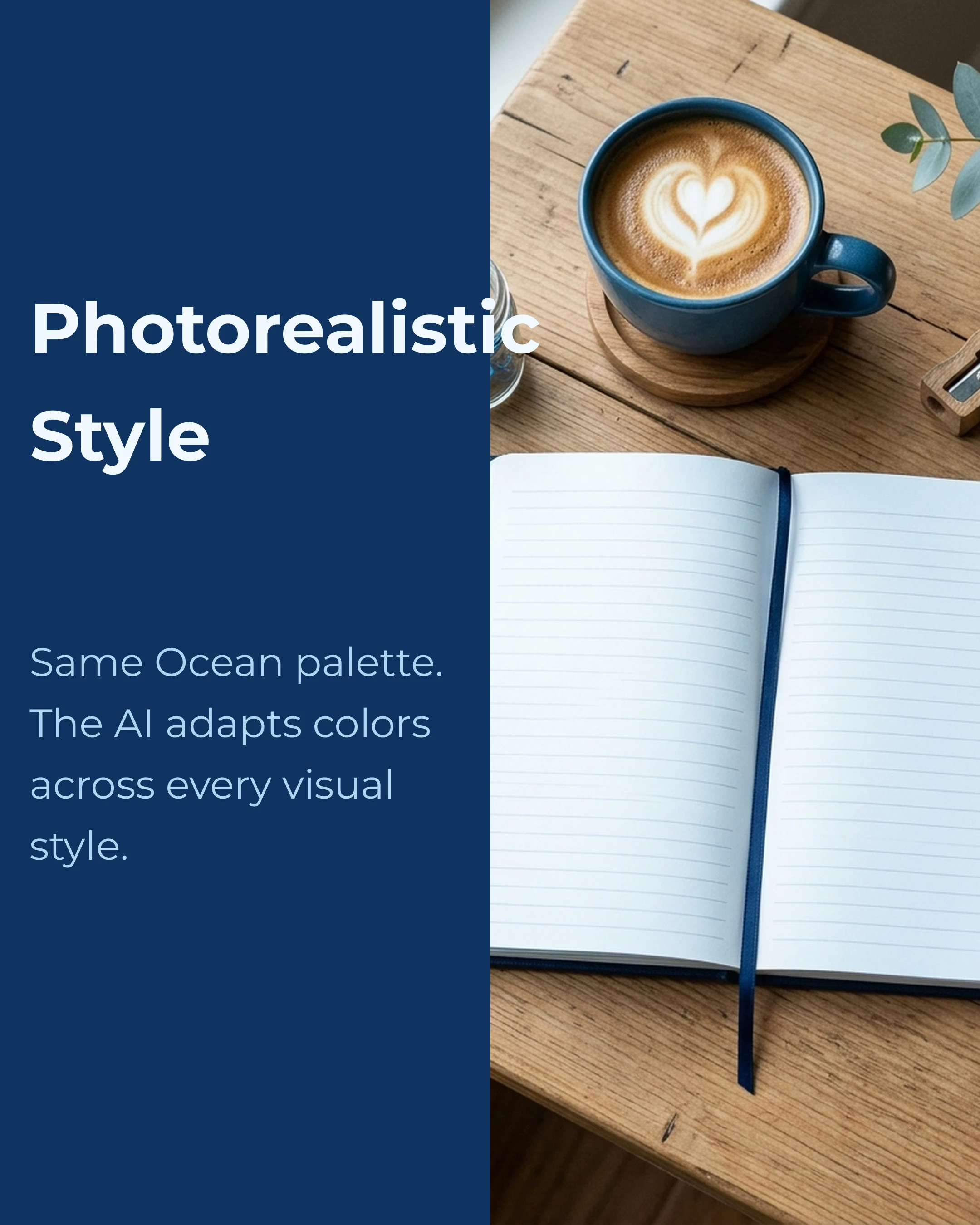
Here is a slide using the split-image template with an AI-generated illustration. The image uses Ocean palette colors — cool blues and navy — matching the text panel perfectly:

The same layout with a photorealistic image — still Ocean palette. The AI adapts the color mood across styles:
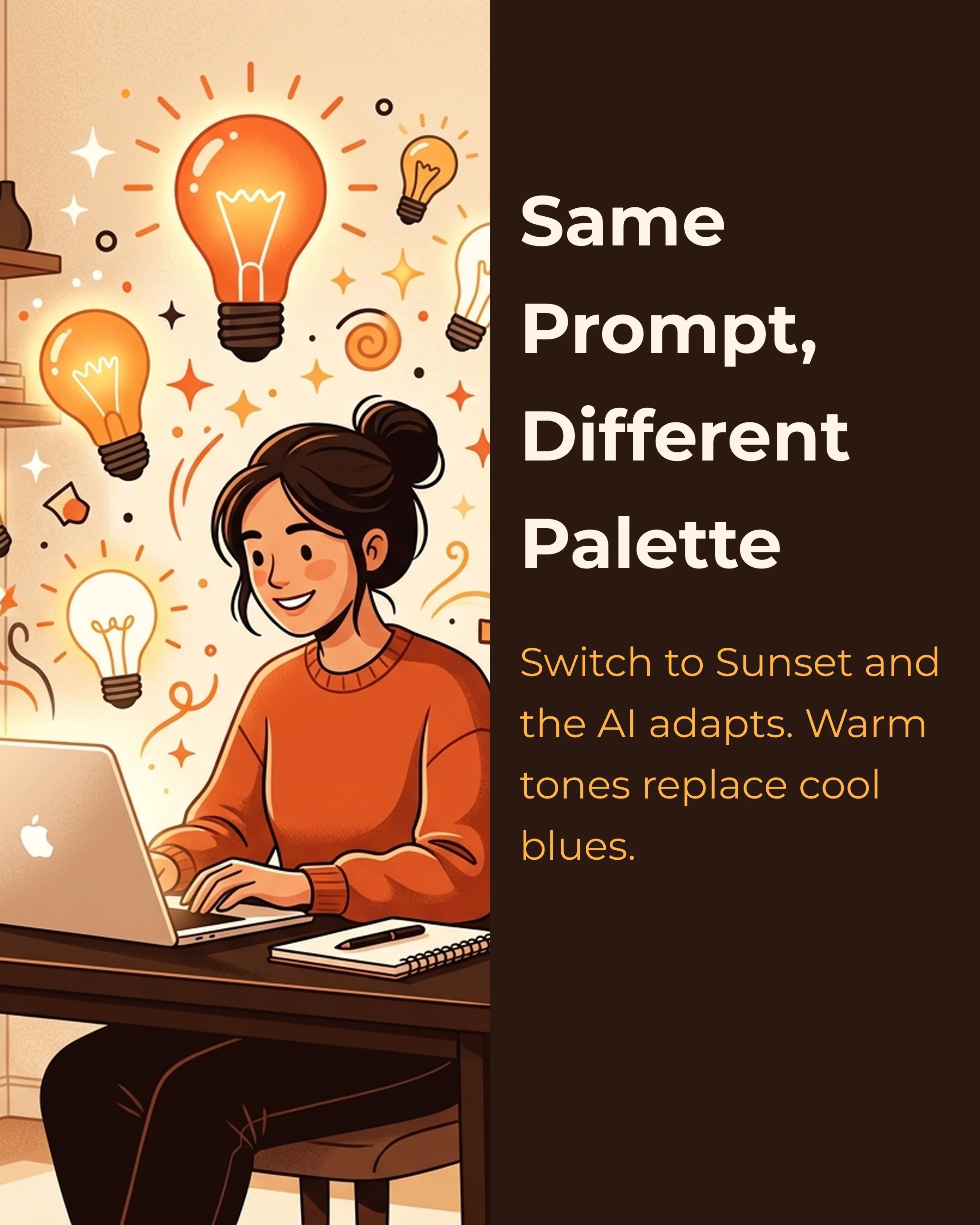
Now switch the palette to Sunset and regenerate. Same prompt, completely different color mood — warm oranges and amber replace cool blues:
This is the full loop: your palette controls text, shapes, backgrounds, and AI images. Every visual element on every slide speaks the same color language. Change the palette once, and everything — including generated images — updates to match.
The app supports six image styles (illustration, cartoon, photorealistic, infographic, minimalist, and flat design), all of which receive your palette context. You choose the style that fits your content; the colors stay consistent automatically.
Key Takeaways
- Define 5 semantic color roles (primary, secondary, accent, background, surface) for every carousel project
- Elements reference roles, not hex values — change the palette, everything updates
- Use role swapping between slides to create visual rhythm without breaking consistency
- Choose palette mood to match content type, not just brand guidelines
- Consistent color use increases brand recognition by up to 80%
- Five roles is the sweet spot: enough for hierarchy, few enough for cohesion
The Carousel app has 10 curated semantic palettes built in (including Ocean, Sunset, Forest, Coral, and Midnight) with one-tap application and automatic role swapping in templates. Download free on the App Store.
Create your first carousel in 60 seconds — free
Pick a template, paste your text, export. It's that simple. No design skills needed.
Download Carousel