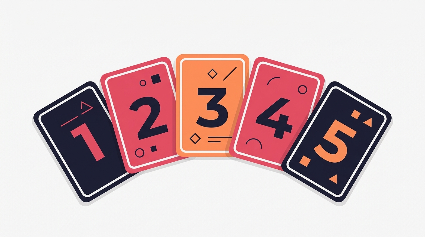
Listicle Carousels: Why the Numbered Tips Format Still Dominates
Listicle Carousels: Why the Numbered Tips Format Still Dominates
Open any high-performing Instagram account in 2026 and you will find the same format appearing over and over again: the numbered listicle carousel. “5 Tips for Better Morning Routines.” “7 Tools Every Designer Needs.” “3 Mistakes Killing Your Engagement.”
The format feels almost too simple. Number your slides, drop in a tip per card, and post. Yet listicle carousels consistently outperform open-ended educational content, long-form storytelling, and aesthetic photo dumps in both saves and shares.
The reason is psychological. Listicles set a contract with the reader before they even start swiping. They promise a specific, finite amount of value and they deliver it in a predictable rhythm.
Why Listicles Work on Every Platform
The numbered tips format is not an Instagram trend. It dominates LinkedIn, TikTok carousels, Pinterest idea pins, and even email subject lines. The format works because it aligns with how people consume content under time pressure.
Scannable structure. A number on each slide tells the reader exactly where they are in the sequence and how much is left. This reduces the cognitive load that causes people to abandon a post mid-swipe.
Implied completeness. When a post says “5 Tips,” the reader assumes you have curated the best five. It signals expertise and editorial judgment. An unstructured carousel saying “Here are some thoughts on productivity” carries none of that weight.
Save-worthy by default. Listicles feel like reference material. People save them not just because the content is good but because the format makes it easy to return to later. A numbered list is essentially a cheat sheet.
How to Structure a Listicle Carousel
Not all listicles are created equal. A lazy list of generic tips will flop regardless of format. Here is the structure that consistently performs.
The Hook Slide
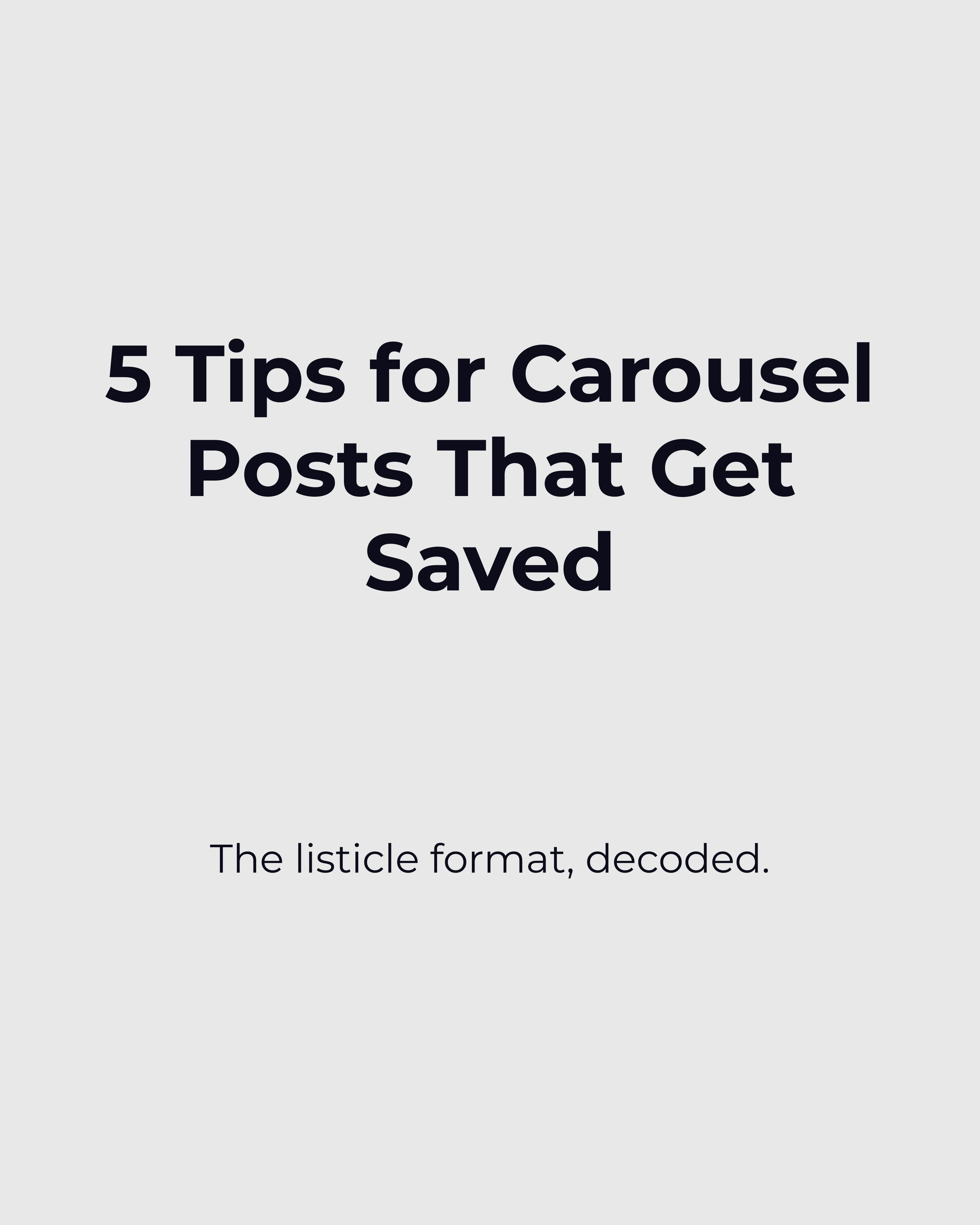
Your first slide needs to establish the number, the topic, and the audience in one glance. “5 Tips to Grow on Instagram” is too broad. “5 Reels Editing Tricks That Tripled My Views” is specific enough to stop the scroll.
The carousel hooks guide covers this in depth — and our Instagram carousel guide breaks down general best practices — but for listicles specifically, the number itself is part of the hook. Odd numbers (3, 5, 7) tend to outperform even numbers because they feel less manufactured.
One Tip Per Slide
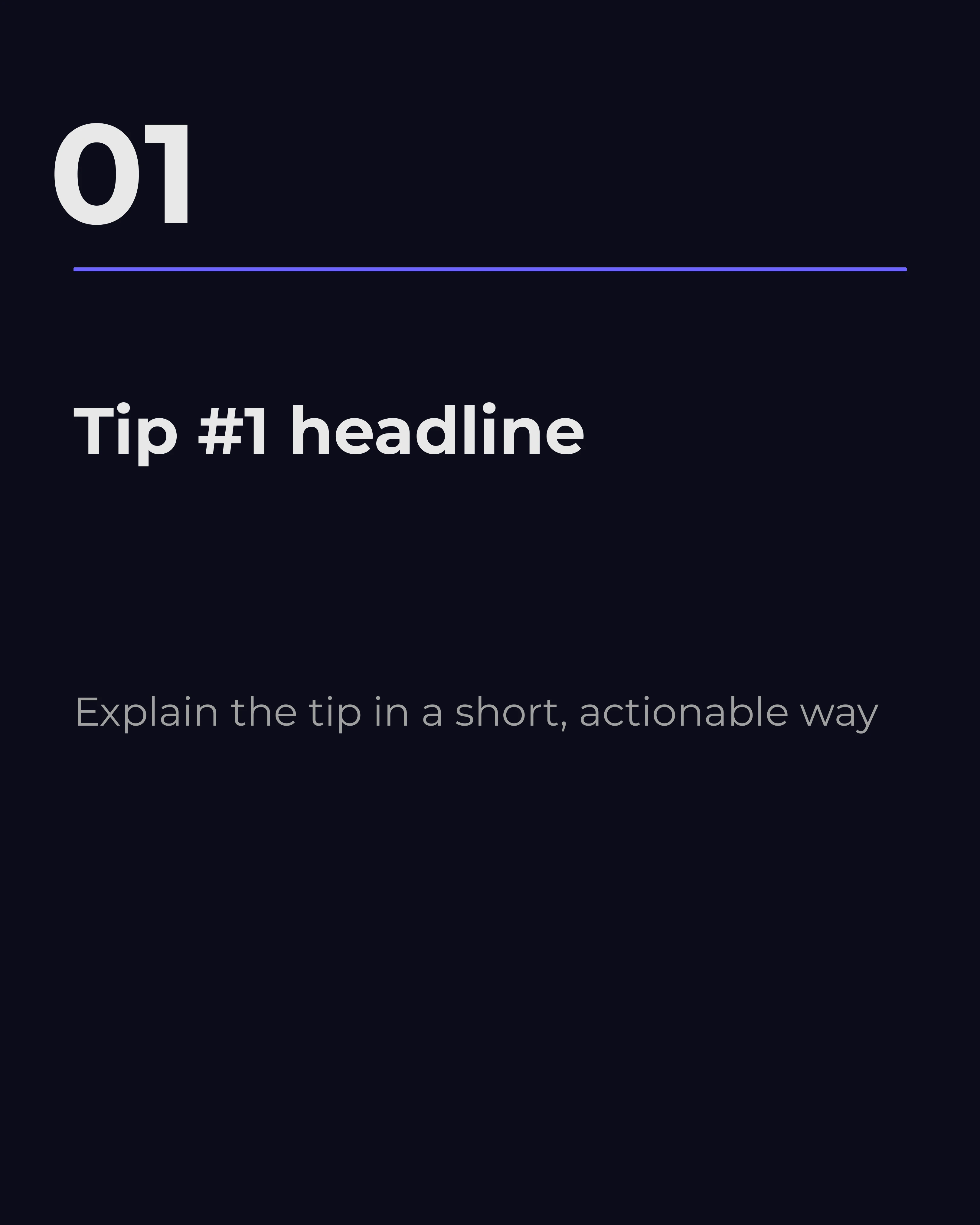
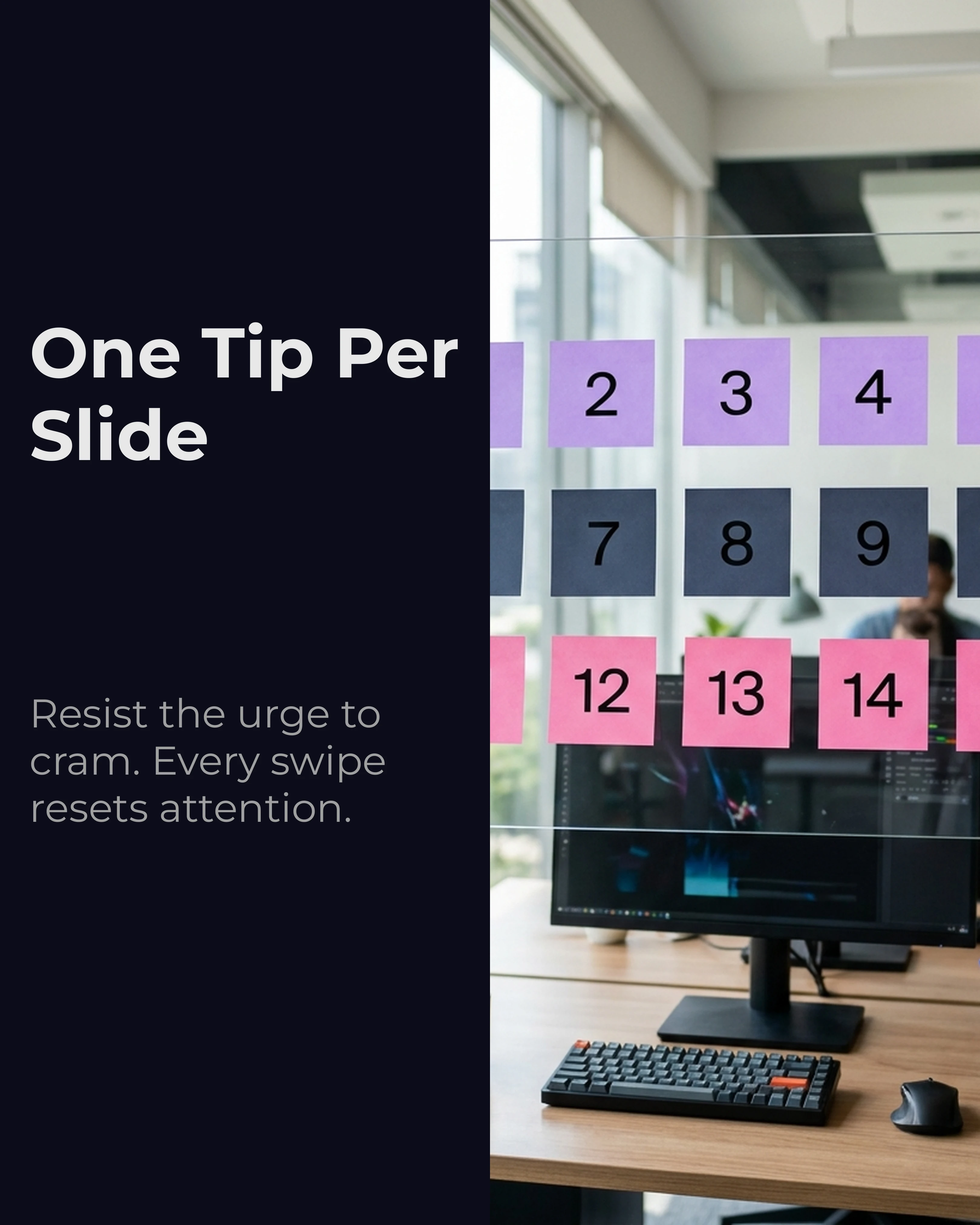
Each slide should deliver exactly one actionable point. Resist the temptation to cram two tips into a single card. The swipe mechanic is what keeps people engaged, and every slide transition resets their attention.
Headline: Keep it to five words or fewer. “Batch Your Content Weekly” is better than “One of the Best Things You Can Do Is Batch Your Content on a Weekly Basis.”
Body: Limit supporting text to 15-18 words. Just enough to explain why the tip matters or how to implement it.
The Summary or CTA Slide
Your final slide should either recap all the tips in a condensed list or deliver a clear call to action. The recap approach works well for save-baiting because it gives readers a single screenshot-worthy slide. The CTA approach works better for conversion-focused content.
Choosing the Right Number
The number you pick affects both performance and effort. Here is a rough guide:
- 3 tips: Best for quick, punchy content. Low commitment for the reader, easy to produce. Works well for Reels-style carousels.
- 5 tips: The sweet spot. Long enough to feel substantial, short enough to hold attention. This is the most common format for a reason.
- 7 tips: Best for in-depth educational content. You need genuinely strong material for all seven or the quality drop-off will be obvious.
- 10 tips: Risky. Most people will not swipe through ten slides. Only use this if every single tip is a standalone insight worth saving.
The Psychology of Numbered Lists
Understanding why numbers work helps you use them more effectively.
Processing fluency. Numbered items are easier for the brain to process than unstructured prose. When information is easy to process, people rate it as more trustworthy and more valuable. This is not a conscious decision — it is a cognitive shortcut.
The Zeigarnik effect. People remember uncompleted tasks better than completed ones. When your hook says “5 Tips,” the reader’s brain opens a mental loop that wants to close at tip five. Each swipe moves them toward completion, which is deeply satisfying.
Anchoring. The number in your hook sets an expectation. “3 Tips” signals a quick read. “7 Tips” signals depth. Choose your number based on the level of commitment you are asking from your audience.
Mapping Listicles to Frameworks
The listicle format is a container. What goes inside it determines the impact. The best listicle carousels pair the numbered structure with a proven copywriting framework.
AIDA listicles. Your hook slide grabs attention, the first two tips build interest, the middle tips create desire, and the final tip or CTA drives action. The AIDA framework guide explains each stage in detail.
PAS listicles. Frame each tip as a problem-solution pair. “Mistake 1: Posting Without a Hook” (problem) followed by “Fix: Open with a bold claim or question” (solution). This works exceptionally well for “mistakes” listicles.
Storytelling listicles. Number your tips chronologically. “Step 1: Research Your Niche. Step 2: Pick a Content Pillar.” This turns a listicle into a mini-tutorial with narrative flow.
Template Choices for Listicles
The visual design of a listicle carousel matters as much as the copy. You want a template that puts the number front and center.
Tips-clean template. Ideal for text-heavy listicles where the value is in the advice itself. The clean layout gives each tip room to breathe without competing with imagery.
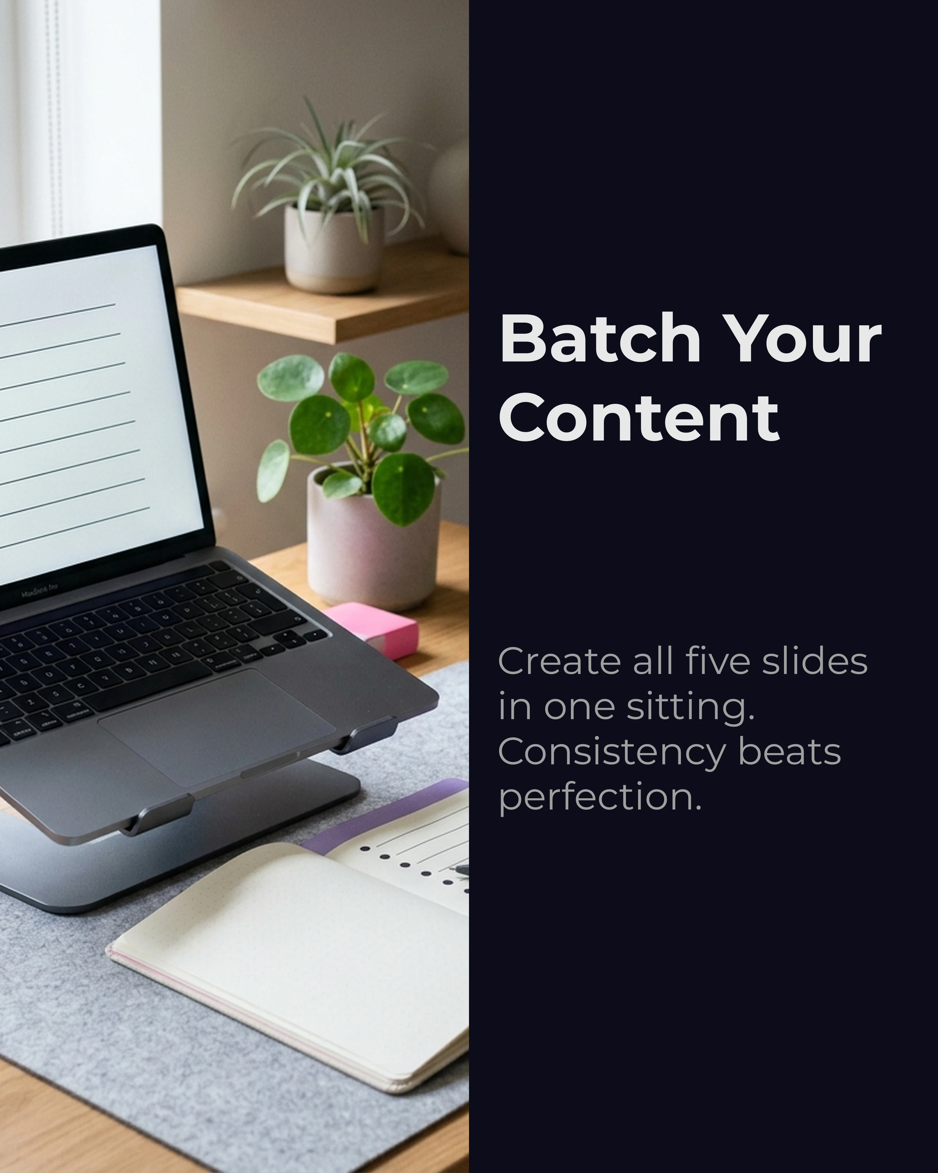
Split-image template. Best when you have relevant visuals to pair with each tip. The image occupies one half of the slide, and the numbered tip fills the other. This works well for product-focused or how-to content.
Infographic style. For data-driven listicles, an infographic approach with icons, stats, and minimal text can make complex information digestible. Keep color palettes tight — two or three colors maximum.
Platform-Specific Listicle Considerations
The listicle format translates across platforms, but the execution should adapt.
Instagram. Square or 4:5 aspect ratio. Keep text large enough to read on mobile. Use the first slide as a visual hook — Instagram shows the first slide in the feed, so it needs to work as a standalone thumbnail.
LinkedIn. Document carousels (PDF uploads) dominate the feed. Listicles in this format perform exceptionally well because LinkedIn’s audience skews toward educational content. Keep the tone professional but not stiff.
TikTok photo mode. Shorter listicles (3-5 tips) work best because TikTok users swipe faster. Use bold, high-contrast visuals and minimal text per slide.
Pinterest idea pins. Listicles are essentially native to Pinterest’s format. Optimize for vertical aspect ratios and include keyword-rich descriptions on each slide for search discovery.
Common Listicle Mistakes
Weak tips buried in the middle. If you have five tips and only three are strong, post three. Padding a listicle with filler destroys credibility.
Inconsistent formatting. If slide two has a headline and body text, every slide should follow that pattern. Inconsistency breaks the reading rhythm.
No visual hierarchy. The number and headline should be the first things the eye lands on. If the supporting text competes for attention, your font sizes or layout need adjusting.
Creating Listicle Carousels Faster
Building a well-structured listicle carousel from scratch takes time — writing five or seven distinct tips, formatting each slide, and maintaining visual consistency across the deck.
Carousel speeds this up significantly. Drop in your topic or rough notes, select the listicle framework, and the app structures your tips into a clean, numbered slide deck. You can choose templates like tips-clean or split-image, adjust the palette, and export — all without opening a design tool.
Key Takeaways
- Listicle carousels outperform unstructured content because they set a clear contract with the reader
- Use odd numbers (3, 5, 7) and keep one tip per slide with headlines under five words
- Pair the listicle format with copywriting frameworks like AIDA or PAS for stronger impact
- Choose templates that put numbers and headlines front and center
- Every tip must earn its place — cut filler ruthlessly
Ready to build your next listicle carousel? Download Carousel — free on the App Store.