Interior Designer Carousel Posts: Showcase Transformations That Book Projects
Interior Designer Carousel Posts: Showcase Transformations That Book Projects
Interior design is one of the most visual professions on the planet, which should make social media easy. But most designers post a single hero shot of a finished room and wonder why the inquiries do not follow. A gorgeous photo proves you have taste. It does not prove you can solve a client’s problem, manage a project, or transform their space within their budget.
Carousels close that gap. They let you tell the story behind the photo: the constraint, the decision, the before, the after. That narrative is what turns an admirer into a paying client, and it is exactly what a single image cannot do.
This guide covers why carousels suit designers, seven post ideas with example slides, and the palette and styling choices that keep your feed looking like a portfolio rather than a mood board dump.
Why Carousels Work for Interior Designers
The most powerful word in design marketing is “before.” A finished room is beautiful but abstract. The same room shown against the dated, awkward space it replaced is proof, and proof is what books projects.
Carousels are built for that reveal. Slide one sets up the problem, the swipe delivers the payoff, and the slides in between show your thinking. The format also rewards saves, and design content is saved constantly by people gathering ideas for their own renovations. Every save is a future client filing you away for when their budget is ready.
The Before-After-Bridge framework maps almost perfectly onto design work, and the storytelling framework helps you turn a project into a narrative people actually finish reading.
Seven Carousel Ideas for Interior Designers
1. The Room Reveal
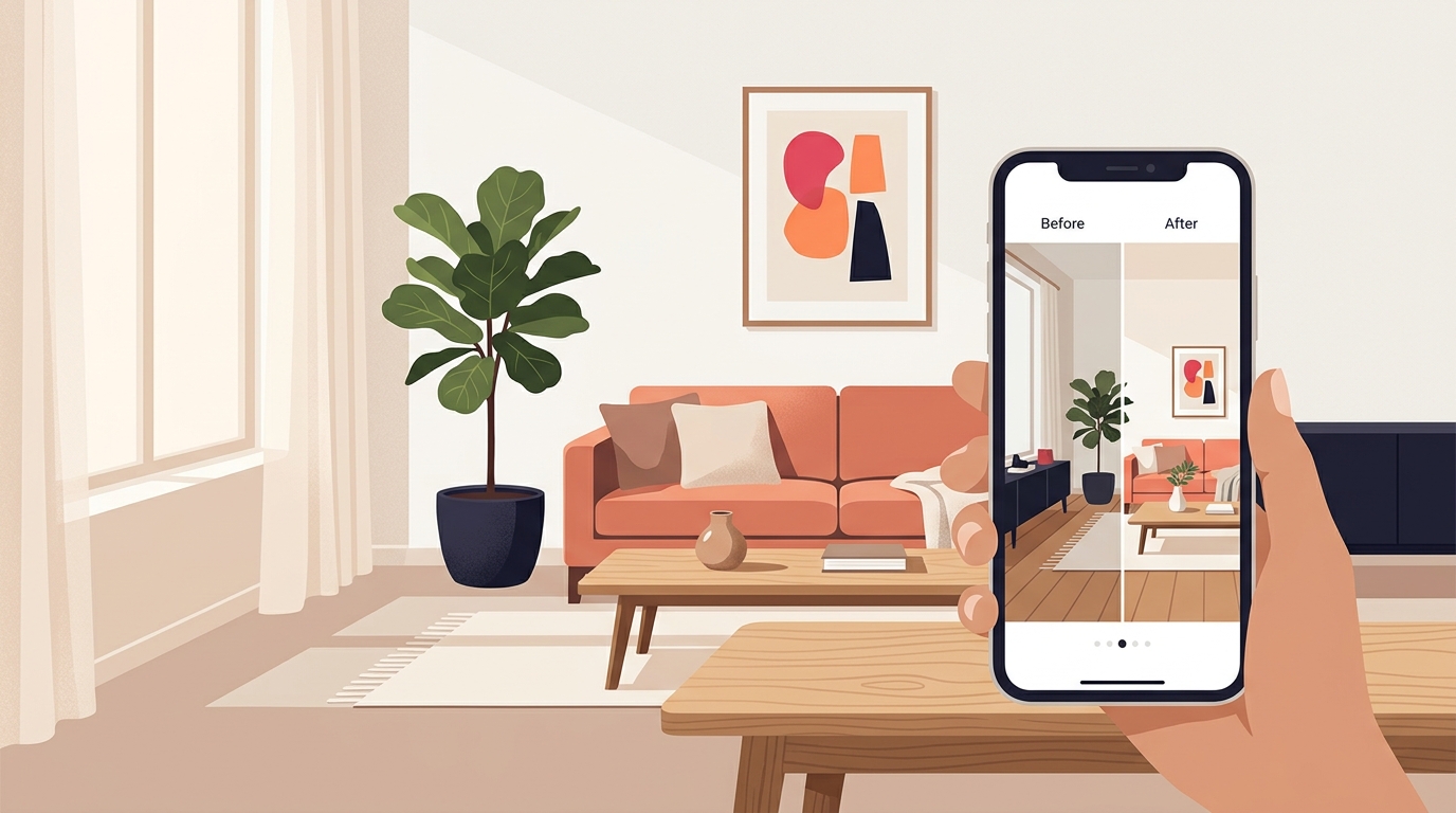
The classic, and still the best. Open on the “before,” build through the process, land on the “after.” Use Before-After-Bridge: the dated room, the transformation, the result the client now lives in. Write the hook as a homeowner would feel it, not as a designer’s caption.
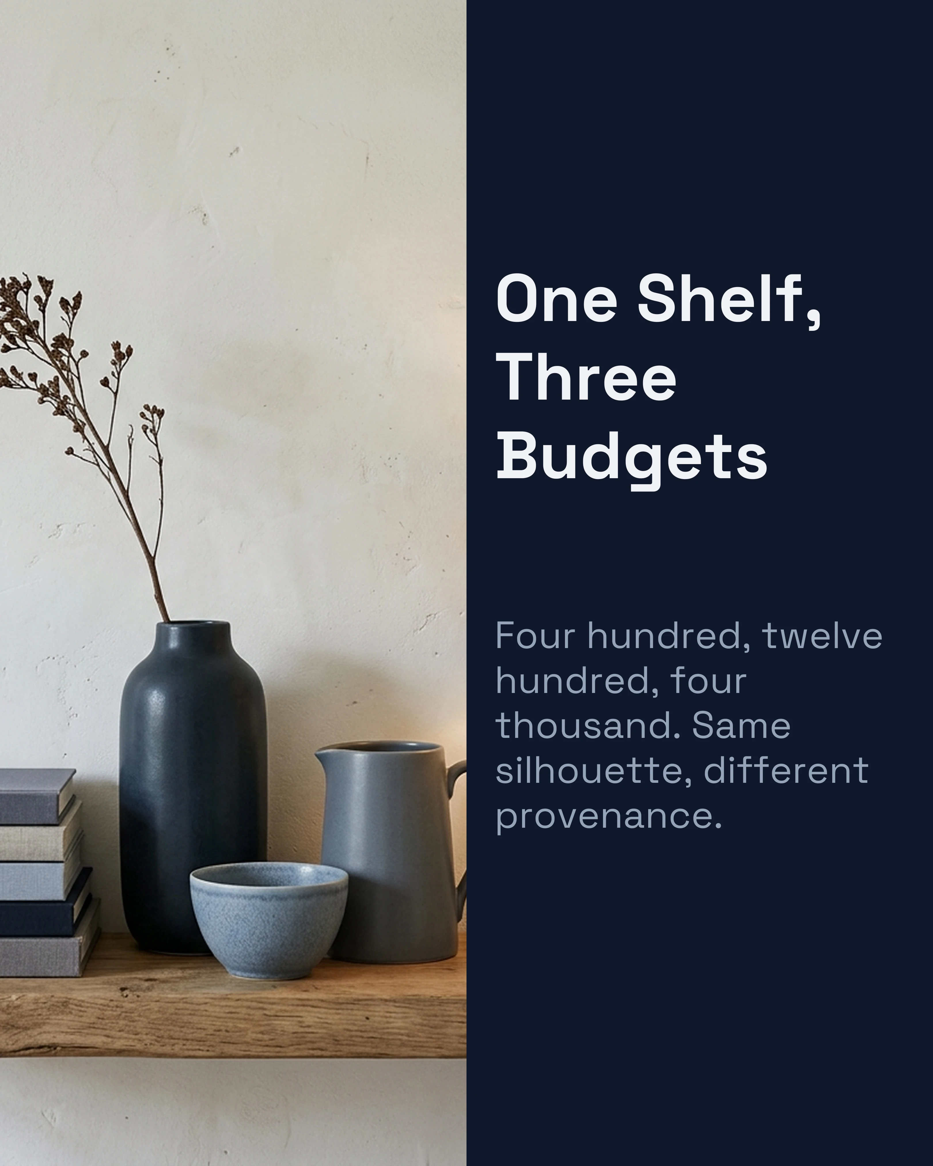
2. The One-Room, Three-Budgets Breakdown
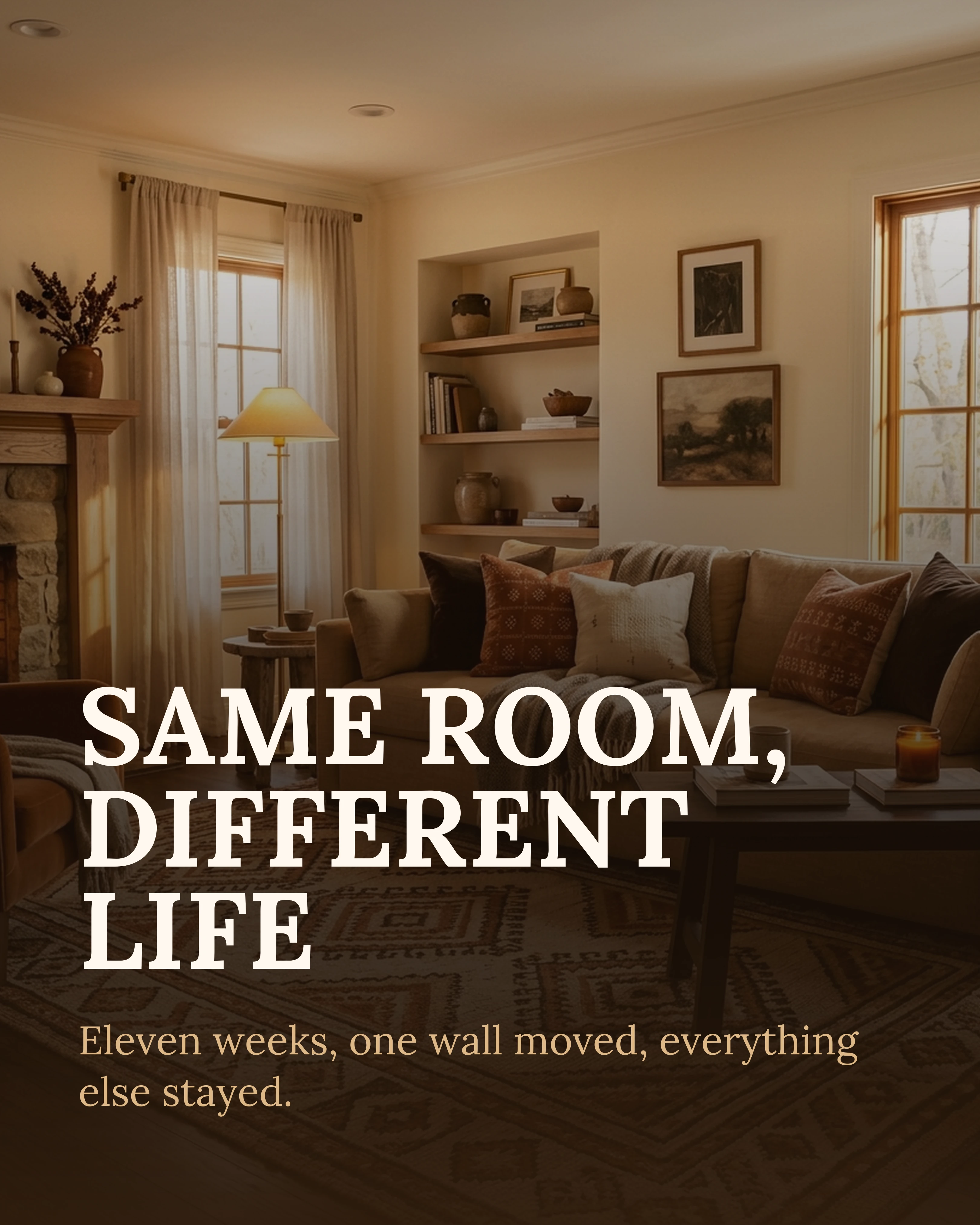
Show the same room styled at three price points. This is endlessly saveable because it answers the question every prospect has: what can I get for my money? It also pre-qualifies clients by setting honest expectations.
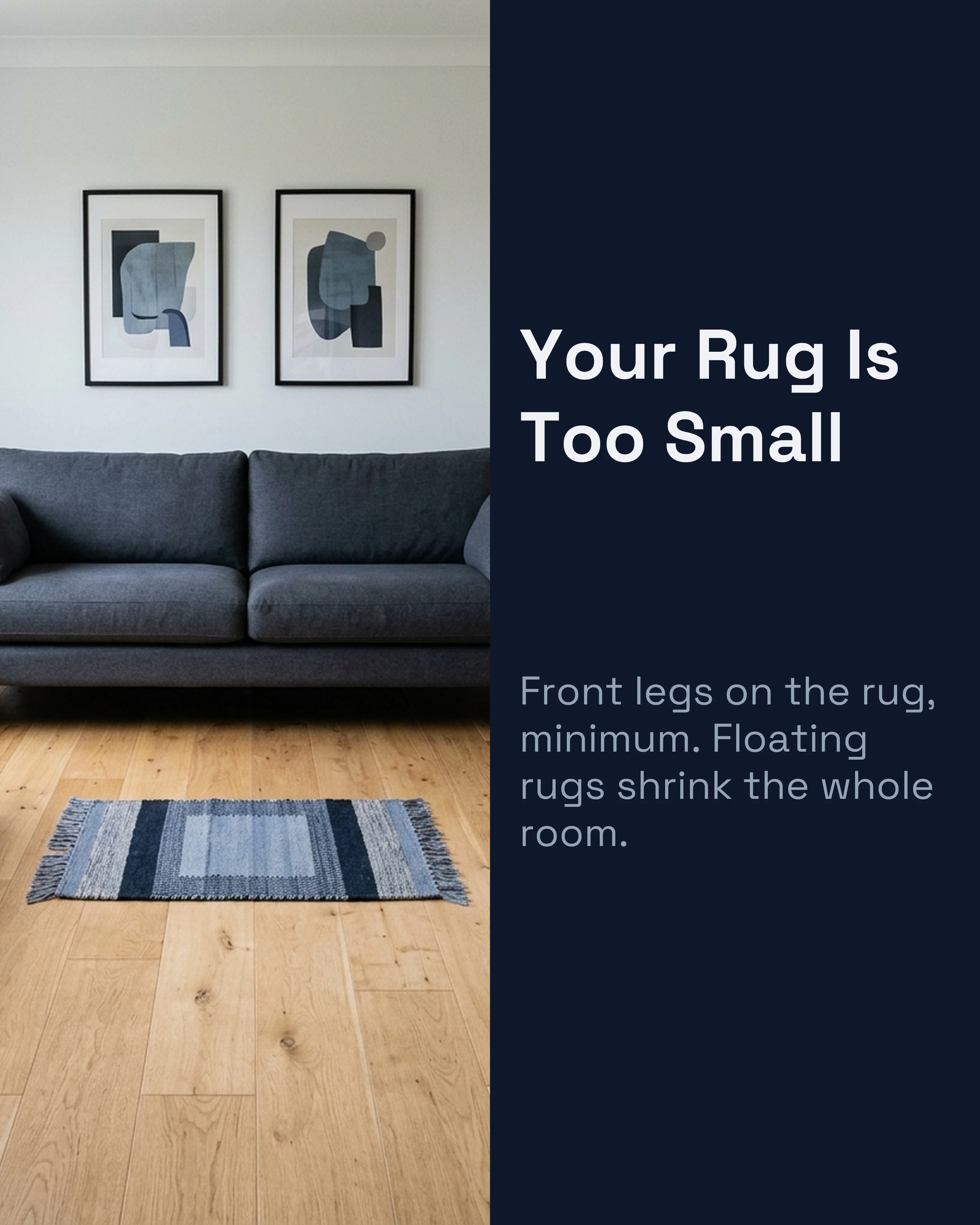
3. The Design Mistake
Call out a common decorating error and the fix. “The reason your living room feels cramped, and the rug rule that fixes it.” This positions you as the expert and gives immediate, usable value, which builds trust faster than any portfolio shot.
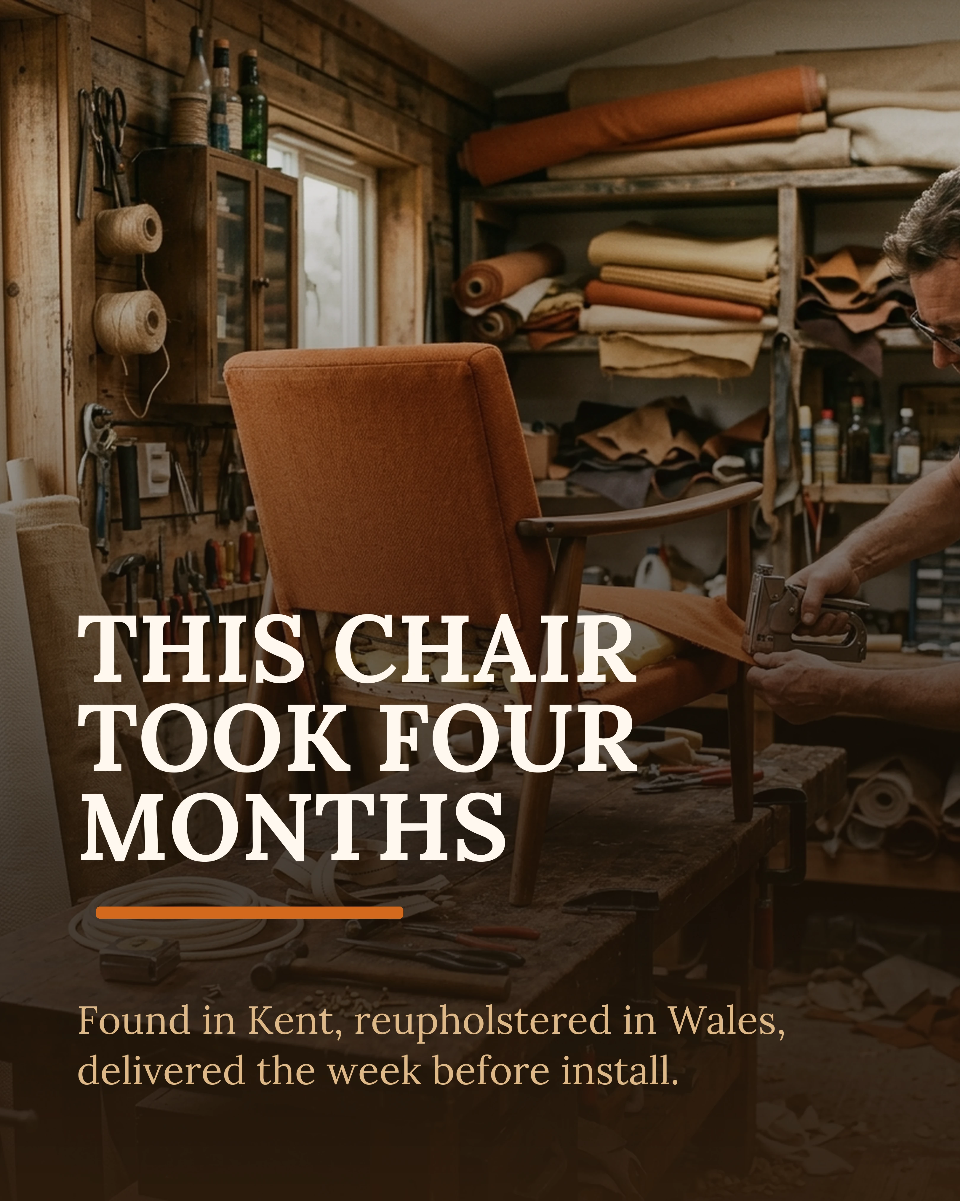
4. The Sourcing Story
Walk through where one standout piece came from and why you chose it. “How I found the perfect statement light for a north-facing kitchen.” Process content shows your eye and your access, both of which clients pay for.
5. The Trend Verdict
Take a position on a design trend. “Is the all-beige look already over?” A confident point of view earns comments and shares, and it shows prospects you have a perspective rather than just executing whatever is popular. This works well as a This or That comparison.
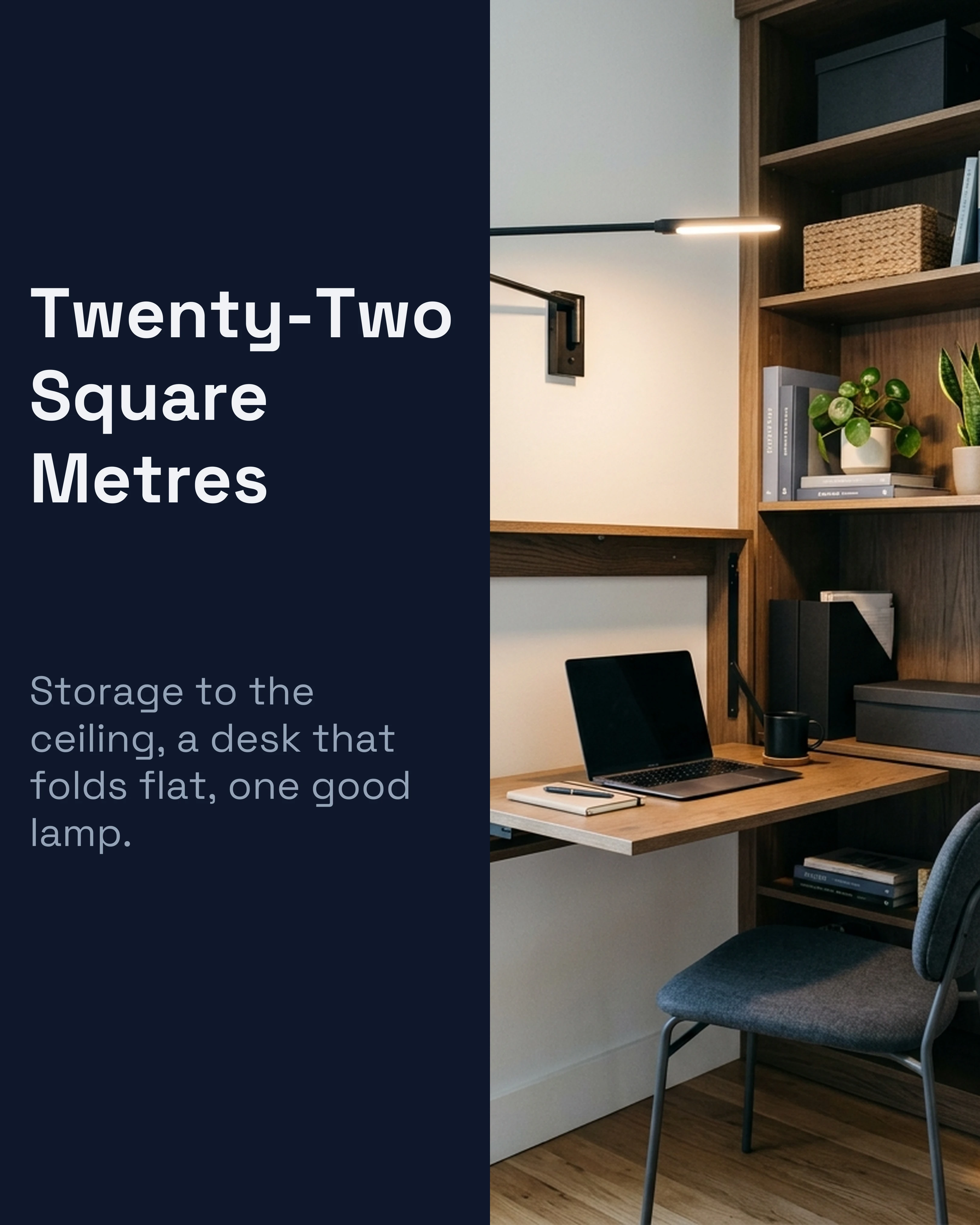
6. The Small-Space Solution
Solve a specific, relatable problem. “Five ways to make a tiny entryway actually work.” Small-space content reaches far beyond your local market because the problem is universal, and broad reach feeds local discovery.
7. The Client Journey
Document a full project from first call to final styling. This is your most powerful conversion content because it shows prospects exactly what working with you feels like, removing the uncertainty that stops people from inquiring.

Palette and Styling for Design Content
Your feed should look like the work. Let your photography carry the color and keep your text overlays restrained: warm neutrals such as the Warm and Coral palettes suit hospitality-style, lived-in interiors, while Slate and Sage read as elevated and architectural.
Resist the urge to over-design the slides. When the photography is the star, the typography should step back. A refined serif like Playfair Display or Lora on the headline with generous spacing reads as editorial; busy fonts and loud colors fight the room. The color palette guide covers schemes that complement rather than compete with photography.
Above all, keep aspect ratios consistent and let the rooms breathe. White space is a design choice, and your audience will read it as confidence.
How Carousel Helps Interior Designers Publish Faster
Designers are busy on site, not behind a screen, which is why posting falls apart between projects. Carousel lets you drop in your project photos, pick a framework like Before-After-Bridge, and build a polished reveal in minutes, with templates that put your photography front and center. Save a brand kit once and every project post matches, so your feed reads like a cohesive portfolio instead of a camera roll.
Key Takeaways
- “Before” is the most powerful word in design marketing; carousels are built to deliver the reveal.
- Lead with room reveals, budget breakdowns, and common-mistake fixes.
- Use Before-After-Bridge for transformations and let your photography carry the color.
- Keep typography restrained and aspect ratios consistent so the feed reads as a portfolio.
- Client-journey carousels are your strongest conversion content because they remove uncertainty.