Instagram Carousel Size and Dimensions: The 2026 Specs Guide
Instagram Carousel Size and Dimensions: The 2026 Specs Guide
Nothing undermines a good carousel faster than the wrong dimensions. You spend an hour on the copy, the design looks sharp in your editor, and then Instagram crops off the headline or compresses the whole thing into a blurry mess. The fix is almost always a sizing decision you made before you started.
This guide covers the exact sizes, aspect ratios, and resolution Instagram uses in 2026, plus the safe-zone rules that keep your text from getting cut off. Get these right once and you can stop thinking about them.
The Short Answer: Use 1080 x 1350
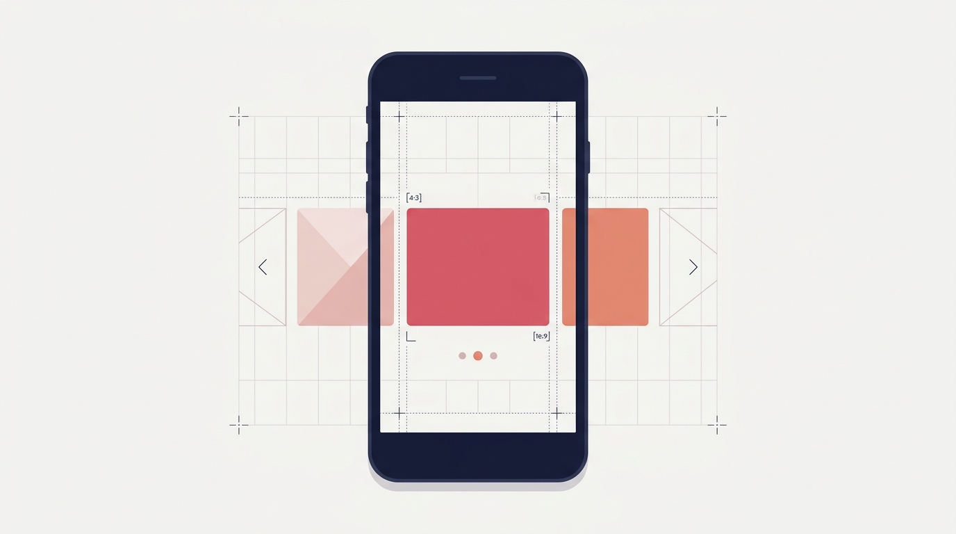
If you remember one thing, remember this. For carousels in 2026, design at 1080 x 1350 pixels, which is a 4:5 portrait aspect ratio.
Portrait posts take up more vertical space in the feed than square ones, which means more screen real estate, more attention, and more reason for someone to stop scrolling. Instagram has favored taller content for years, and 4:5 is the tallest ratio the feed supports without cropping.
The old square standard of 1080 x 1080 still works, but it leaves engagement on the table. Unless you have a specific reason to go square, default to 4:5.
Full Carousel Specs for 2026
Here are the dimensions that matter, in one place.
| Spec | Recommended | Notes |
|---|---|---|
| Aspect ratio | 4:5 (portrait) | Maximum feed real estate |
| Pixel size | 1080 x 1350 | The reliable default |
| Square alternative | 1080 x 1080 | Works, but smaller in feed |
| File format | JPG or PNG | PNG for text-heavy slides |
| Max slides | 20 | Just because you can does not mean you should |
| Color space | sRGB | Avoid color shifts on upload |
A note on slide count: Instagram allows up to 20 slides, but the sweet spot for engagement is far lower. For a deeper look at the tradeoff, see the guide on how many slides a carousel should have.
Aspect Ratio: Why 4:5 Beats Square
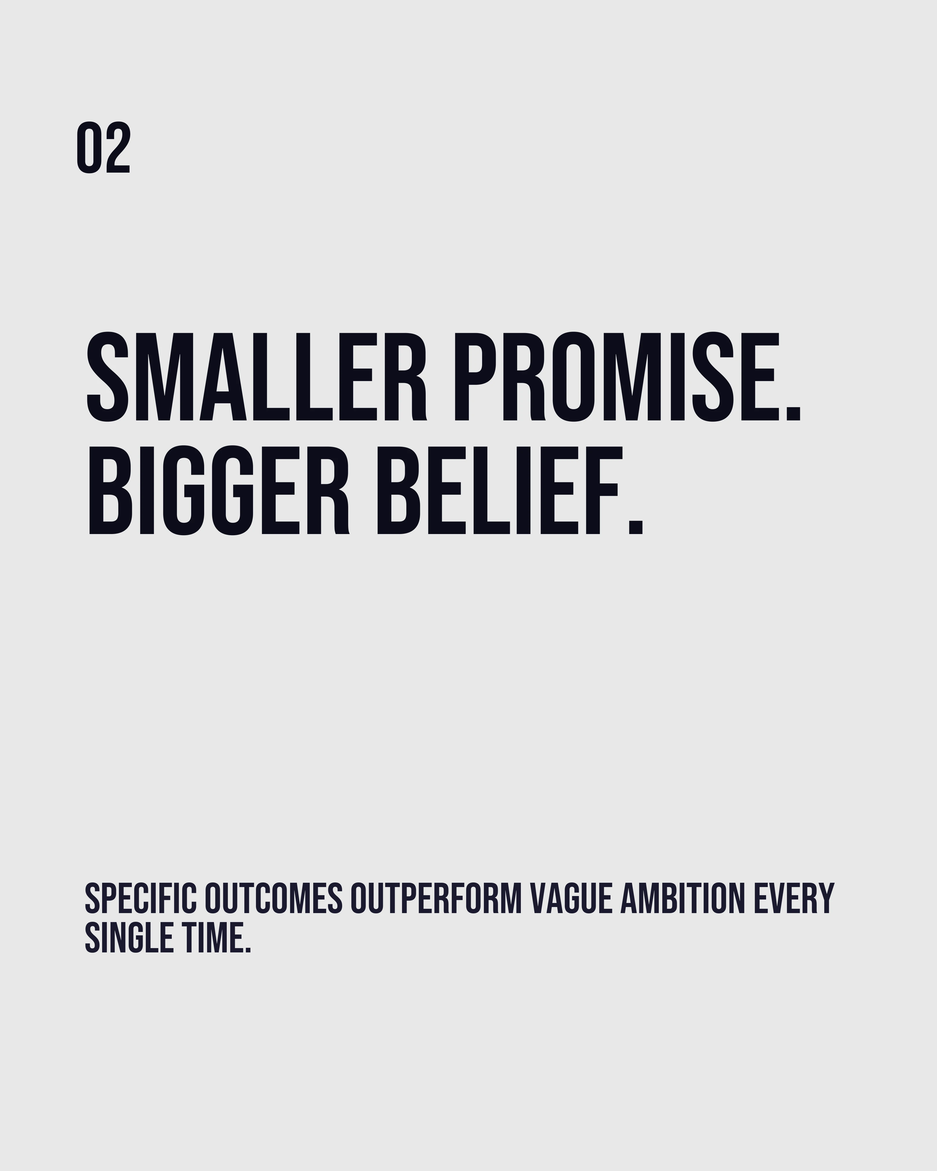
Aspect ratio is the relationship between width and height. A 4:5 ratio means for every 4 units wide, the image is 5 units tall, giving you that upright rectangle.
The reason it matters is simple: feed space equals attention. A portrait slide pushes competing content further down the screen, so for the moment someone is looking at your post, they are looking at only your post. Square slides leave a strip of the next post visible, which is a small but constant invitation to keep scrolling.
One caution: keep every slide in a carousel the same aspect ratio. Mixing 4:5 and 1:1 slides in one post causes Instagram to crop inconsistently, and the swipe feels jarring.
Resolution and File Size
Design at 1080 pixels wide at minimum. Going higher, such as 1350 x 1688, gives Instagram more data to work with and survives compression better, especially on slides with fine text.
Export as JPG for photo-heavy slides and PNG for text-heavy ones. PNG preserves crisp edges on letters and shapes, which is what you want when your slide is mostly typography. Keep files under Instagram’s limits and stick to the sRGB color space so your carefully chosen palette does not shift on upload.
If your colors look different after posting, sRGB is almost always the culprit. The color palette guide covers how to keep your scheme consistent from design to feed.
Safe Zones: Where Not to Put Important Content
This is the rule that saves the most carousels. Instagram overlays interface elements on parts of your slide, and on the first slide especially, the bottom is busy with the caption, username, and action buttons.

Keep these margins clear:
- Top: Leave about 80 pixels. On some phones the username and location overlay the top edge of the post.
- Bottom: Leave about 120 pixels for the slide dots and, when people are tagged, the tag icon.
- Sides: Keep at least 60 pixels of padding so nothing touches the frame, and remember the profile grid shows a 3:4 crop that trims a sliver off each side of a 4:5 post.
In the feed, the caption and the like, comment and share buttons sit below a carousel, not on top of it. The much bigger 250-pixel margins you’ll see quoted are for Stories and Reels, where the interface does cover the image.
When in doubt, center your key message vertically. A headline parked dead center is never at risk of being cropped or hidden behind an icon.
How Carousel Handles Sizing for You
The fastest way to stop thinking about most of this is to start from the right canvas. Carousel builds every slide at the correct 4:5 dimensions (or 9:16 and 1:1 if you choose them when you start a project), with templates that keep text toward the centre, then exports clean, properly sized files. You design the message; a quick check against the safe zones above makes sure it lands on-screen, uncropped.
For platform-specific tips beyond sizing, the Instagram carousel guide covers hooks, slide order, and CTAs.
Key Takeaways
- Default to 4:5 portrait at 1080 x 1350 pixels for maximum feed real estate.
- Keep every slide in a carousel the same aspect ratio to avoid inconsistent cropping.
- Export as PNG for text-heavy slides, JPG for photos, always in sRGB.
- Leave about 80 pixels at the top, 120 at the bottom and 60 at the sides; save the 250-pixel margins for Stories and Reels.
- Up to 20 slides are allowed, but fewer almost always performs better.
Create your first carousel in 60 seconds — free
Pick a template, paste your text, export. It's that simple. No design skills needed.
Download Carousel