
How to Create Instagram Carousels That Get Saves (2026 Guide)
Instagram carousels consistently outperform every other format on the platform. According to recent data, carousel posts achieve an average engagement rate of 0.55% — significantly higher than single images (0.41%) or even Reels in many niches.
But not all carousels are created equal. The difference between a carousel that gets scrolled past and one that gets saved, shared, and bookmarked comes down to a handful of decisions you make before you even open your design tool.
This guide breaks down exactly what makes a high-performing Instagram carousel in 2026, with practical tips you can apply to your very next post.
Why Carousels Outperform Other Formats
Before diving into tactics, it’s worth understanding why carousels work so well.
The algorithm rewards time spent. When someone swipes through your carousel, they spend more time on your post. Instagram interprets this as a signal that your content is valuable and shows it to more people.
Double exposure in the feed. If someone scrolls past your carousel without engaging, Instagram often re-surfaces it later showing a different slide. This gives you a second (or third) chance to grab attention — something a single image never gets.
Carousels invite interaction. Swiping is a micro-commitment. Once someone starts swiping, they’re invested. That psychological momentum makes them far more likely to like, save, or comment.
The data backs this up. Socialinsider’s 2025 benchmark study found that carousels with 8–10 slides generate the highest engagement, while posts with fewer than 4 slides performed barely better than single images.
Anatomy of a High-Performing Carousel
Every great carousel follows a predictable structure. Here’s the framework:
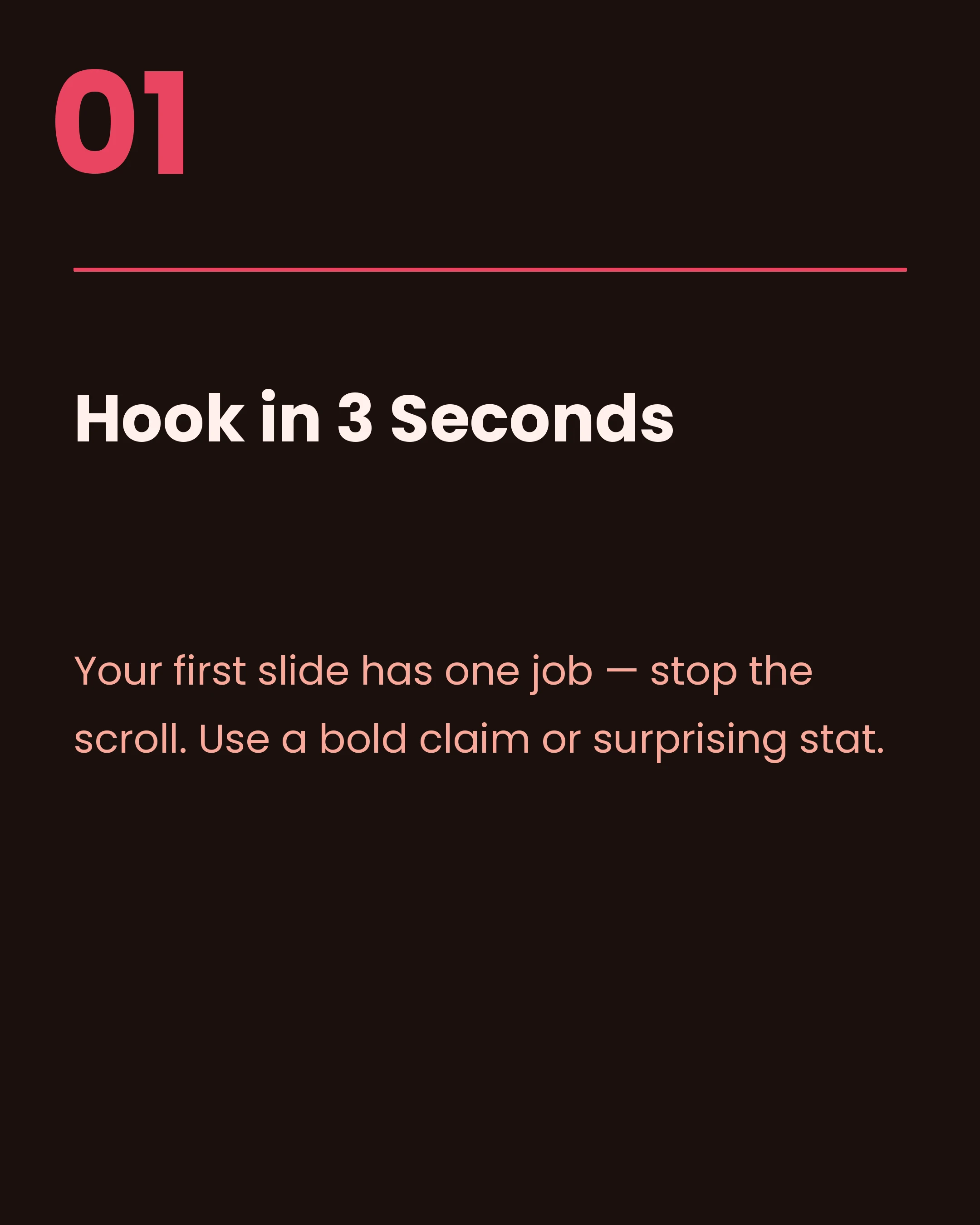
1. The Hook Slide
Your first slide has one job: stop the scroll. It needs to be instantly compelling enough that someone wants to swipe.
What works:
- A bold, specific promise (“7 hooks that tripled my engagement”)
- A surprising statistic (“87% of coaches make this mistake”)
- A relatable pain point (“Tired of posting and getting crickets?”)
- Pattern interruption with unusual visuals or layouts
What doesn’t work:
- Vague titles (“Tips for social media”)
- Starting with your logo or brand name
- Burying the value proposition in small text
- Using stock photos with no context
The hook slide should be readable in under 2 seconds. If someone has to squint or think to understand what your carousel is about, they’ll scroll past.
2. The Value Slides
These are the meat of your carousel — the slides that deliver on your hook’s promise.
Keep each slide focused on one idea. Don’t cram two tips onto one slide. It’s better to have more slides with less text than fewer slides that feel overwhelming.
Use a consistent visual hierarchy:
- A clear heading or numbered point
- 1–3 supporting sentences
- Optional icon or small illustration
Write for scanners. Most people won’t read every word. Use bold text, short sentences, and plenty of white space. If someone can get the gist by reading only the headings, you’ve done it right.
3. The CTA Slide
Your final slide should tell people what to do next. Don’t just end — close.
Effective CTAs for carousels:
- “Save this for later” (drives saves, which the algorithm loves)
- “Share with someone who needs this” (expands reach)
- “Comment [word] and I’ll send you the template” (drives comments)
- “Follow @handle for more [topic]” (grows followers)
- “Link in bio for the full guide” (drives traffic)
The best carousels combine two CTAs: a primary action and a secondary one. For example: “Save this for your next content day Follow @handle for weekly carousel tips.”
How Many Slides Should Your Carousel Have?
The short answer: 7–10 slides for most carousels.
Here’s why each count works:
| Slide Count | Best For |
|---|---|
| 2–3 | Before/after reveals, simple comparisons |
| 4–5 | Quick tips, short listicles |
| 7–8 | Educational content, frameworks |
| 10 | Deep dives, comprehensive guides |
Instagram allows up to 20 slides (increased from 10 in 2024), but that doesn’t mean you should use all of them. The sweet spot for engagement remains 7–10 slides. Beyond that, completion rates drop — and completion signals to the algorithm that your content is worth promoting.
Design Tips That Actually Matter
You don’t need to be a designer to create carousels that look professional. Focus on these fundamentals:
Typography
- Use no more than 2 fonts: one for headings, one for body text
- Keep body text at least 16pt (anything smaller gets lost on mobile)
- Left-align text — it’s easier to read than centerd text for longer content
Color
- Choose 2–3 brand colors and stick to them across all your carousels
- Use high contrast between text and background (white text on dark backgrounds or dark text on light backgrounds)
- Use your accent color sparingly — for highlights, numbers, or key words
Layout
- Leave generous padding (at least 40px from the edge on all sides)
- Keep the Instagram UI in mind — the bottom of each slide can be partially obscured by the carousel dots and engagement buttons
- Use a consistent grid or layout template across all slides
Brand Consistency
The most successful carousel creators use the same template structure repeatedly. Their audience recognizes their posts instantly in the feed. This brand recognition builds trust and increases engagement over time.
If you want to speed up the creation process, a carousel maker app can help. Carousel, for example, lets you pick from curated templates and color palettes, type your text, and export all slides in one tap — so you spend your time on the content, not the design.
Content Frameworks That Drive Saves
Saves are the most valuable engagement metric on Instagram. When someone saves your post, it tells the algorithm this content has lasting value. Here are carousel frameworks designed to maximize saves:
The Listicle
“7 tools every content creator needs” — Each slide features one item with a brief explanation. Simple, effective, and highly saveable.
The Step-by-Step
“How to plan a week of content in 30 minutes” — Numbered slides walking through a process. People save these as reference guides.
The Myth-Buster
“5 Instagram myths that are killing your growth” — Each slide debunks a common misconception. These get saved and shared because they challenge assumptions.
The Comparison
“Instagram in 2024 vs 2026: what’s changed” — Side-by-side comparisons create curiosity and provide reference value.
The Framework
“The AIDA method for carousel posts” — Teaching a reusable framework that people can apply to their own work. These get bookmarked constantly.
Copywriting Tips for Carousel Slides
The words on your slides matter as much as the design. Here are writing principles that work:
Start each slide with the most important word. Don’t bury your point. “Engagement drops 40% when…” hits harder than “According to recent studies, it has been shown that engagement…”
Use numbers. “3 ways to…” is always more compelling than “Some ways to…” Specificity builds credibility.
Write at a 6th-grade reading level. Not because your audience is simple — but because simple writing is faster to process while scrolling. Short words. Short sentences. Clear ideas.
Use power words. Words like “free”, “proven”, “secret”, “mistake”, “simple”, and “essential” trigger curiosity and urgency.
End body slides with a transition. “But that’s not the biggest mistake…” or “The next tip is the one most people skip…” — these create momentum that compels the swipe.
Posting Strategy for Maximum Reach
Creating a great carousel is half the battle. How and when you post matters too.
Best posting times vary by audience, but general benchmarks suggest:
- Weekdays between 7–9am (people checking their phones in the morning)
- Lunchtime 12–1pm
- Evenings 7–9pm
Write a strong caption. Your carousel does the heavy lifting, but the caption adds context, personality, and additional keywords for searchability. Start with a hook, add value, and end with a question to drive comments.
Use 3–5 hashtags. Instagram’s own recommendation has shifted toward fewer, more targeted hashtags rather than the old 30-hashtag strategy. Focus on niche hashtags where your content can actually rank.
Engage in the first hour. Reply to every comment quickly after posting. This signals to Instagram that your post is generating conversation, boosting its reach.
Common Mistakes to Avoid
After analyzing thousands of carousels, here are the patterns that consistently underperform:
Too much text per slide. If it looks like a wall of text, nobody will read it. Aim for 30–50 words maximum per slide.
No visual hook. A plain text-on-white first slide won’t stop anyone from scrolling. Invest time in making slide one pop.
Inconsistent design. Mixing fonts, colors, and layouts within a single carousel looks amateur. Pick a template and stick to it.
Forgetting the CTA. So many carousels just… end. Always tell your audience what to do next.
Optimising for likes over saves. Likes are nice, but saves drive long-term algorithmic reach. Create content people want to come back to.
Start Creating Today
The best way to improve your carousels is to start making them consistently. Your first carousel won’t be perfect — and that’s fine. The creators who win on Instagram are the ones who show up regularly and iterate based on what their audience responds to.
Focus on providing genuine value, keep your design clean and consistent, and always end with a clear call to action. The data shows that carousels reward creators who put in the thought. Now it’s your turn to put these tips into practice.
Create your first carousel in 60 seconds — free
Pick a template, paste your text, export. It's that simple. No design skills needed.
Download Carousel