How to Create a Consistent Brand Across Your Carousel Posts
Scroll through the Instagram feed of any creator or brand you admire and you’ll notice something immediately: their carousels look like they belong together. Not identical — but clearly from the same family. Same colors, same fonts, same visual energy.
That consistency isn’t accidental. It’s strategy. And it’s one of the most underrated advantages in social media marketing.
According to a study by Lucidpress, consistent brand presentation across all platforms increases revenue by up to 23%. Meanwhile, research from the University of Loyola found that color increases brand recognition by up to 80%. When someone scrolling through their feed sees your colors and instantly knows it’s you — before reading a single word — that’s brand equity working in your favor.
For carousel creators, consistency solves a specific problem: your content competes in a feed alongside hundreds of other posts. Visual consistency acts as a signal amplifier — it makes your content recognizable faster, which means people are more likely to stop, engage, and swipe.
The Four Pillars of Carousel Brand Consistency
1. Color Palette
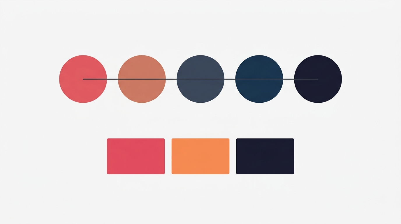
Your color palette is the single most impactful branding decision for carousels. It’s what people see first, remember longest, and associate most strongly with your brand.
How to choose a palette:
Start with 4-5 colors that serve specific roles:
- Primary: Your main brand color — used for headlines, key elements, and the overall dominant tone
- Secondary: A complementary color for supporting elements, subheadings, and accent panels
- Accent: A pop color used sparingly for emphasis — CTAs, highlights, important numbers
- Background: Your default canvas color (usually light or dark)
- Surface: A slightly tinted version of your background for cards, sections, and depth
This semantic approach — assigning meaning to each color — creates consistency automatically. You don’t have to remember which hex code goes where; the role determines it.
Palette selection tips:
- Limit yourself to one palette. Using multiple palettes across posts creates visual chaos. Pick one and commit for at least 3-6 months.
- Test contrast. Your primary on your background must pass readability tests. If you can’t read the headline from arm’s length on a phone screen, the contrast isn’t sufficient.
- Consider the emotional message. Deep blues and navies convey expertise and trust. Warm oranges and corals convey energy and approachability. Muted greens signal growth and calm. Choose colors that match your brand’s personality.
2. Typography
Font choice is the second pillar. Consistent typography creates visual rhythm — your audience learns to read your slides without consciously thinking about it.
Building a type system:
- Headline font: Bold, attention-grabbing. This appears on your hook slides, section headers, and key statements. Sans-serif fonts like Montserrat, Oswald, or Bebas Neue work well for strong, modern headlines.
- Body font: Readable at smaller sizes. This is your workhorse for explanations, details, and longer text blocks. Poppins, DM Sans, and Raleway are clean and legible.
- Accent font (optional): A decorative or contrasting font used sparingly — for quotes, callouts, or special emphasis. Playfair Display or Lora can add elegance when used in small doses.
Typography rules for consistency:
- Use a maximum of two fonts. One for headlines, one for body text. More than two creates visual noise.
- Keep sizes consistent. If your headlines are 64px on one carousel, don’t make them 48px on the next. Establish a type scale and stick with it.
- Maintain hierarchy. Headline > Subheading > Body text > Caption. This hierarchy should be the same across every carousel you publish.
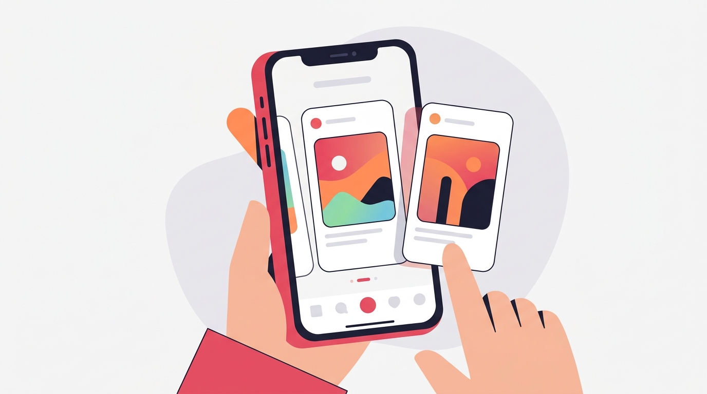
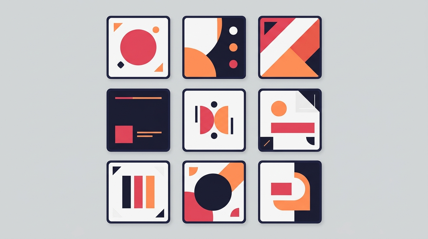
3. Template Structure
Using the same template (or 2-3 templates on rotation) creates structural consistency. Your audience learns to navigate your slides intuitively — they know where to find the headline, where the body text lives, and where the CTA will be.
Template strategy:
- Primary template: Used for 60-70% of your content. This is your signature look — the layout most people associate with your brand.
- Secondary template: Used for a different content type (e.g., listicles vs stories). Still uses the same palette and fonts, but varies the layout.
- Accent template: For special occasions — launches, milestones, collaborations. Breaks the pattern intentionally to signal importance.
What to keep consistent within templates:
- Element positioning (headline at top, body in center, CTA at bottom)
- Spacing and padding between elements
- Use of dividers, cards, and visual separators
- Aspect ratio (stick to one — 4:5 for Instagram, 9:16 for TikTok)
4. Content Patterns
Beyond visual elements, consistency in how you structure your content builds reader expectations:
- Hook formula: If you typically start with a question, keep starting with questions. If you start with a bold claim, maintain that pattern. People learn to recognize your style.
- Slide count: Staying within a consistent range (e.g., 5-8 slides) trains your audience on what to expect.
- CTA format: Use the same call-to-action approach consistently — whether it’s “Save this for later,” “DM me [keyword],” or “Follow for more frameworks.”
- Framework usage: Picking 2-3 frameworks (e.g., AIDA and Listicle) and using them consistently creates a predictable value delivery system.
Building Your Brand System: A Step-by-Step Guide
Step 1: Audit Your Existing Content
Before building a system, look at what you’ve already posted. Open your profile grid and ask:
- Is there a dominant color? If not, pick one now.
- Are you using more than three fonts? Cut to two.
- Do your carousels have a recognizable structure? If not, identify which template felt most “you.”
Screenshot your best-performing carousel. That’s your starting point — refine what already works rather than starting from scratch.
Step 2: Define Your Brand Kit
Document your choices:
- Primary palette: Name it, lock in the hex codes
- Fonts: One headline font, one body font
- Primary template: The layout you’ll use for most posts
- Tone: Bold and direct? Warm and conversational? Academic and data-driven?
Write this down. Put it in your notes. The act of defining it prevents drift.
Step 3: Create a Reference Post
Design one “perfect” carousel that represents your brand at its best. This becomes your reference — every future carousel is compared against this standard.
- Does it use the right palette?
- Does it use the right fonts?
- Does it follow the right template?
- Does it sound like you?
Step 4: Implement Gradually
You don’t need to rebrand overnight. Start applying your brand system to new content. Over the course of 4-6 weeks, your grid will naturally become more consistent as new posts replace older, less cohesive ones.
Common Branding Mistakes in Carousels
Chasing trends over consistency. Using a different trendy color scheme every week destroys recognition. Trends come and go — your brand colors shouldn’t.
Too many palettes. Some creators use Ocean for Monday posts, Sunset for Wednesday, Coral for Friday. The variety feels creative but kills recognition. Pick one palette and use it everywhere.
Ignoring dark/light context. Your palette needs to work on both light and dark backgrounds. If your primary color is deep navy, your dark-background slides need a different approach than your light-background slides. Plan for both.
Confusing consistency with monotony. Consistency doesn’t mean every carousel looks identical. Vary your content, your frameworks, and your hook styles — but keep the visual foundation the same. It’s like wearing different outfits in the same color family.
Skipping the brand kit. Without defined colors and fonts, you’ll make slightly different choices every time. “Close enough” compounds into visual inconsistency over weeks and months.
The Brand Consistency Compound Effect
Brand consistency isn’t dramatic in the short term. Your first month of consistent posting won’t look radically different from your inconsistent months. But over 3-6 months, the compound effect is significant:
- Recognition speed increases. Your audience identifies your content without reading the username.
- Trust builds passively. Consistency signals professionalism and reliability — qualities people associate with credibility.
- Content production speeds up. When your design decisions are predetermined, you spend less time choosing colors and fonts and more time on the content itself.
- Grid aesthetics improve. A consistent grid looks intentional, which attracts new followers who value quality.
Making Consistency Effortless
The biggest barrier to brand consistency isn’t design skill — it’s friction. If maintaining your brand requires remembering hex codes, font names, and layout rules for every post, it won’t last.
Carousel approaches this with a brand kit system — you define your palette, fonts, and preferred templates once, and every new carousel starts from your brand defaults. Combined with 10 curated palettes (Midnight, Ocean, Forest, Sunset, Lavender, Coral, Sage, Slate, Warm, Rose) and 14 built-in Google Fonts, it removes the friction of maintaining consistency post after post.
Key Takeaways
- Consistent brand presentation increases revenue by up to 23% (Lucidpress) and color increases brand recognition by up to 80% (Loyola)
- Build your brand system on four pillars: color palette, typography, template structure, and content patterns
- Limit yourself to one palette and two fonts — more creates visual chaos
- Use semantic color roles (primary, secondary, accent, background, surface) to automate consistency
- Vary your content and frameworks while keeping the visual foundation stable
- Define your brand kit in writing and create one reference carousel to measure against
Ready to build a consistent brand across your carousels? Download Carousel — free on the App Store.
Create your first carousel in 60 seconds — free
Pick a template, paste your text, export. It's that simple. No design skills needed.
Download Carousel