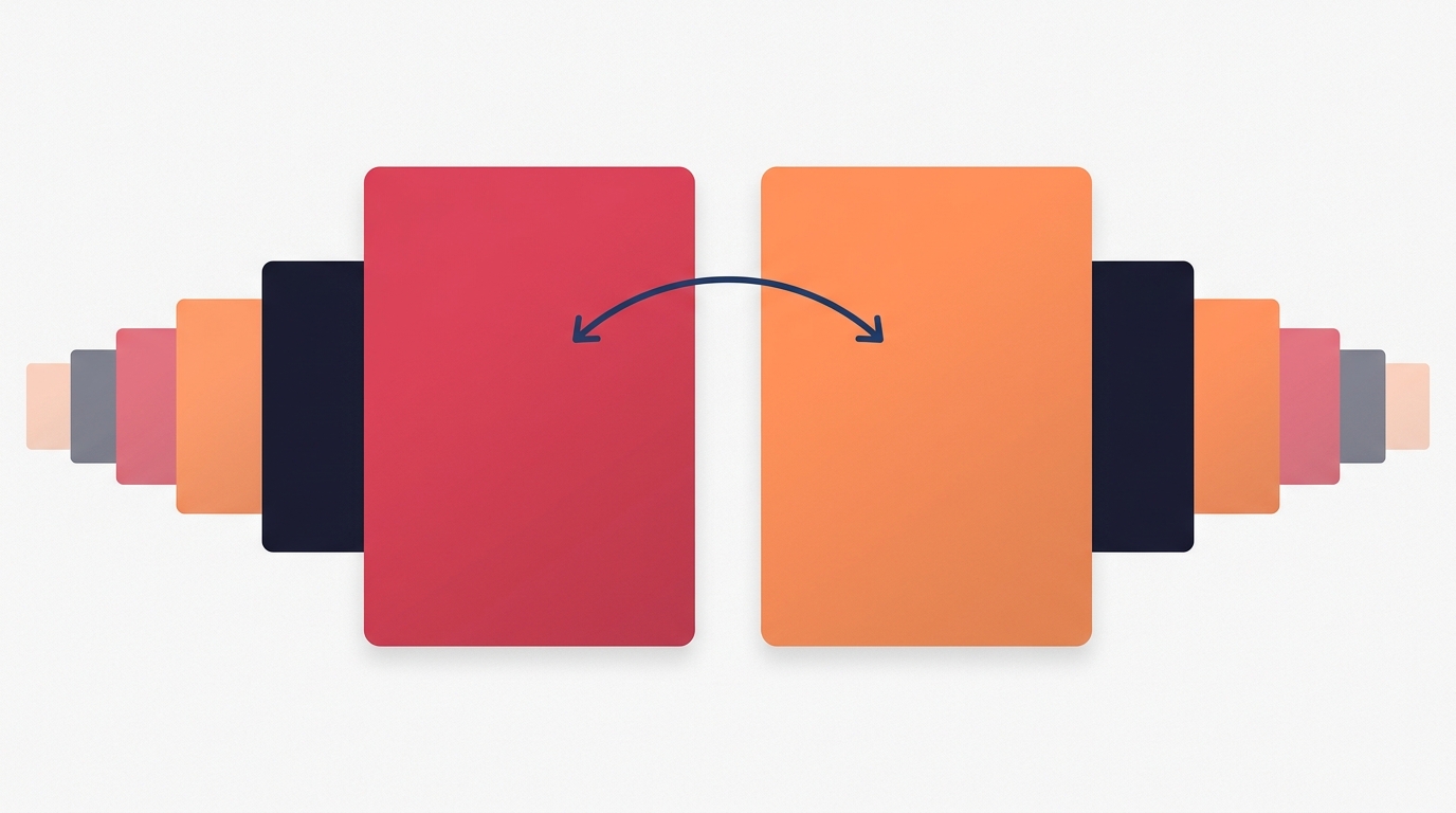
Slide 2 Is Your Second Cover Slide
Slide 2 Is Your Second Cover Slide
Almost every piece of carousel advice ever written treats slide one as the only slide that matters. Get the hook right, the argument goes, and the rest follows.
That was true when a carousel got shown once. It is not how Instagram serves them now.
If someone scrolls past your post without engaging, Instagram can show it to them again later starting from a different slide — most commonly slide two. The same post gets more than one shot at the same person, and each of those shots opens on a different image.
Which means slide two is not the first body slide. It is a second cover, and most people are writing it as though nobody will ever see it first.
What Goes Wrong
The typical slide two is a continuation. It assumes context that only exists if you read slide one.
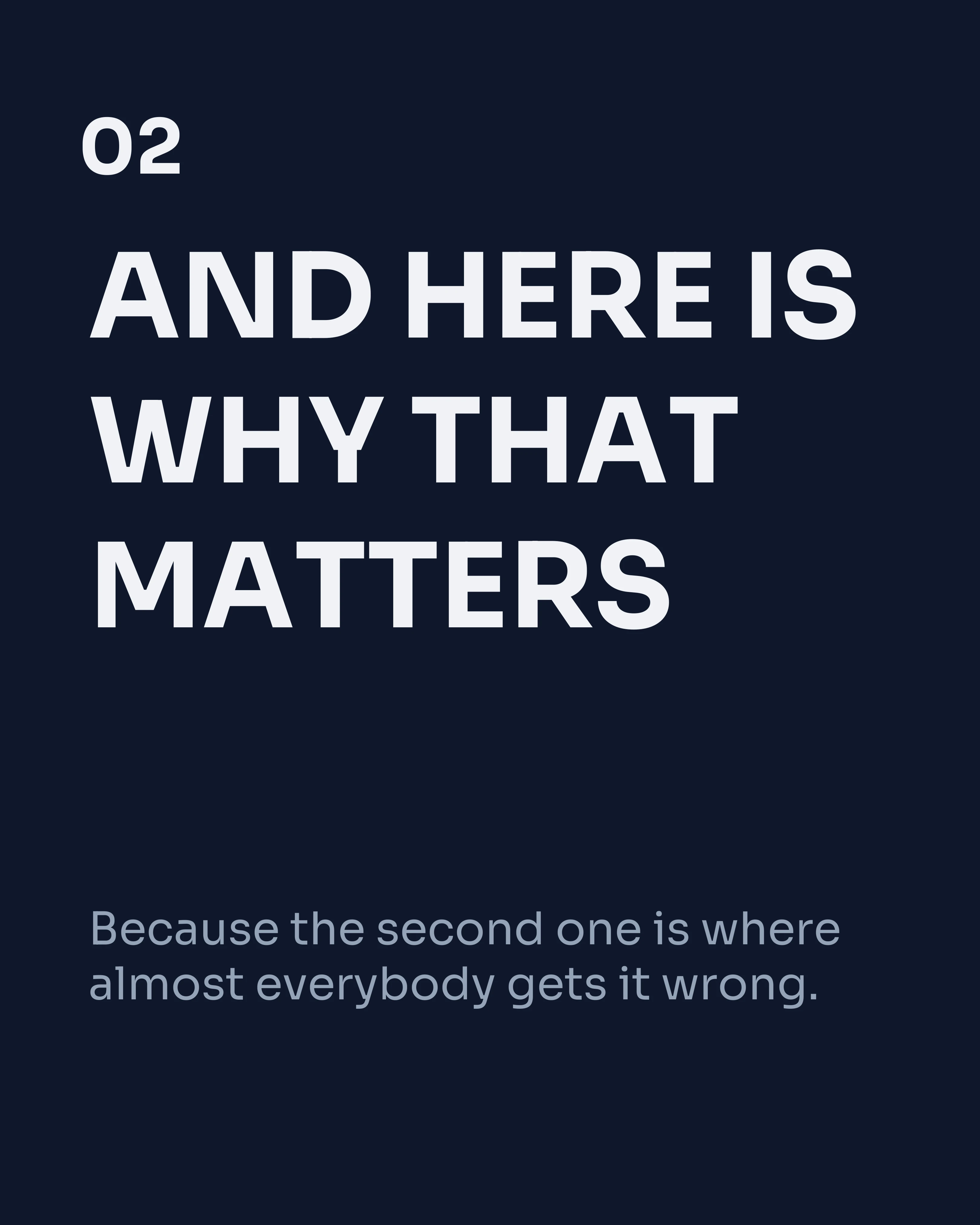
- “And here’s why that matters.”
- “The problem starts with three things…”
- “But most people get this backwards.”
Every one of those is fine as slide two of a sequence and useless as an opening. Served cold to someone who never saw the cover, they read as the middle of a conversation, and people scroll past the middle of conversations.
The cost is invisible in your analytics. You do not see “impressions wasted because slide two made no sense standalone.” You see a post that underperformed and no obvious reason why.
The Standalone Test
Before you publish, look at slide two on its own. Cover slide one with your hand if it helps.
Ask three questions:
- Does it state something, or continue something? A statement can open a post. A continuation cannot.
- Would a stranger understand the subject? Not the argument — the subject. If slide two says “the second one is where most people lose money” and never says what “one” refers to, it fails.
- Is there a reason to swipe? A cover earns the next slide. So should this one.
If it fails any of the three, rewrite it. You are not weakening slide one by doing this; you are giving the post a second front door.
How to Write a Second Cover
Restate the stakes, do not restate the hook. Repeating slide one word for word feels redundant to anyone reading in order. Instead, come at the same idea from a different angle — if the cover led with the outcome, slide two leads with the cost of getting it wrong.
Name the subject explicitly. One concrete noun. The reader who lands here cold needs to know what this is about within a second.
Make it visually strong. A second cover competing for attention in a feed needs the same treatment as the first: high contrast, one dominant message, critical text clear of the lower third where the feed crops it. Our cover slide guide applies here twice over.
Keep it short. Slide two is where people start dumping body copy. Resist. Fewer words earn more swipes on a slide that has to work cold.
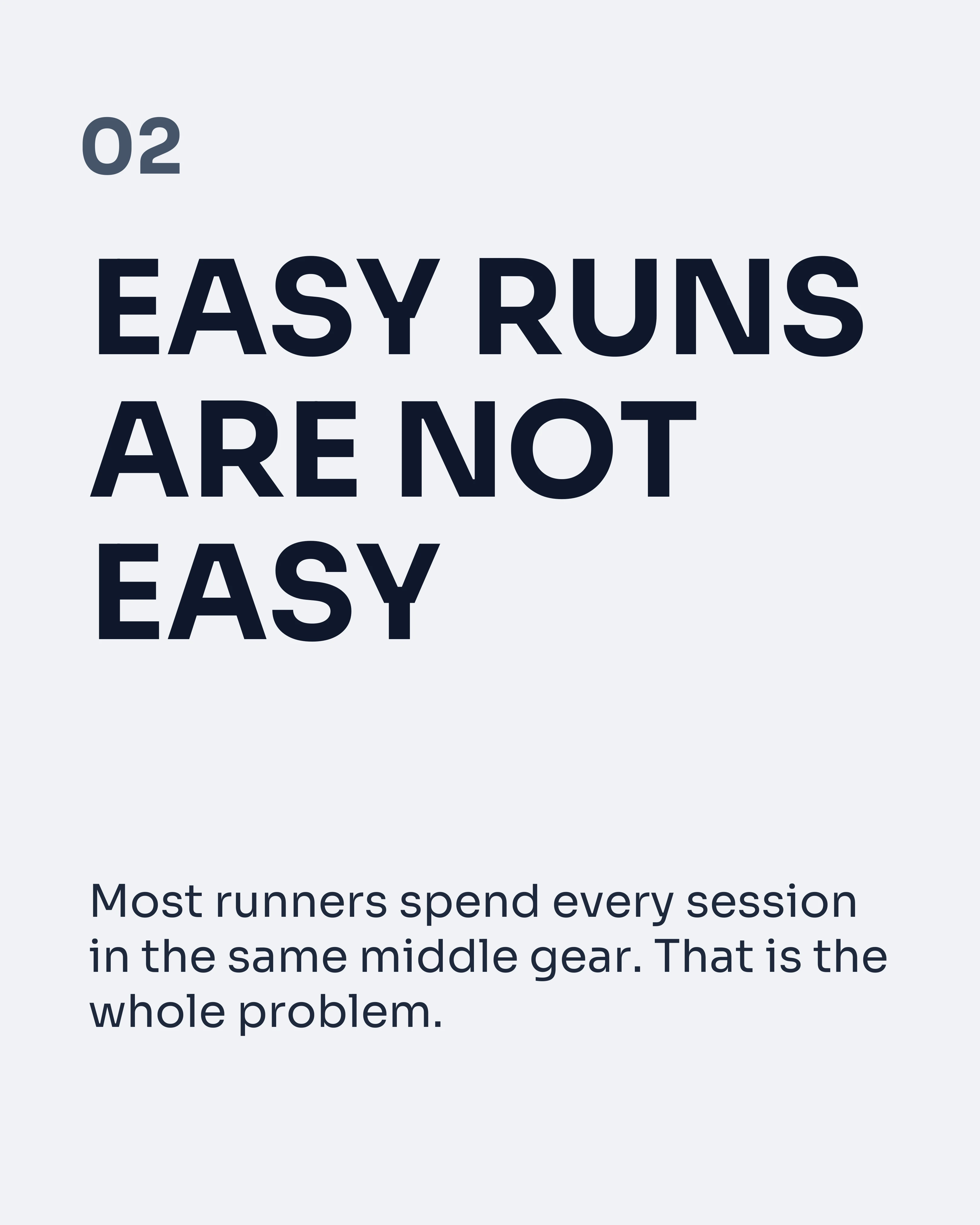
Here is what a weak and a strong slide two look like side by side, on the same post.
A Full Post With Two Covers
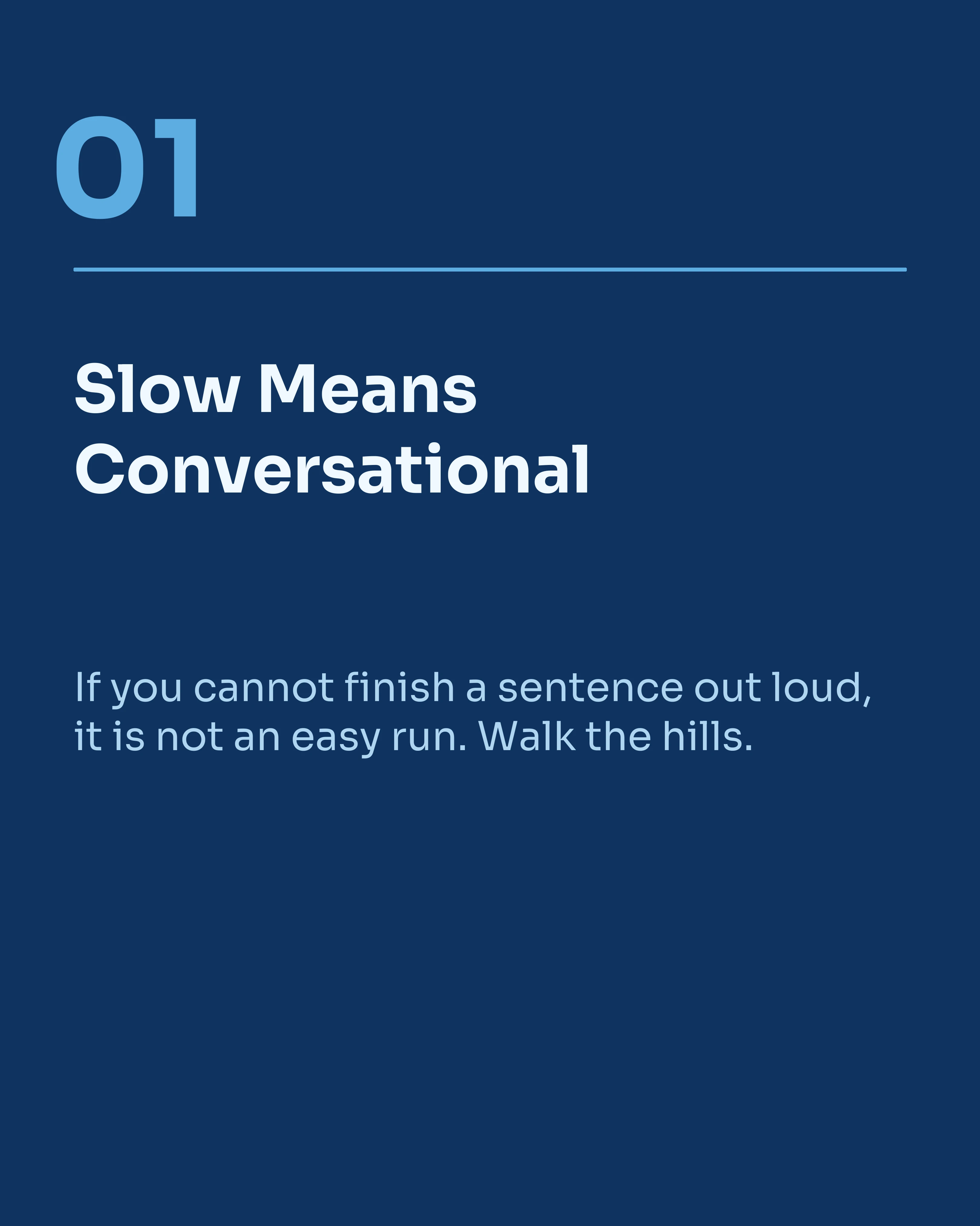
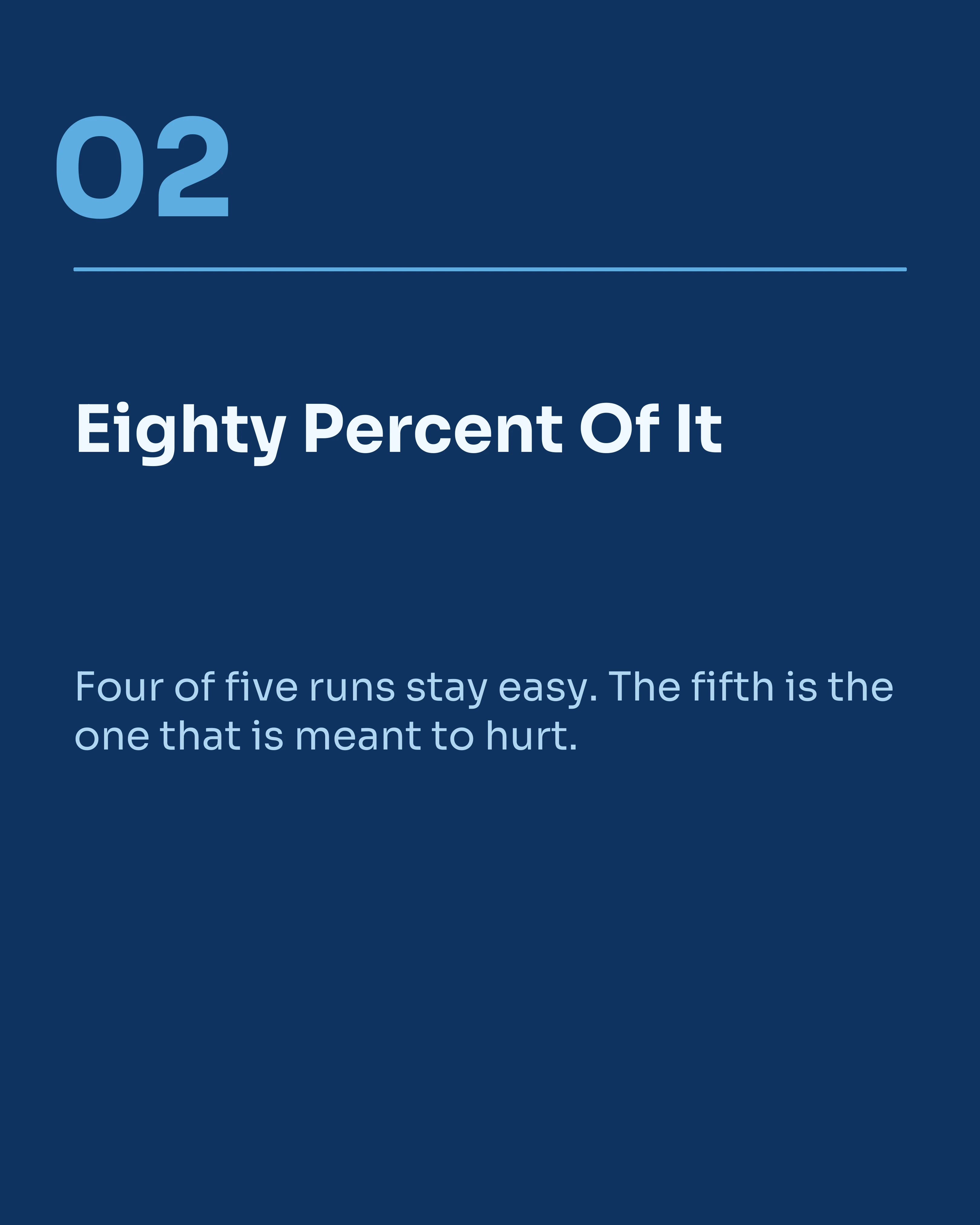
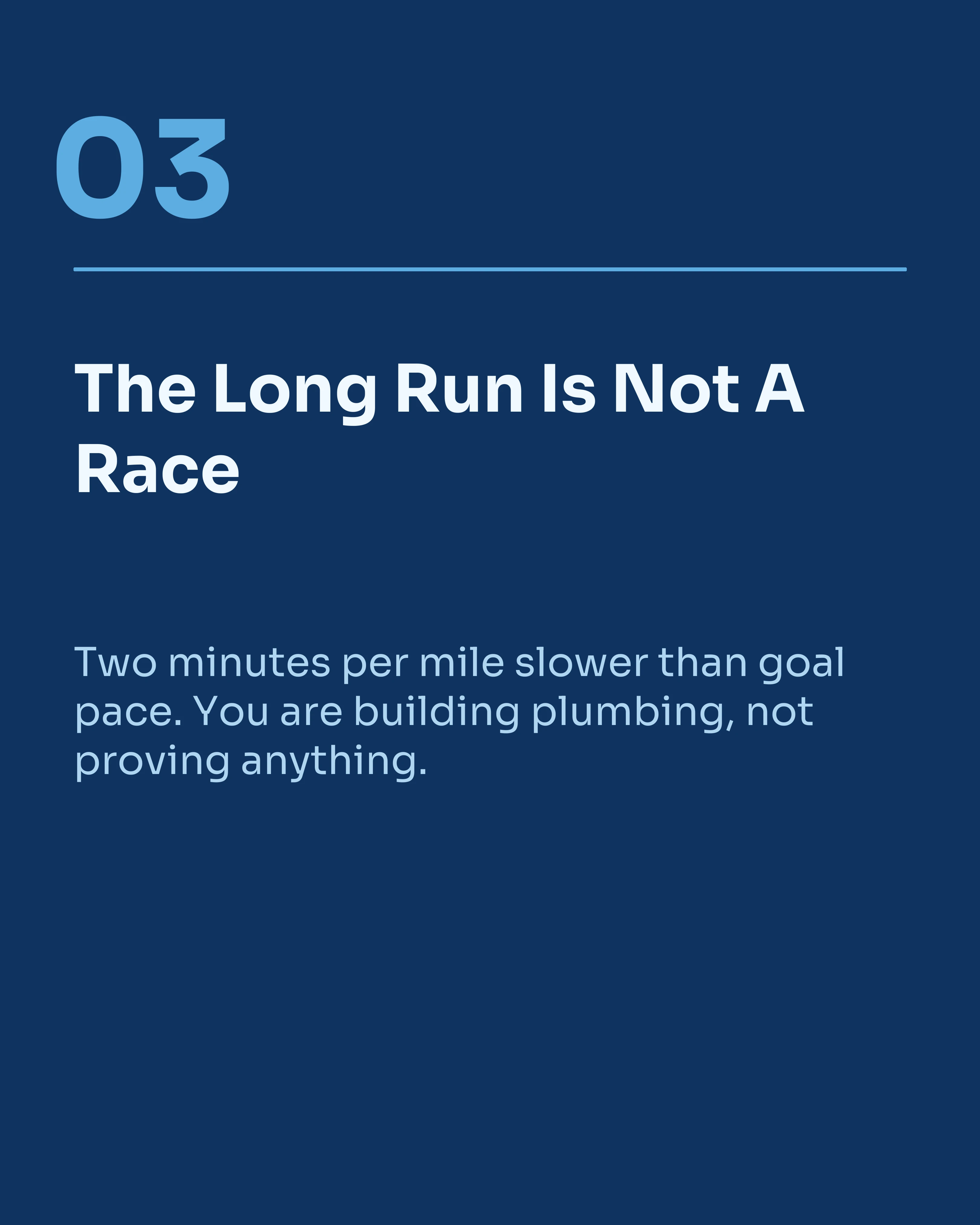
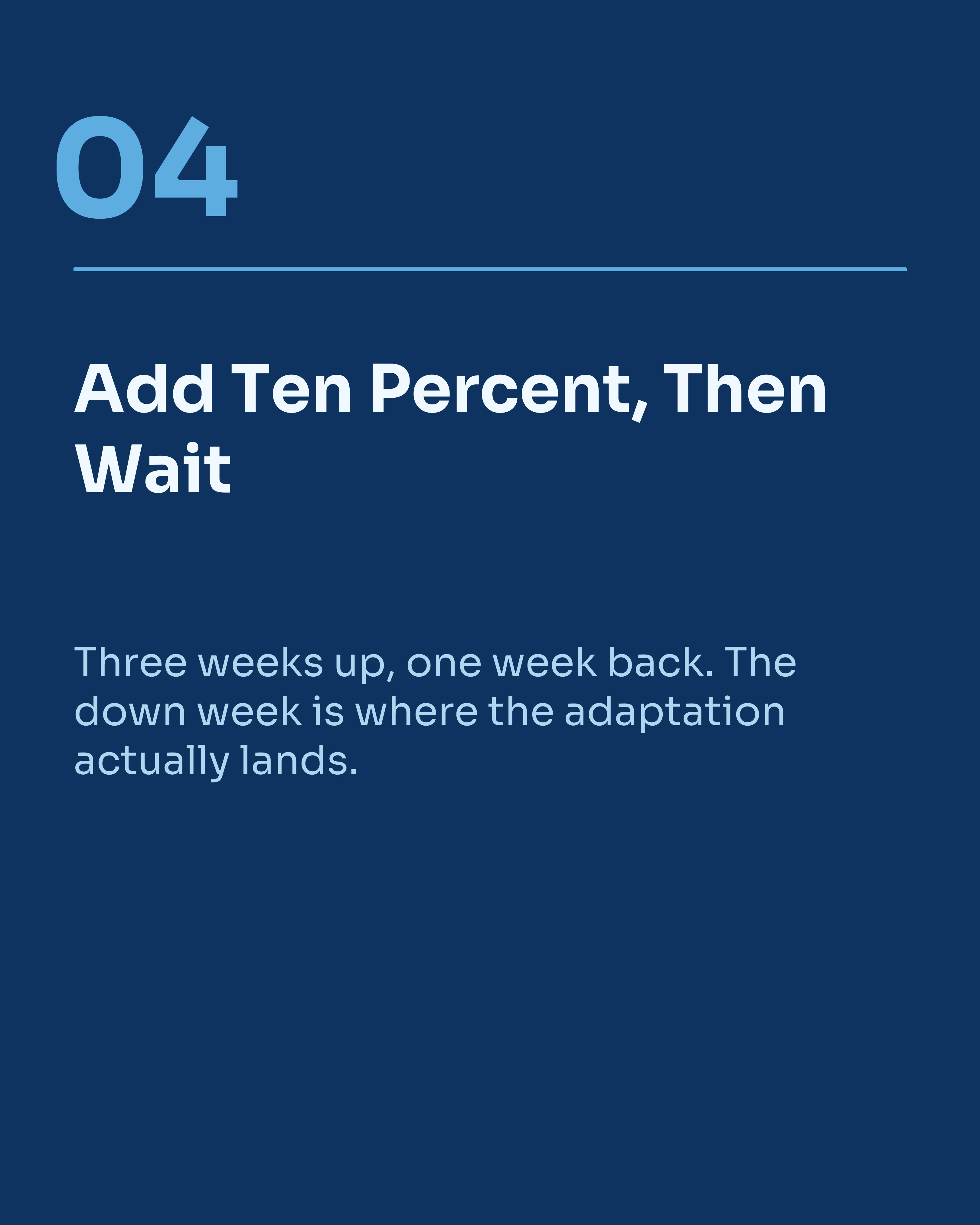
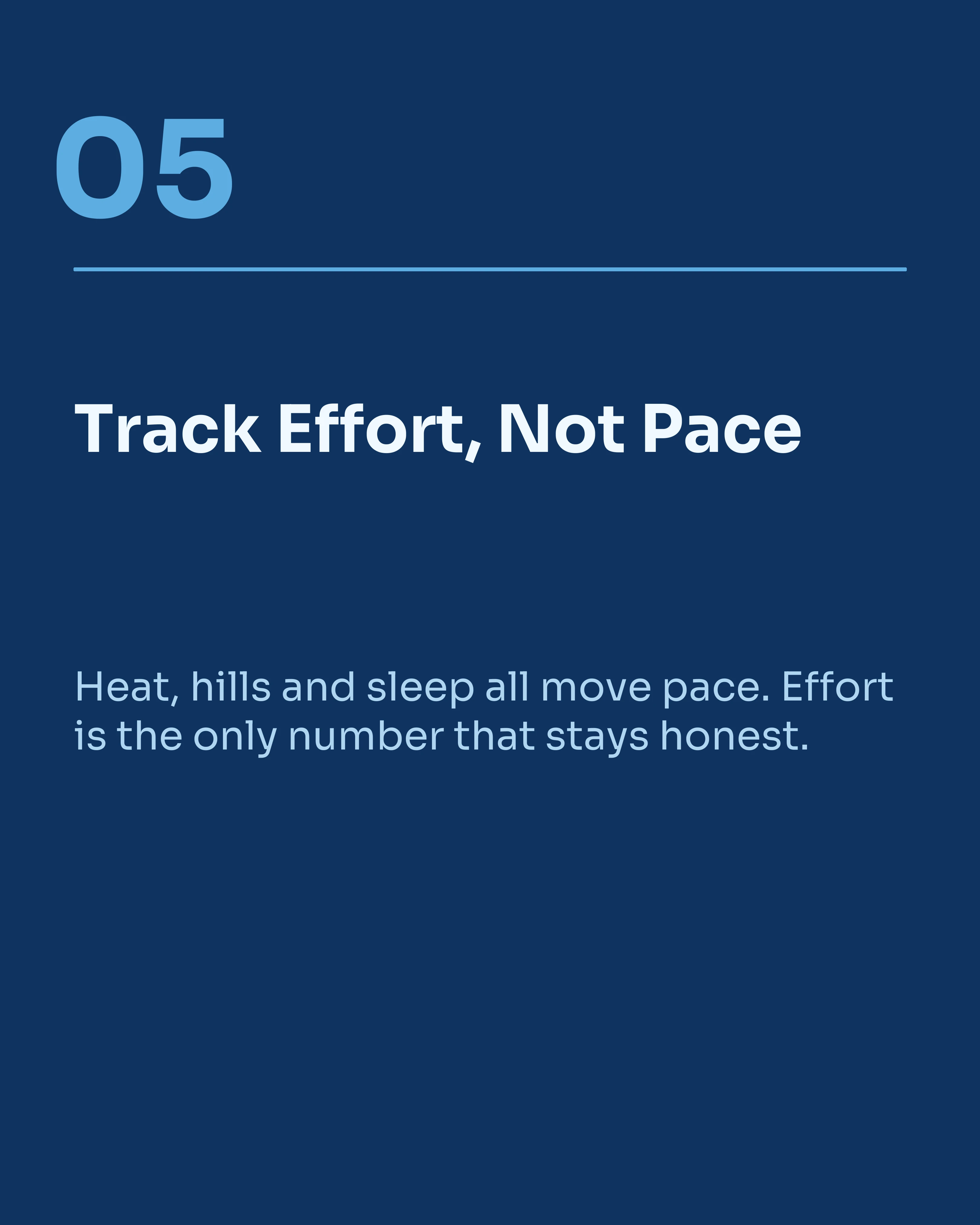
Below is an eight-slide post from a running coach, built so that slides one and two both work as openings. Slide one leads with the outcome. Slide two names the subject and the stakes from scratch, then hands off to the numbered body.
A reader who arrives at slide one gets a sequence. A reader who is re-served at slide two gets a post that makes sense immediately. Neither reader is aware anything special happened, which is the point.



Two Related Mechanics Worth Knowing
Instagram crops every slide to match the first. Whatever aspect ratio slide one uses is imposed on the rest. Mix a 4:5 with a 1:1 in the same post and the odd ones get silently cut. Keep the whole set at one ratio — our size and dimensions guide has the specifics.
Your cover is also a permanent grid tile. Slide one has a second job long after the post leaves the feed: it sits in your profile grid at thumbnail size. A cover that only reads at full size looks like noise on the grid. Design for both.
Put those together with the re-serve behavior and the first two slides carry three jobs between them: stop the scroll, survive the grid, and open the post cold.
How Carousel Helps
Carousel makes this easy to check because you build and preview the whole set as a strip rather than one slide at a time. Swapping slide two onto a high-impact visual template, or moving a body slide later so a stronger statement takes second position, takes a few seconds. Export keeps every slide at one aspect ratio, so the crop problem does not arise in the first place.
Key Takeaways
- Instagram can re-serve a carousel starting from slide two, giving one post several distribution windows.
- A slide two that only makes sense after slide one wastes those windows silently.
- Test slide two alone: does it state something, name its subject, and earn a swipe?
- Restate the stakes from a new angle rather than repeating the hook.
- Keep every slide at the same aspect ratio, because slide one dictates the crop for all of them.
- Remember the cover’s second life as a grid thumbnail.
Ready to build a post with two front doors? Download Carousel — free on the App Store.
Create your first carousel in 60 seconds — free
Pick a template, paste your text, export. It's that simple. No design skills needed.
Download Carousel