
Carousel Cover Slides: How to Design First Slides That Earn the Swipe
Carousel Cover Slides: How to Design First Slides That Earn the Swipe
Your first slide is doing almost all the work. It decides whether someone stops scrolling, whether they swipe, and whether the nine slides you carefully built behind it get seen at all. A brilliant carousel with a weak cover is a brilliant carousel nobody reads.
Most creators spend their energy on the content slides and treat the cover as an afterthought. That is backwards. The cover is the single highest-leverage element in the entire post, and small improvements there move every metric downstream.
This guide covers what a cover slide actually has to accomplish, the layout and copy rules that make it work, and the mistakes that quietly kill reach.
What the Cover Slide Has to Do
A cover slide has exactly two jobs, and they happen in sequence.
First, it has to stop the scroll. In a feed moving at speed, your cover has a fraction of a second to register as worth pausing for. That is a visual job: contrast, clarity, and a single readable focal point.
Second, it has to earn the swipe. Stopping someone is useless if they do not move to slide two. That is a copy job: the cover has to open a loop the reader needs to close, a promise of payoff that only swiping delivers.
Cover design lives at the intersection of those two. Pretty but vague fails the second job. Punchy but cluttered fails the first. You need both.
The Anatomy of a High-Performing Cover
Strong covers tend to share the same structure.
One dominant message. A single idea, large and unmissable. If a reader has to work out what the post is about, you have already lost them. One thought, big.
A curiosity gap. The cover states enough to intrigue but withholds the payoff. “The pricing mistake costing you clients” makes you need slide two. “Pricing tips” does not.
Visual hierarchy. The eye should land on the headline first, then everything else. Size, weight, and color create that order. When everything shouts, nothing is heard.
Breathing room. Crowded covers read as noise at thumbnail size. Generous space around the headline makes it legible in the half-second you get.
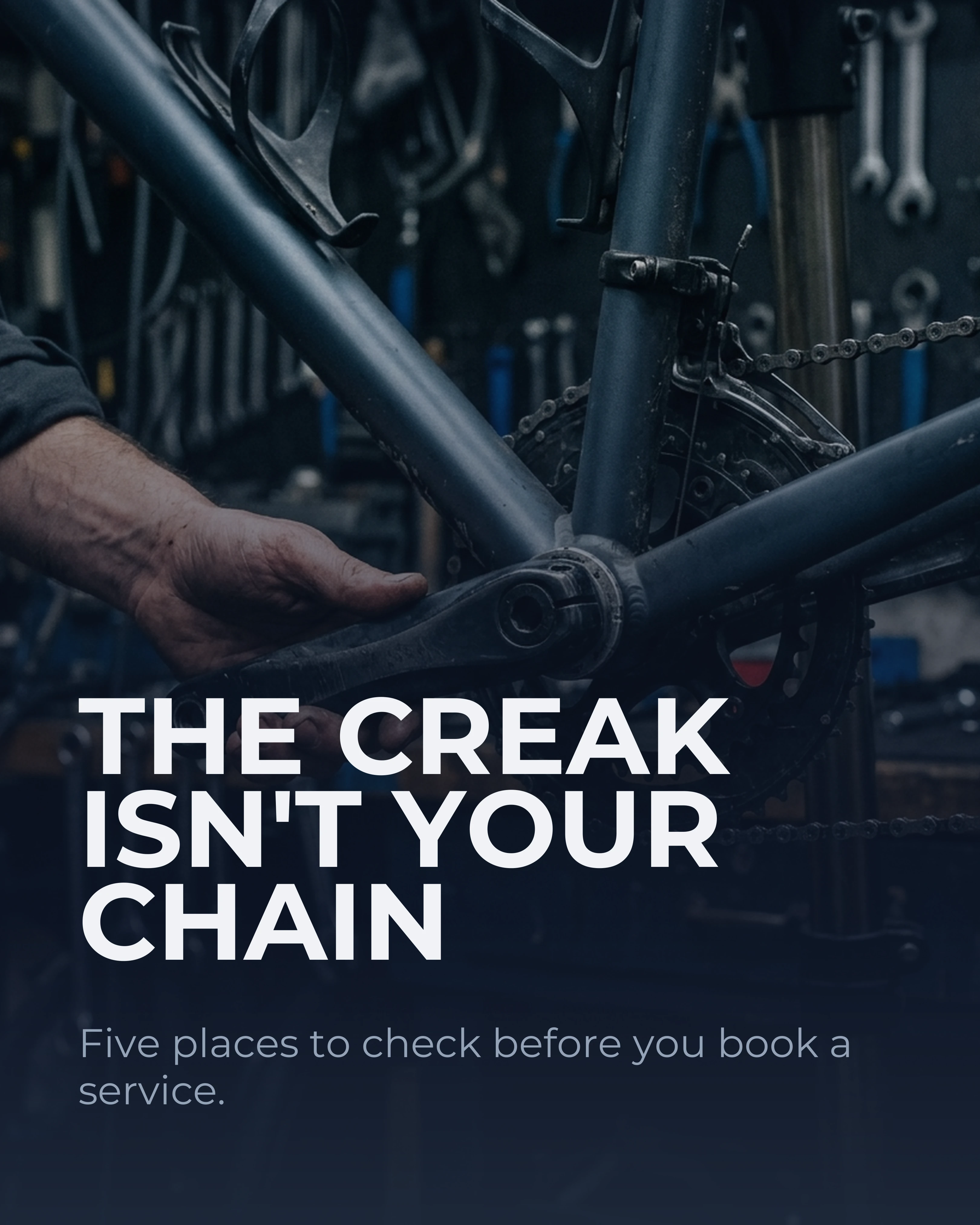
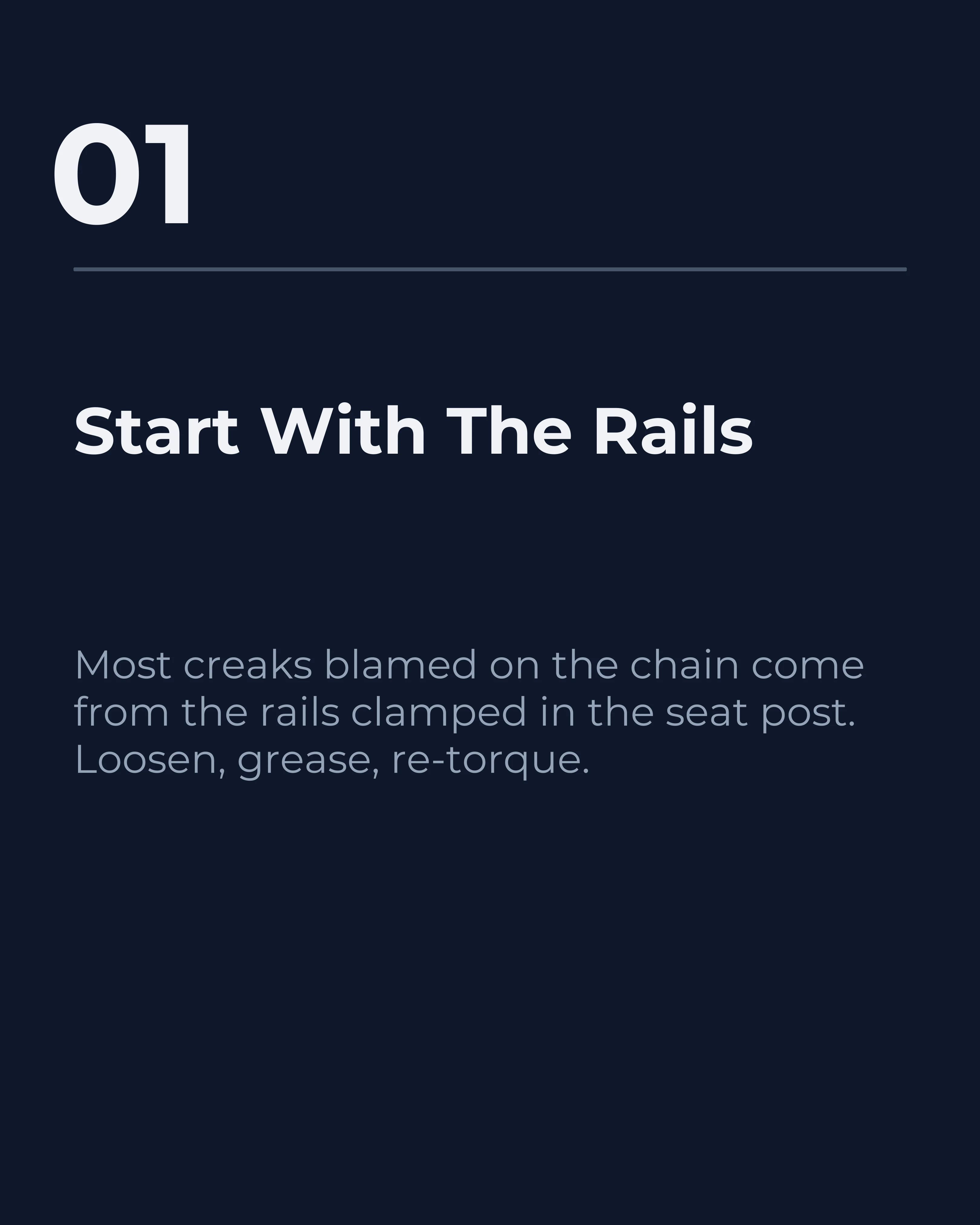
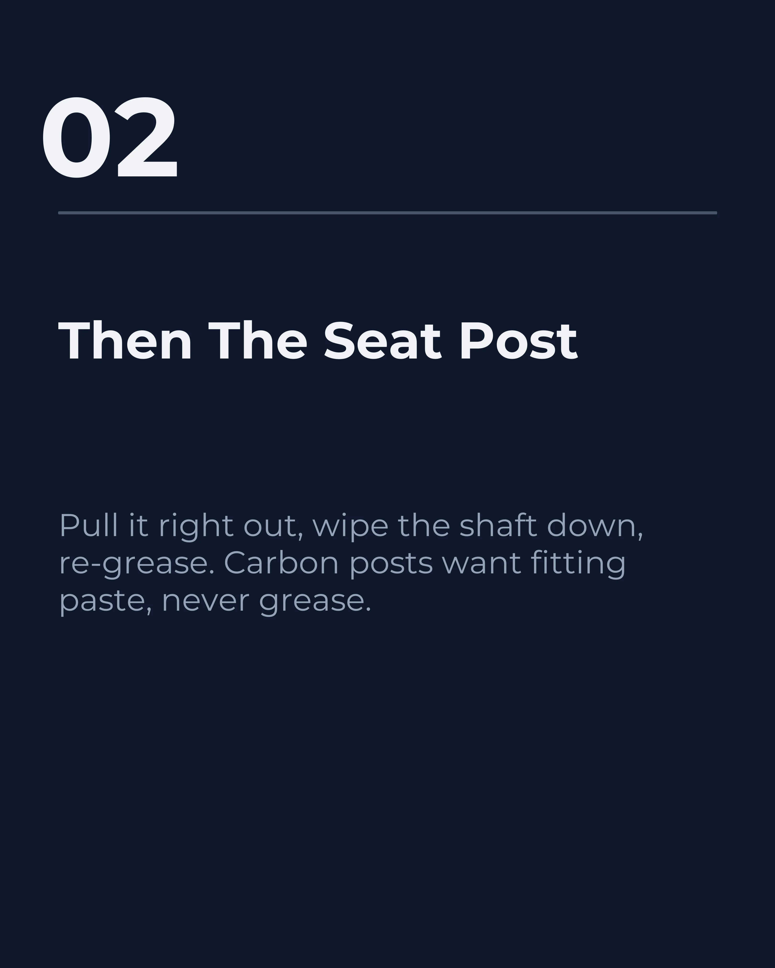
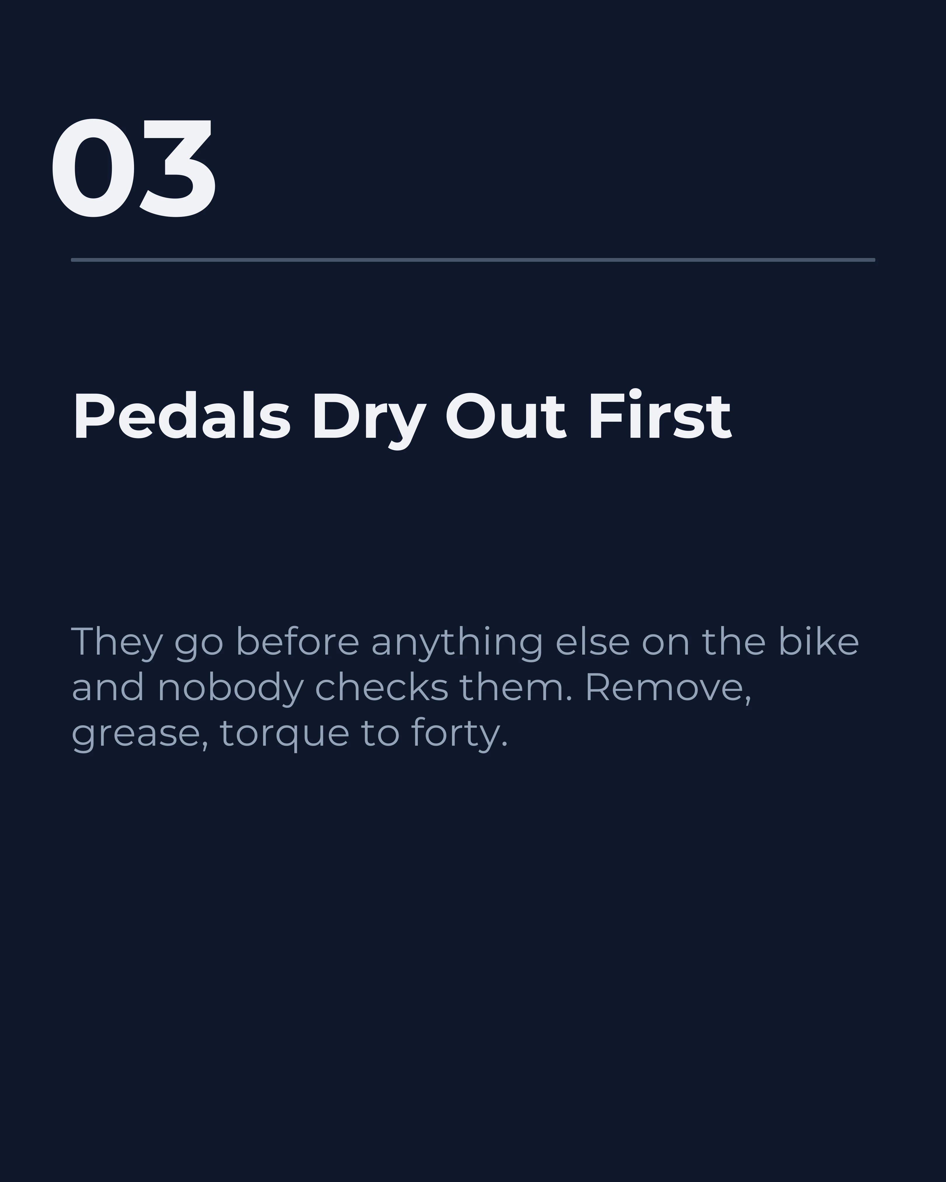
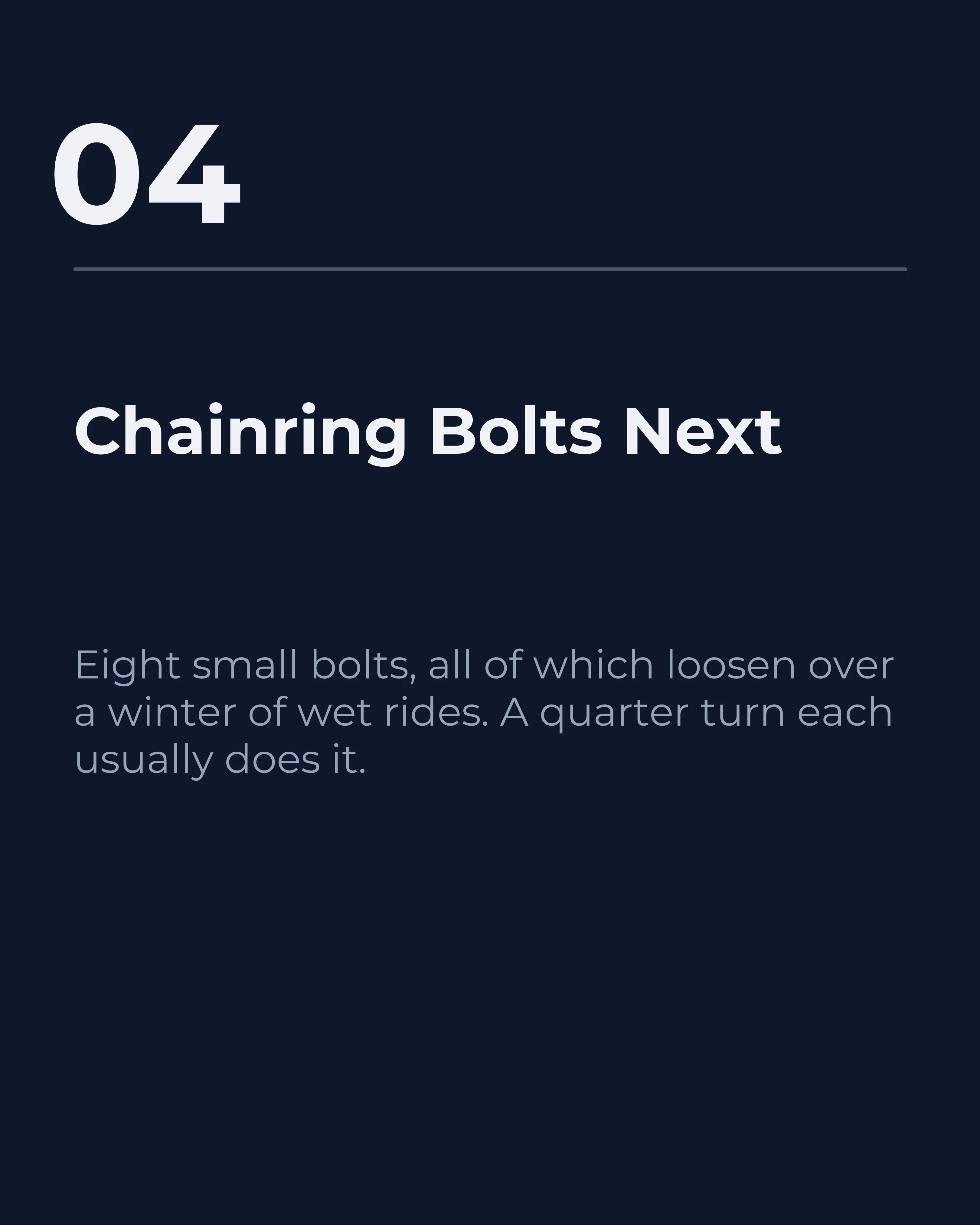
Here is that anatomy in a real post. A bike workshop explaining creaks, seven slides, and the cover doing all four jobs at once: one dominant message, an open loop you have to swipe to close, the headline sized like the boss of the slide, and nothing crowding it.
Read it as the reader would, left to right. The cover is only good if what follows justifies the promise, which is why it is shown in full rather than on its own.


Copy Rules for Cover Slides
The words on your cover matter more than any design choice. A few rules that consistently work.
Lead with a number or a stakes word. “7,” “stop,” “mistake,” “before,” and “why” all signal value or tension. They give the reader a reason to care in the first word.
Keep it under about eight words. A cover headline is read at a glance, not studied. If it wraps to four lines, it is too long for the format. Cut until it lands in one breath.
Speak to one person’s problem. “How founders can fix a leaky onboarding flow” beats “Onboarding tips for everyone.” Specificity signals the post is for you.
The full discipline of writing scroll-stopping openers is its own subject; the carousel hooks guide goes deeper on the copy side, and it pairs directly with everything here.
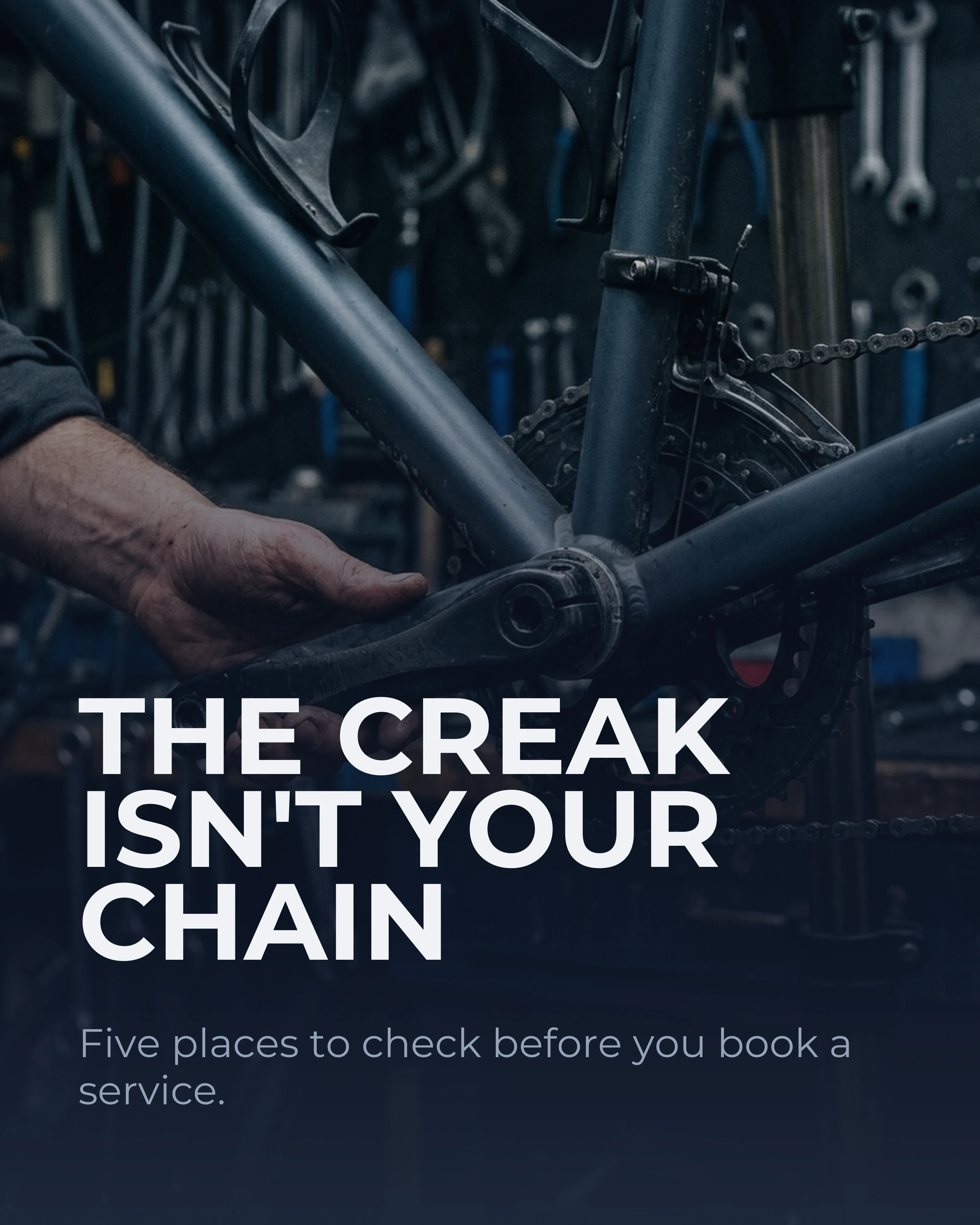
These three are the same slide one for the same post, on the same photograph, with only the words changed. Not a carousel — three drafts of a cover, so you can see what the copy alone is doing.
The first describes instead of promising: accurate, and there is nothing to swipe for. The second is a pun, which asks the reader to decode something mid-scroll, and they will not. The third is the one that shipped.


Design Rules That Make Covers Pop
Once the copy is right, design carries it across the line.
Maximize contrast. Dark text on light, or light text on dark. Low-contrast covers vanish in a busy feed. This is the single most common reason a good post underperforms.
Pick one focal point. A bold headline or a striking image, with the other in support. Two competing focal points cancel each other out.
Respect the safe zone. Keep critical text out of the lower third of the first slide, where the caption and interface icons sit. The Instagram dimensions guide covers the exact margins.
Stay on-brand. Your cover should be instantly recognizable as yours. Consistent color and type build the familiarity that earns trust over time, which the brand consistency guide covers in depth.
Cover Slide Mistakes That Kill Reach
A few habits sink otherwise good posts.
Burying the message. If the most important words are small, you have inverted the hierarchy. The headline is the boss; size it like one.
Being too clever. Clever-but-unclear loses every time to plain-but-compelling. The reader will not decode a pun mid-scroll.
Over-designing. Five fonts, three colors, and a texture is not a cover, it is a collision. Restraint reads as confidence.
No promise. A cover that describes rather than promises gives no reason to swipe. Always answer the reader’s silent question: what do I get if I keep going?
The first two covers in the comparison above are exactly these last two mistakes, on a photograph that was never the problem. Nothing about the design changed between them and the one that worked.
How Carousel Helps You Build Better Covers
A great cover is easier to make when the template already handles hierarchy. Carousel gives you cover-ready templates with built-in contrast, type scale, and margins, so your headline starts large and legible. You write the promise and keep it clear of the lower third; the template gives it a strong starting point.
Key Takeaways
- The cover slide does almost all the work: it decides whether the rest gets seen.
- It has two jobs, stop the scroll (visual) and earn the swipe (copy), and needs both.
- Lead with one dominant message, a curiosity gap, and clear visual hierarchy.
- Keep the headline under about eight words, high-contrast, and out of the lower-third safe zone.
- Avoid clever-but-unclear copy and over-designed layouts; restraint and a clear promise win.