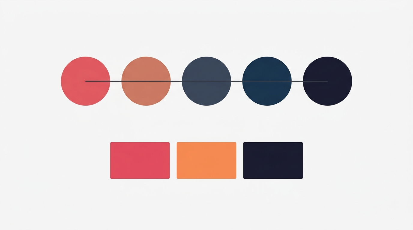
10 Color Palette Ideas for Eye-Catching Carousel Posts
Color is the first thing people notice about your carousel — before they read a single word. Research shows it takes just 90 seconds for someone to form an opinion about a post, and up to 90% of that assessment is based on color alone.
Choosing the right palette isn’t just about looking good. It’s about communicating the right feeling, stopping the scroll, and building a recognisable brand that your audience associates with value.
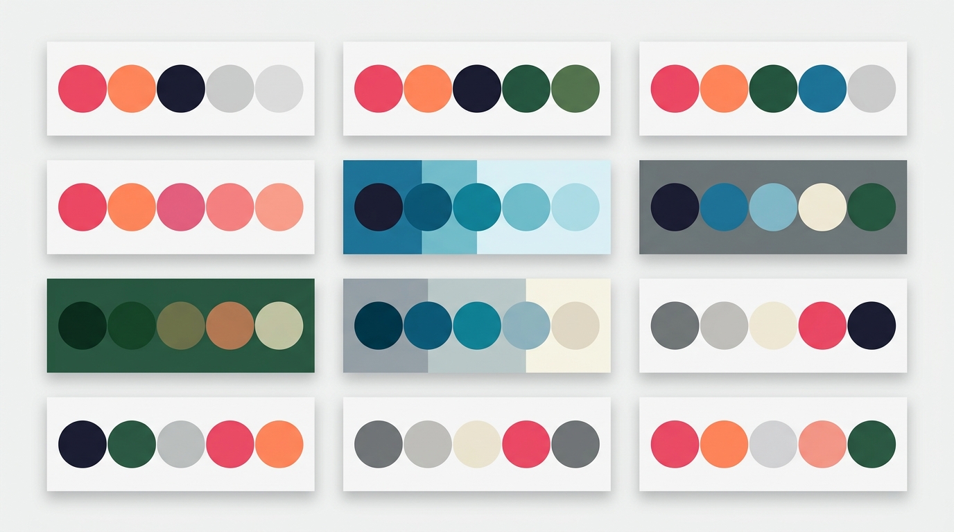
Here are 10 curated color palettes designed specifically for carousel posts, complete with hex codes and guidance on when to use each one.
1. Midnight
Palette: Deep navy backgrounds with cool blue accents and crisp white text.
| Role | Color | Hex |
|---|---|---|
| Background | Dark Navy | #1A1A2E |
| Accent | Royal Blue | #0F3460 |
| Highlight | Electric Blue | #4E9AF1 |
| Text | White | #FFFFFF |
Best for: Technology, finance, professional services, B2B content. Midnight conveys authority and sophistication. It’s the palette of choice for thought leaders who want their carousels to feel substantial and trustworthy.
Psychology: Dark blue evokes trust, stability, and intelligence — which is why most banks and tech companies use it. On a carousel, it creates a premium feel that makes your content stand out against the bright, casual posts typical of most feeds.
2. Ocean
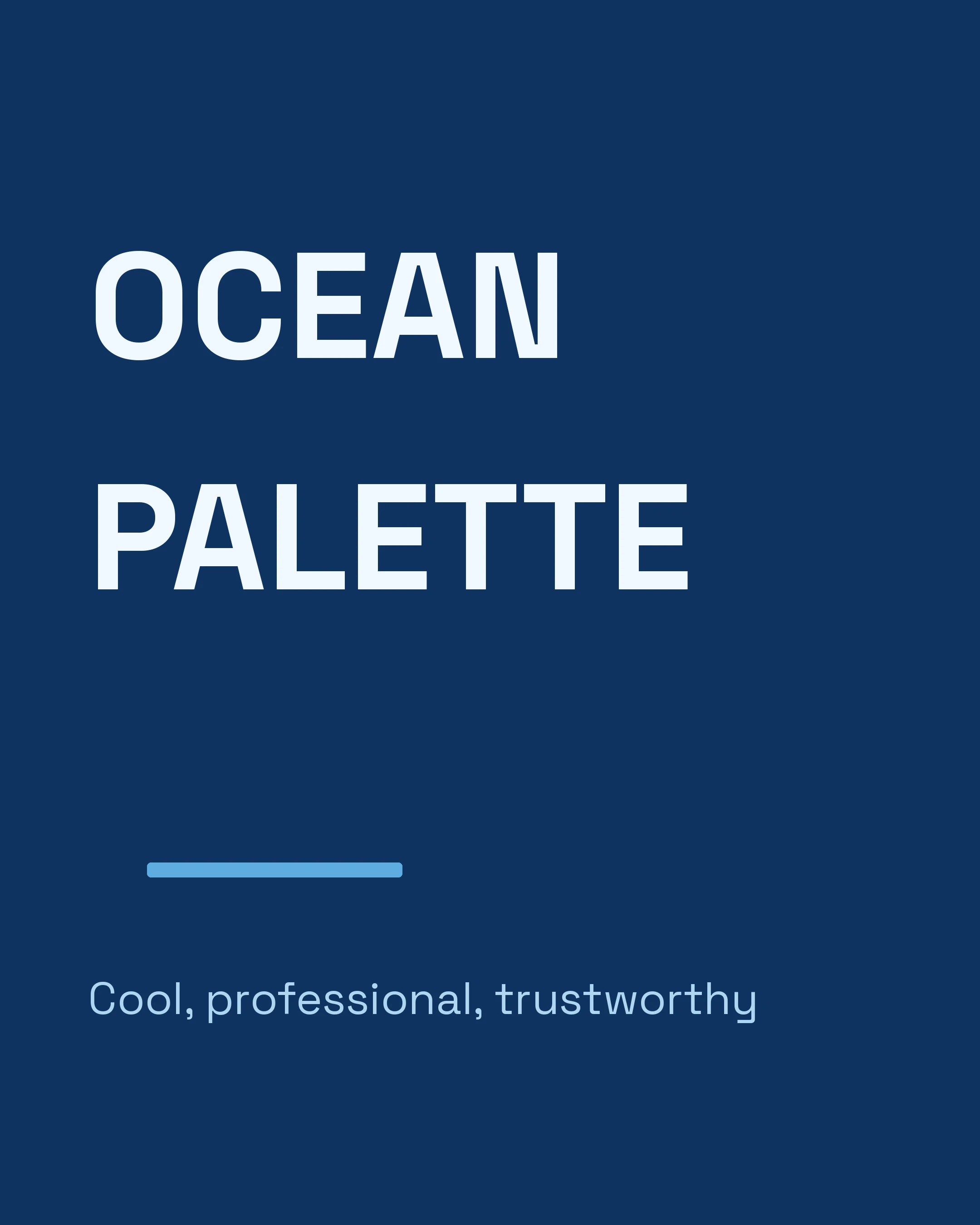
Palette: Teal and aqua tones with a fresh, approachable feel.
| Role | Color | Hex |
|---|---|---|
| Background | Deep Teal | #0A4D68 |
| Accent | Ocean Blue | #088395 |
| Highlight | Aqua | #05BFDB |
| Text | Soft White | #F5F5F5 |
Best for: Health and wellness, coaching, therapy, mindfulness content. Ocean colors feel calming and trustworthy without being corporate.
Psychology: Teal combines the calming properties of blue with the renewal energy of green. It suggests balance, healing, and clarity — perfect for content about personal growth or wellbeing.
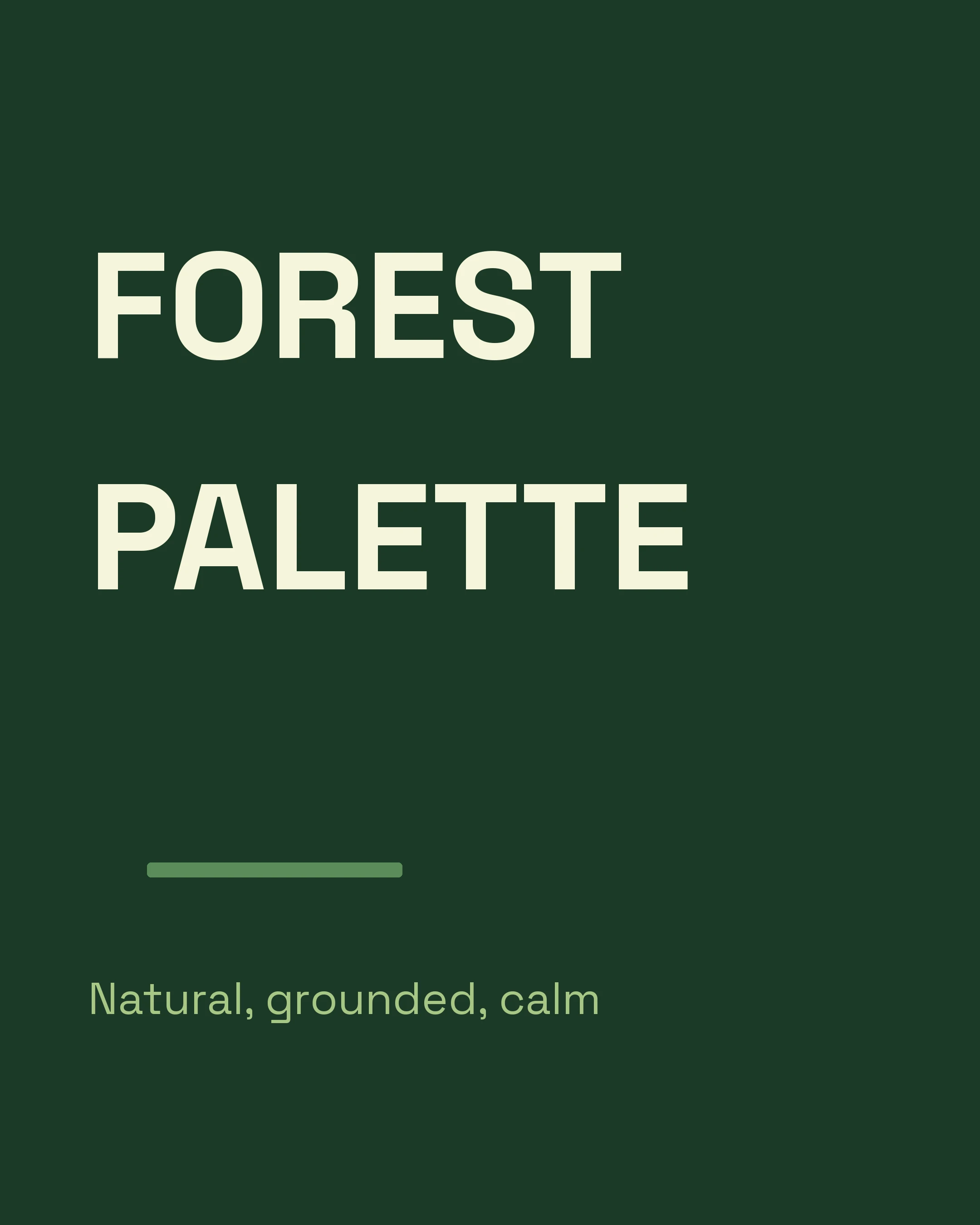
3. Forest
Palette: Rich greens with earthy warmth.
| Role | Color | Hex |
|---|---|---|
| Background | Deep Forest | #1B4332 |
| Accent | Sage Green | #52796F |
| Highlight | Spring Green | #95D5B2 |
| Text | Cream | #F8F4E8 |
Best for: Sustainability, nature, organic products, nutrition, eco-brands. Forest palettes signal environmental consciousness and natural authenticity.
Psychology: Green is universally associated with growth, health, and freshness. A forest palette specifically conveys depth and maturity — it’s green that says “we’re serious about this,” not just trendy.
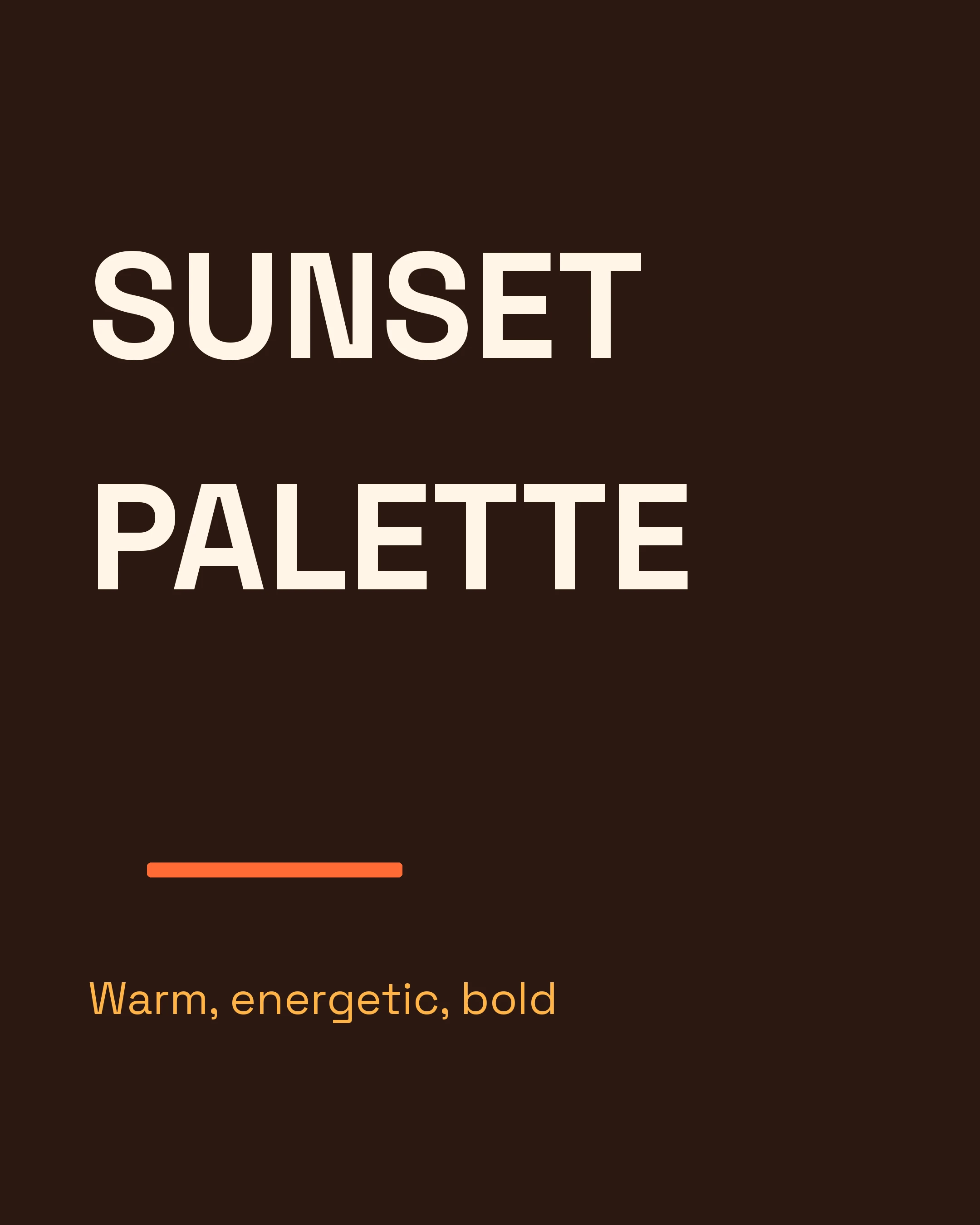
4. Sunset
Palette: Warm gradients from golden amber to soft coral.
| Role | Color | Hex |
|---|---|---|
| Background | Warm Dark | #2D1B2E |
| Accent | Burnt Orange | #E86A33 |
| Highlight | Golden Amber | #FFB347 |
| Text | Warm White | #FFF5E4 |
Best for: Creative industries, food, travel, lifestyle content. Sunset palettes are warm, inviting, and immediately eye-catching in any feed.
Psychology: Warm colors trigger appetite, excitement, and optimism. They create a sense of urgency and energy — which makes them ideal for promotional carousels or content designed to inspire action.
5. Lavender
Palette: Soft purples with elegant grey undertones.
| Role | Color | Hex |
|---|---|---|
| Background | Soft Purple | #2E1A47 |
| Accent | Lavender | #7B68AE |
| Highlight | Light Violet | #C3AED6 |
| Text | Pearl | #F0EBF5 |
Best for: Beauty, luxury, spirituality, premium coaching, women-focused brands. Lavender feels sophisticated and calming without being cold.
Psychology: Purple has long been associated with creativity, wisdom, and luxury. Lighter purple shades (lavender) add femininity and softness, making this palette versatile for both premium branding and approachable lifestyle content.
6. Coral
Palette: Vibrant coral-red with warm pink undertones.
| Role | Color | Hex |
|---|---|---|
| Background | Deep Rose | #3D0C11 |
| Accent | Coral | #E94560 |
| Highlight | Soft Pink | #FF8E8E |
| Text | White | #FFFFFF |
Best for: Bold brands, fitness, motivation, social media marketing, creators who want to stand out. Coral demands attention.
Psychology: Coral sits between red (passion, urgency) and pink (playfulness, warmth). It’s energetic without being aggressive, making it one of the most effective accent colors for carousel posts that need to stop the scroll.
7. Sage
Palette: Muted sage greens with neutral warmth.
| Role | Color | Hex |
|---|---|---|
| Background | Light Sage | #F5F5F0 |
| Accent | Sage Green | #9CAF88 |
| Highlight | Deep Olive | #5F7161 |
| Text | Charcoal | #2C3E2D |
Best for: Minimalist brands, interior design, wellness, stationery, soft-spoken branding. Sage is calming and contemporary.
Psychology: Sage green is the design world’s neutral — it pairs with everything and offends no one. It suggests sophistication, sustainability, and a curated aesthetic. Perfect for brands that want to feel “effortlessly stylish.”
8. Slate
Palette: Cool greys with blue undertones and sharp contrast.
| Role | Color | Hex |
|---|---|---|
| Background | Charcoal | #1E2A3A |
| Accent | Steel Blue | #475B6F |
| Highlight | Ice Blue | #8EACCD |
| Text | Silver White | #EEF1F5 |
Best for: SaaS, engineering, architecture, data, analytics. Slate communicates precision and technical competence.
Psychology: Cool greys suggest objectivity and professionalism. When paired with blue undertones, they evoke the feeling of precision instruments and clean interfaces — ideal for technical or data-driven content.
9. Warm
Palette: Earthy terracotta and sand tones.
| Role | Color | Hex |
|---|---|---|
| Background | Sand | #F5ECD7 |
| Accent | Terracotta | #C67C4E |
| Highlight | Clay | #D4A574 |
| Text | Dark Brown | #3C2A1E |
Best for: Interior design, artisan products, coffee, pottery, handmade goods, authentic storytelling. Warm palettes feel human and tangible.
Psychology: Earth tones evoke warmth, reliability, and craftsmanship. In a digital world full of neon gradients and electric colors, an earthy palette signals authenticity and a human touch.
10. Rose
Palette: Dusty rose with modern neutrals.
| Role | Color | Hex |
|---|---|---|
| Background | Soft Blush | #FFF0F0 |
| Accent | Dusty Rose | #D4838F |
| Highlight | Berry | #A4556B |
| Text | Deep Plum | #4A2C3D |
Best for: Bridal, skincare, floral, romance, feminine brands, self-care. Rose palettes are romantic and premium without being overtly pink.
Psychology: Dusty rose is pink grown up. It carries the warmth and femininity of pink but with enough grey and brown undertones to feel sophisticated and modern. It’s the go-to for brands that want to feel premium and approachable at the same time.
How to Choose the Right Palette for Your Brand
Picking a palette isn’t about choosing your favorite color. It’s about choosing colors that communicate the right message to your audience.
Ask yourself three questions:
1. What emotion should my carousel evoke? If you’re selling energy and excitement (fitness, events, marketing), go warm and vibrant — Sunset, Coral, or Warm. If you’re building trust and authority (finance, consulting, tech), go cool and deep — Midnight, Slate, or Ocean.
2. Who is my audience? Your palette should resonate with the people you’re trying to reach. A SaaS company targeting CTOs should probably avoid the Rose palette. A wellness coach probably doesn’t need Slate.
3. Does it work at thumbnail size? People first see your carousel as a small thumbnail in their feed. Your palette needs enough contrast to be legible and eye-catching at that size. Test by zooming out — if it turns into a muddy blob, you need more contrast.
The consistency rule
Once you pick a palette, stick with it. The most successful carousel creators use the same 2–3 palettes across all their posts. This builds brand recognition — your audience starts to recognize your content before they even read the text.
Consistency doesn’t mean monotony. You can alternate between two palettes (e.g., Midnight for educational content and Coral for promotional content) while maintaining a cohesive visual brand.
Applying Your Palette
Having a palette is step one. Here’s how to apply it effectively:
- Background: Use your darkest or lightest color. Dark backgrounds feel premium; light backgrounds feel clean and modern.
- Headings: Use your accent color or white (on dark backgrounds).
- Body text: Use high-contrast text — white on dark, dark on light. Never compromise readability for aesthetics.
- Highlights: Use your brightest color sparingly — for key numbers, important words, or icons. If everything is highlighted, nothing is.
- Borders and dividers: Use your accent color at 20–30% opacity for subtle visual structure.
The Carousel app includes all ten of these palettes as built-in options — Midnight, Ocean, Forest, Sunset, Lavender, Coral, Sage, Slate, Warm, and Rose — so you can apply a professional color scheme to your carousels with a single tap rather than manually entering hex codes.
One More Thing: Accessibility
Whatever palette you choose, make sure your text passes WCAG contrast standards. This means:
- Text should have a contrast ratio of at least 4.5:1 against its background
- Large text (24px+) can be slightly lower at 3:1
You can check your contrast at webaim.org/resources/contrastchecker.
Great color choices make your carousels beautiful. Accessible color choices make them beautiful and readable for everyone — including the 300 million people worldwide with color vision deficiency.
Create your first carousel in 60 seconds — free
Pick a template, paste your text, export. It's that simple. No design skills needed.
Download Carousel