
How to Write Carousel Captions That Get Comments
How to Write Carousel Captions That Get Comments
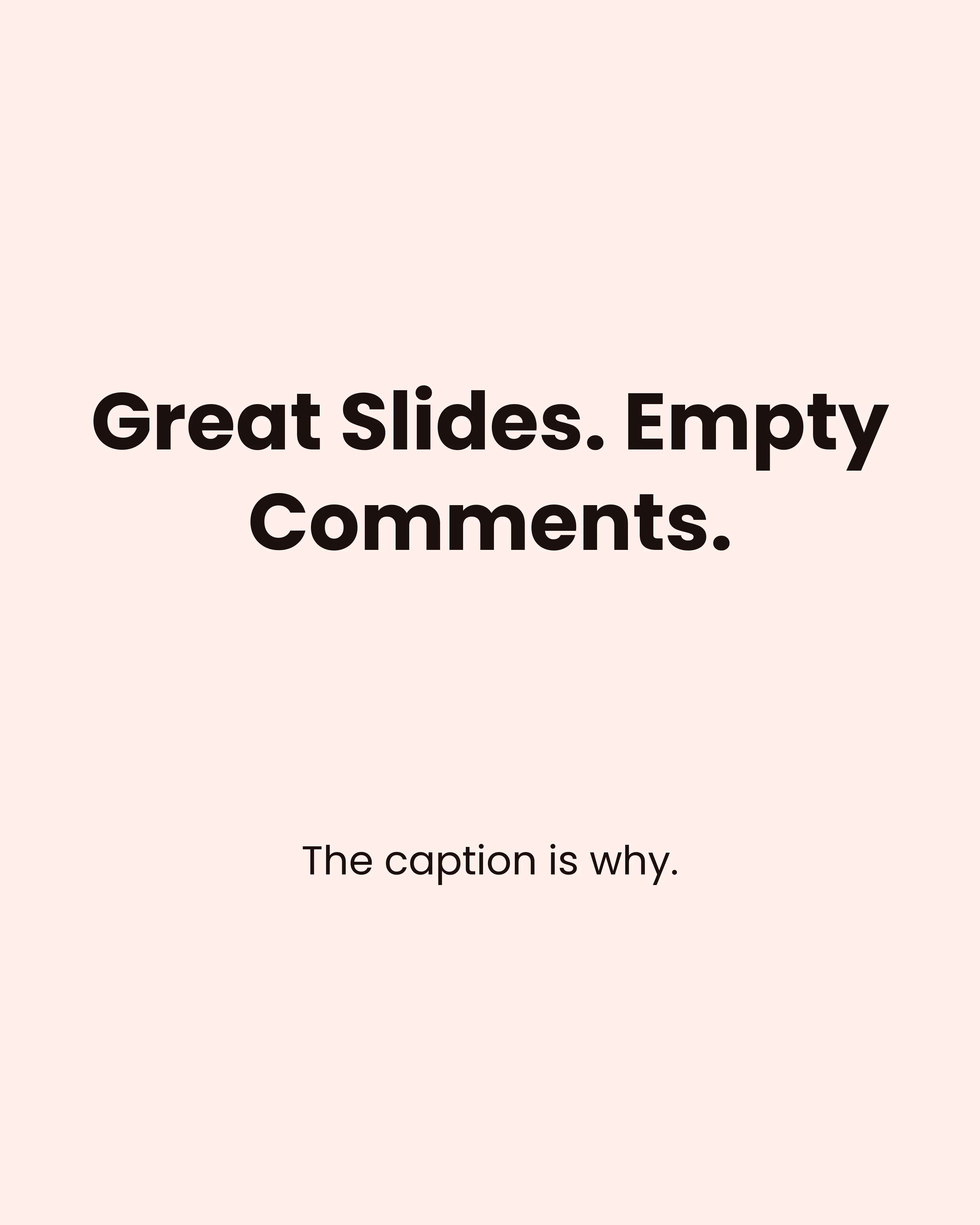
Most people spend two hours on their carousel slides and ninety seconds on the caption. Then they wonder why a post that looked great got fourteen likes and no conversation.
The caption is not an afterthought bolted onto the design. It is the part of the post that turns a passive swipe into a reply, and replies are what tell the algorithm your post is worth showing to strangers. A carousel earns the save. The caption earns the comment.
This guide covers a four-part caption structure that works on Instagram and LinkedIn, opening lines that survive the “more” cutoff, and the habits that quietly kill engagement.
Why the Caption Does Different Work Than the Slides
Your slides and your caption have different jobs, and treating them as one long message wastes both.
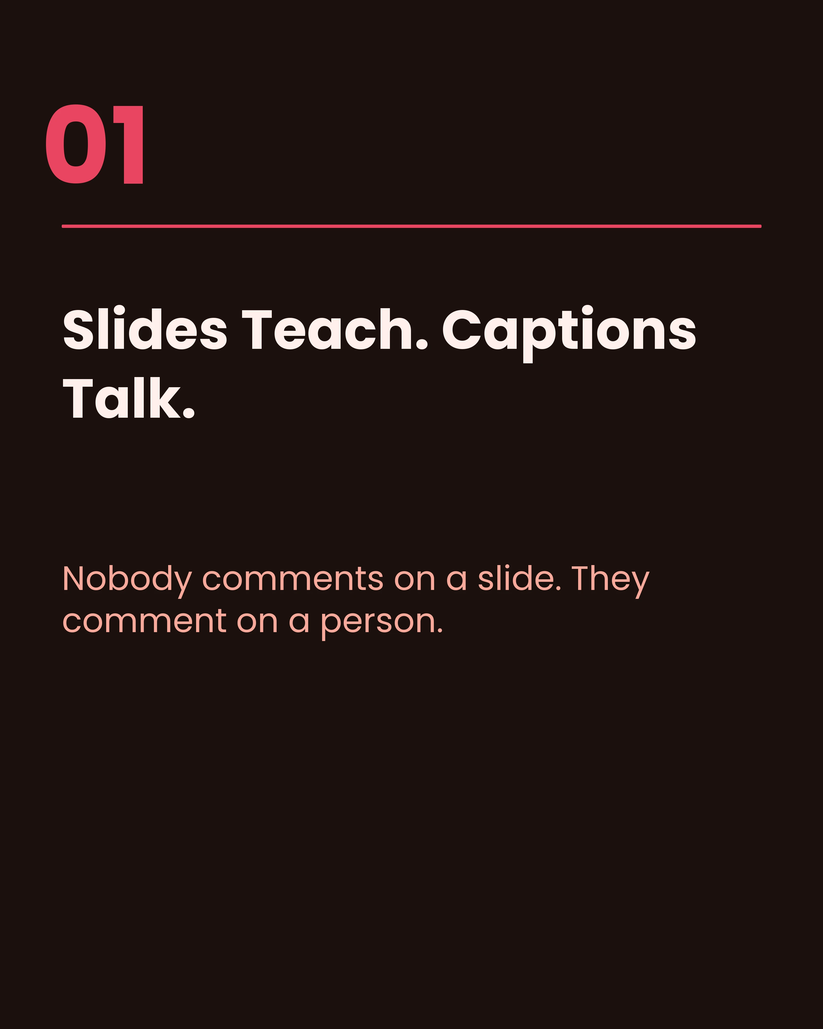
The slides teach. They are visual, scannable, and built to be saved and returned to later. Someone reads them with their thumb already moving.
The caption talks. It is where you add the context that would have cluttered a slide, tell the story behind the tip, admit what you got wrong, and ask the question that invites a reply. Nobody comments on a slide. They comment on a person.
That means the worst thing you can do is retype your slides into the caption. If the caption only repeats what the reader just swiped through, there is no reason to read it and nothing to respond to.
The Four-Part Caption Structure
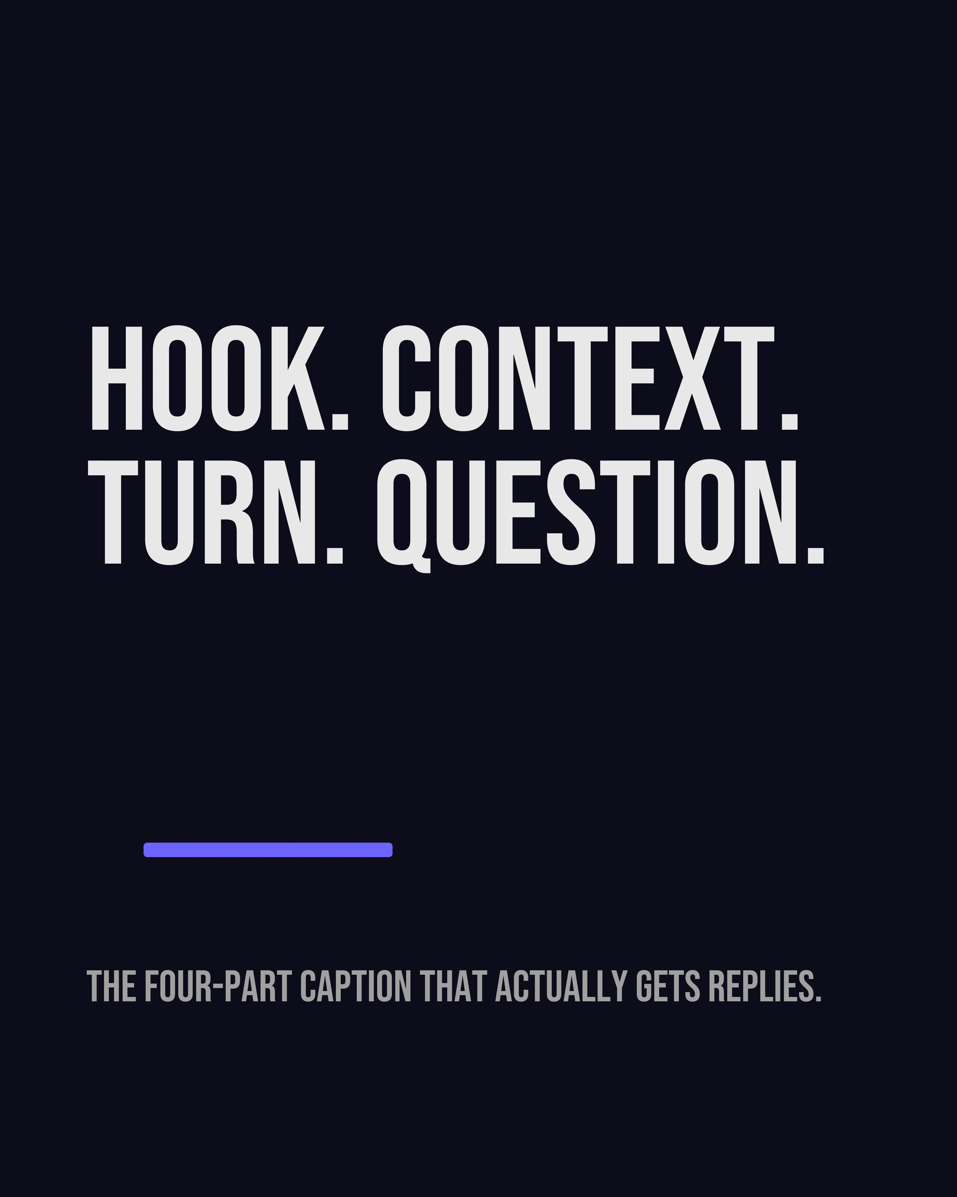
This structure works for almost every carousel, regardless of platform or niche.
1. The Hook Line
The first line is the only one people see before the “more” cutoff. Treat it with the same care you gave your cover slide. One short sentence, no preamble, no throat-clearing.
Openers that work:
- A confession: “I ran this offer for six months before I noticed the problem.”
- A specific number: “Three clients asked me the same question last week.”
- A flat contradiction: “Posting more did nothing for my reach.”
- A named moment: “A prospect ghosted me in March. Here is what I changed.”
Openers that fail: “Hey everyone!”, “Happy Monday!”, “Swipe to learn more”, and anything that starts with the topic rather than the tension.
2. The Context
Two or three short paragraphs that give the slides a story. This is where you explain how you learned the thing, who it applies to, and what it looked like before you figured it out. Specificity does all the work here. “A client” is forgettable. “A bakery owner in Leeds doing 40 orders a week” is not.
Keep paragraphs to one or two sentences with line breaks between them. Dense blocks of text get skipped on mobile every time.
3. The Turn
One line that gives the reader something to do with the information. Not a summary of the slides, but the practical instruction: “If you only change one thing this week, change your first line.” This is the sentence people screenshot.
4. The Question
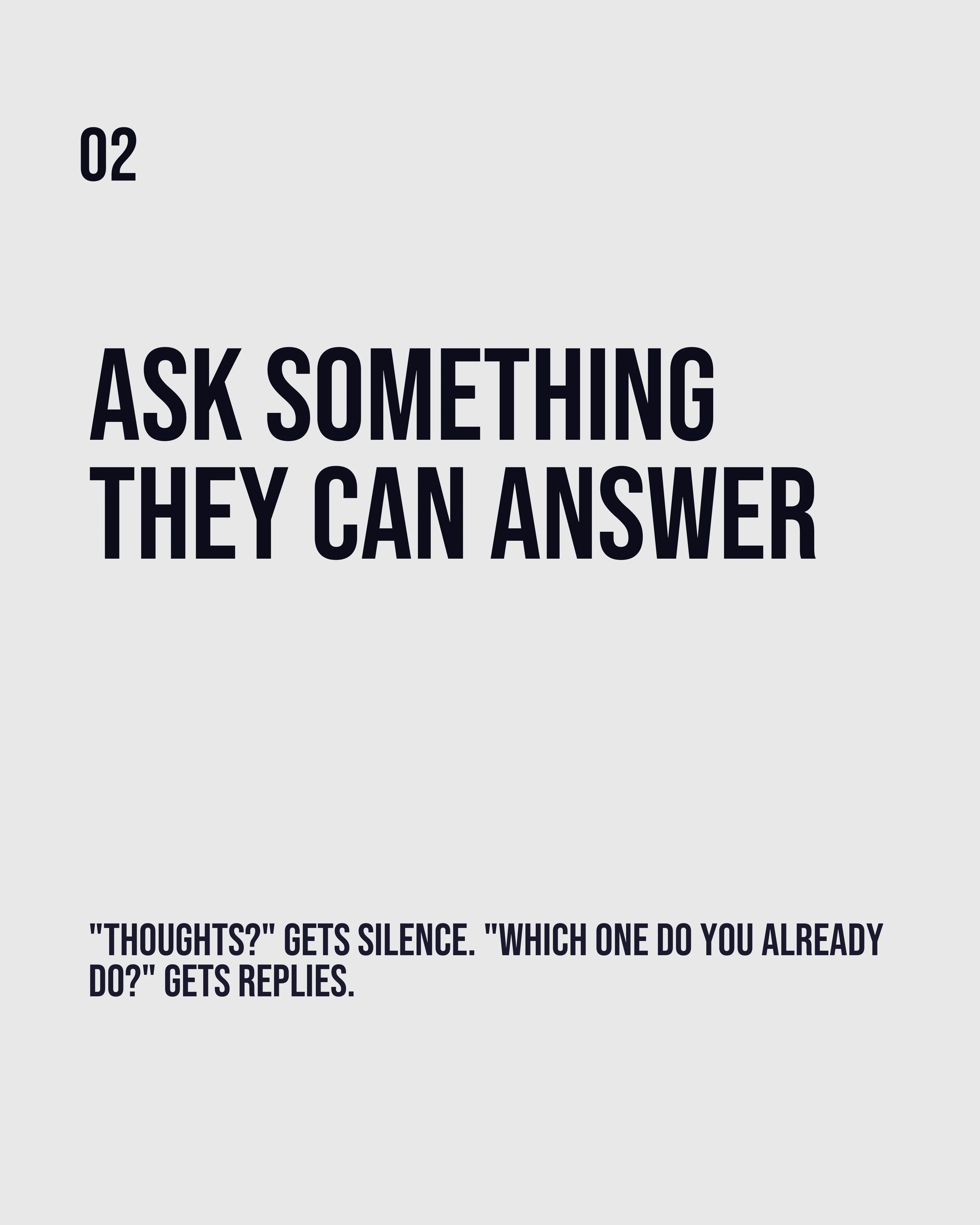
End with one specific question. Not “thoughts?” and not “do you agree?” Those are too broad to answer quickly, and a comment that takes effort does not get written.
Ask something a person can answer in five words: “Which of these five do you already do?” or “What is the worst opening line you have seen this week?” Narrow questions get answered. Open ones get scrolled past.
Length: How Long Should a Carousel Caption Be?
There is no universal number, but there is a useful rule: the caption should be as long as the story needs and no longer.
Short captions (under 50 words) work when the slides are self-contained and the value is obvious, such as a checklist or a stat. Medium captions (100-200 words) suit most educational posts, giving room for context and a question. Long captions (300 words and up) work on LinkedIn and for personal-story posts, where the caption is the content and the carousel is the illustration.
What matters more than length is formatting. Line breaks between every one or two sentences, no walls of text, and no mid-sentence emoji dividers.
Four Caption Mistakes That Cost You Comments
Repeating the slides. If the caption is a transcript, delete it and write the story instead.
Burying the hook. Anything after the first line is invisible until someone taps “more.” Front-load.
Stacking hashtags at the top. Put them at the end or in a comment. Nobody has ever been persuaded by a hashtag block above the fold.
Ending with nothing. A caption with no question is a monologue. You get what you ask for, and if you ask for nothing you get silence.
Match the Caption to the Framework
If your carousel uses a copywriting framework, the caption should extend it rather than repeat it. A PAS carousel that agitated a problem across five slides should use the caption to show the solution working in a real situation. An AIDA carousel that ended on a call to action should use the caption to lower the barrier to that action: what it costs, how long it takes, what happens next.
The slides do the structure. The caption does the proof.
How Carousel Helps You Ship the Whole Post
The reason captions get rushed is that the design took all the energy. Carousel turns an idea or a rough outline into structured slides in a couple of minutes, using frameworks like AIDA, PAS, and Listicle, which leaves the time and attention for the caption where the conversation actually happens.
Key Takeaways
- Slides teach and get saved; captions talk and get comments. Do not make them the same message.
- Use a four-part structure: hook line, context, turn, question.
- The first line is the whole caption to most readers. No greetings, no preamble.
- End with one narrow question a person can answer in five words.
- Format for mobile: short paragraphs, line breaks, hashtags at the bottom.
Create your first carousel in 60 seconds — free
Pick a template, paste your text, export. It's that simple. No design skills needed.
Download Carousel