Barber Carousel Posts: 6 Ideas That Keep the Chair Booked
Barber Carousel Posts: 6 Ideas That Keep the Chair Booked
Most barbers already post. The feed is usually a run of fresh cuts shot from the same angle under the same light, one photo each, captioned with the name of the style. It looks good and it tells a new customer almost nothing.
The person scrolling past is not asking whether you can cut a fade. Every shop on the high street can cut a fade. They are asking whether you can cut their hair, how long it will take, what it costs, whether they will be waiting an hour on a Saturday, and whether the barber will listen when they say “not too short on top.”
A single photo answers none of that. A carousel can answer most of it in one post, and that is the case for using them.
This guide covers six carousel ideas for barbers, the copywriting framework each one maps to, example slides for every idea, and the palette and type choices that make a barbershop feed look like one shop rather than a camera roll.
Why Carousels Work for Barbers
Three things about barbering make the format a natural fit.
The work is a sequence. A fade is built in stages: baseline, blend, top, line-up, beard. A finished photo hides the skill, because a clean result looks effortless. Show the stages and the viewer sees the part they are actually paying for.
Customers buy on repeat. A barbershop lives on people who come back every few weeks. Content that shows how a cut grows out, when to rebook, and which barber suits which hair type does more for retention than another fresh-cut photo.
The questions are practical. Price, wait times, which barber, which style. These are the things people message about, and a carousel can hold a price list, a comparison or an introduction in a form that gets saved and shared with a mate who needs a trim.
The frameworks that fit best are Before-After-Bridge for transformations and This or That for the style comparisons that come up in the chair every day.
All the example slides below are written as posts from one fictional shop, Kingsland Barbers on Kingsland Road in Dalston, so you can see how the ideas hang together as a single feed. Swap in your own shop name, street and prices.
Six Carousel Ideas for Barbers
1. The Full Fade Transformation (Before-After-Bridge)
This is the flagship post, and the one most barbers compress into a before-and-after pair. The pair skips the part that sells you. Someone deciding between two shops wants to see the blend being built, not just the result.
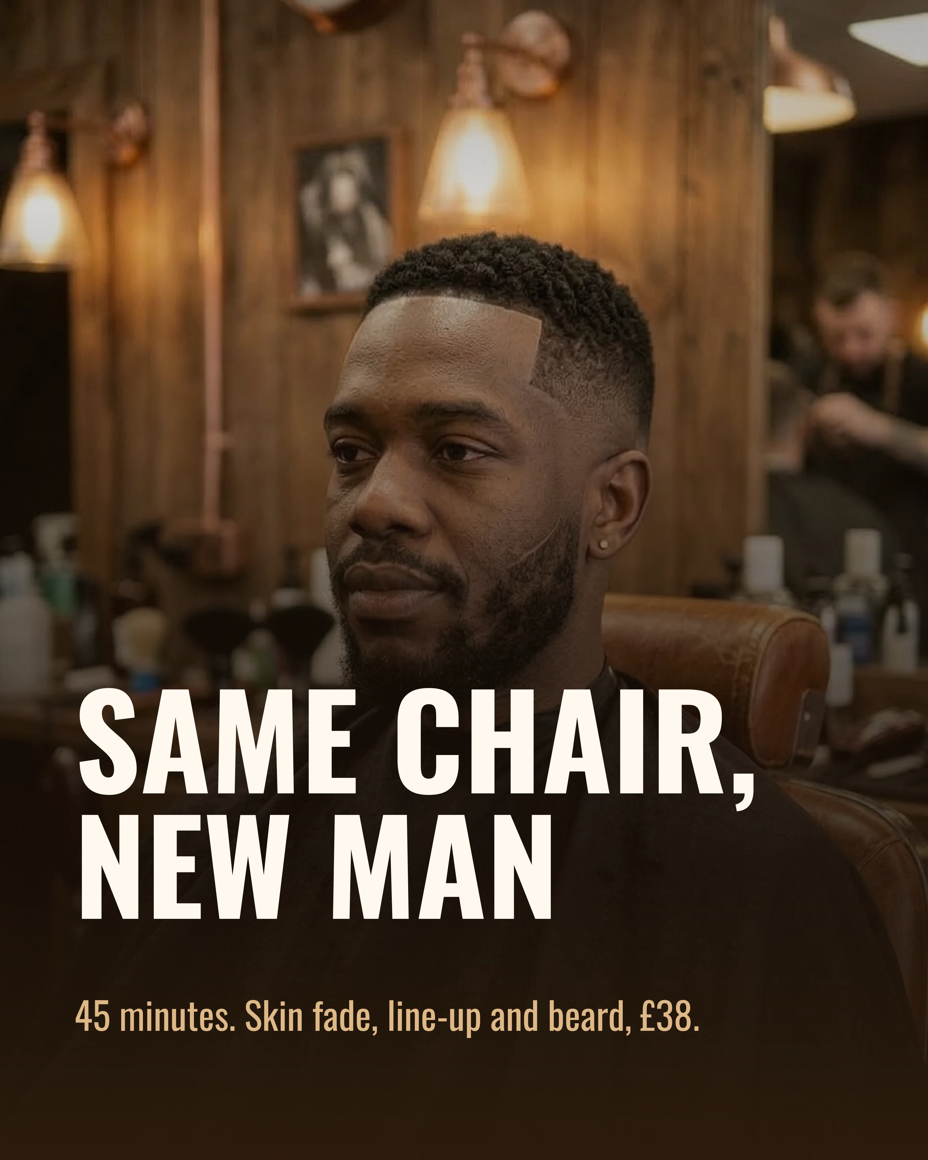
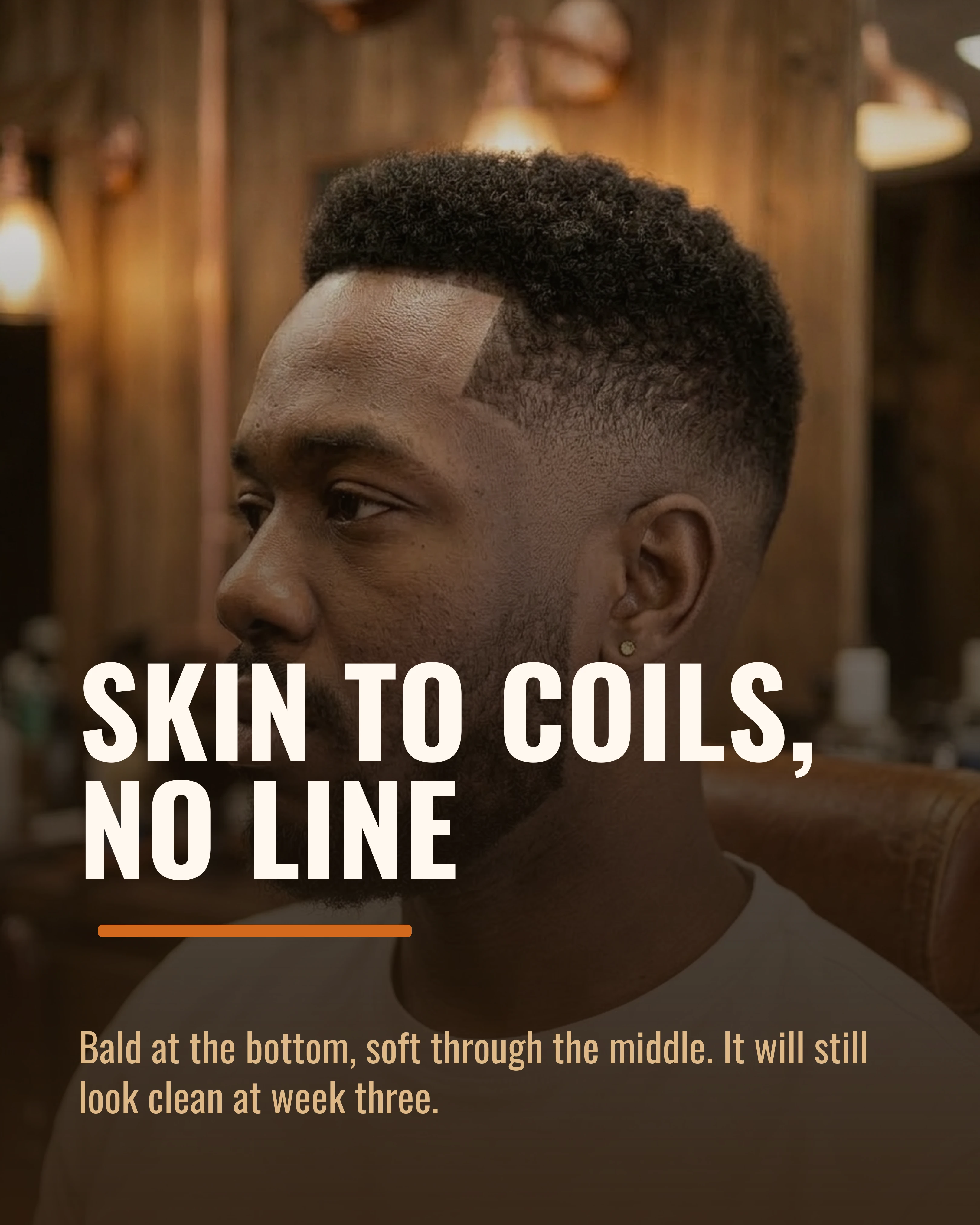
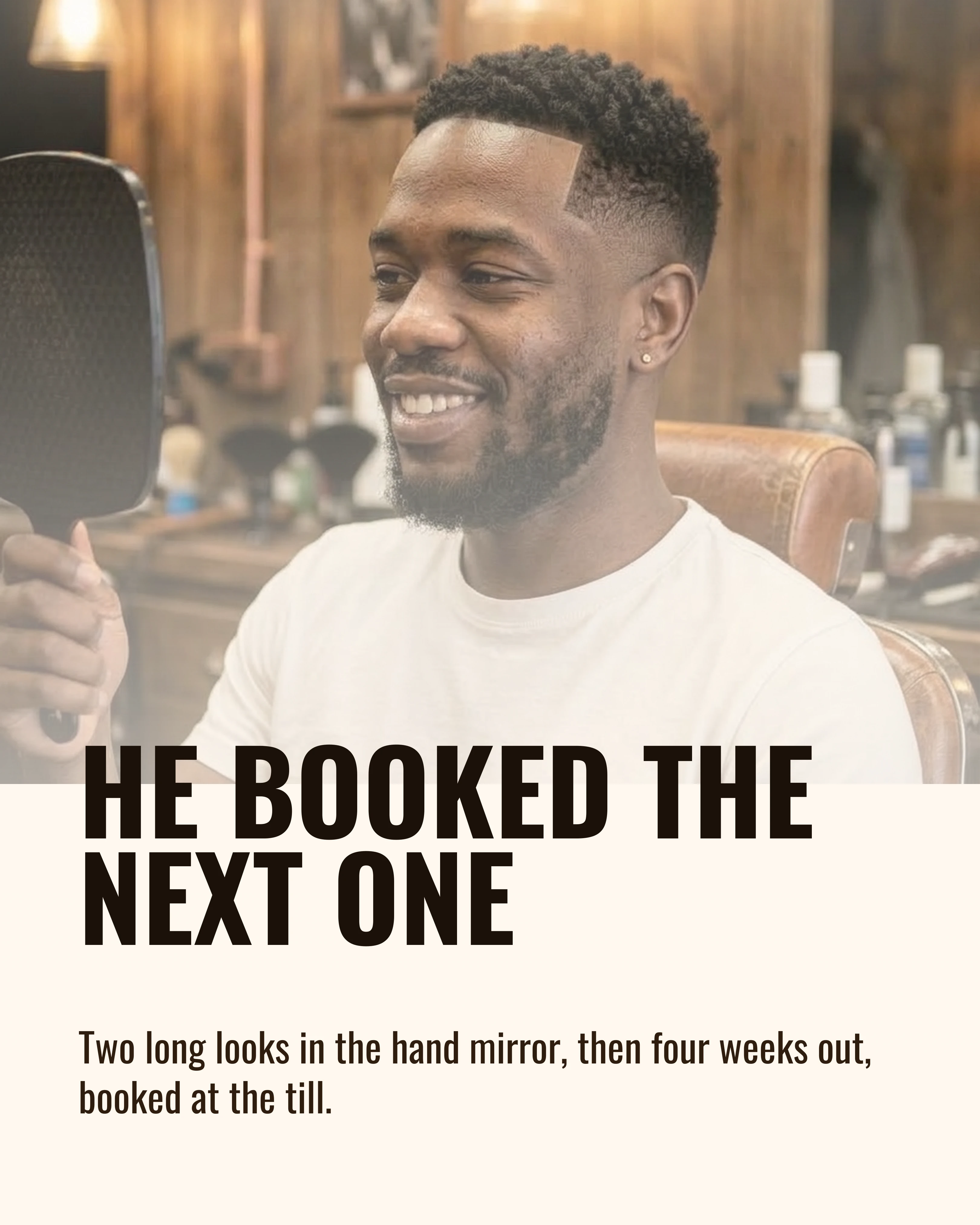
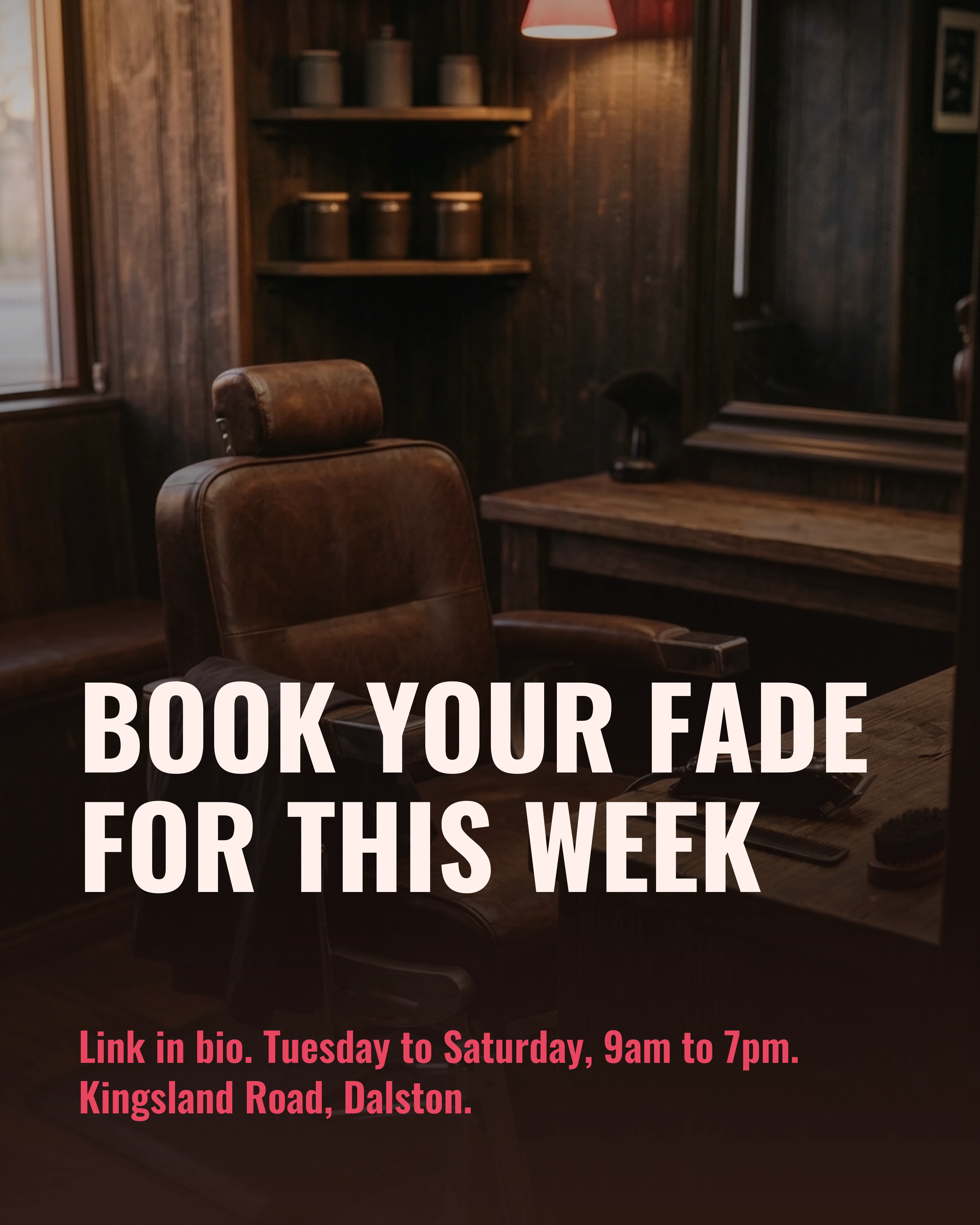
Shown below as a complete nine-slide carousel with the same client in every frame. The overgrown before shot is the cover, because six weeks of growth is the hook. The middle four slides walk through the cut stage by stage. The payoff shows the finished fade from the front, the side and the client’s own reaction, and the closing slide switches to a different palette so the booking ask reads as a separate slide rather than one more photo.
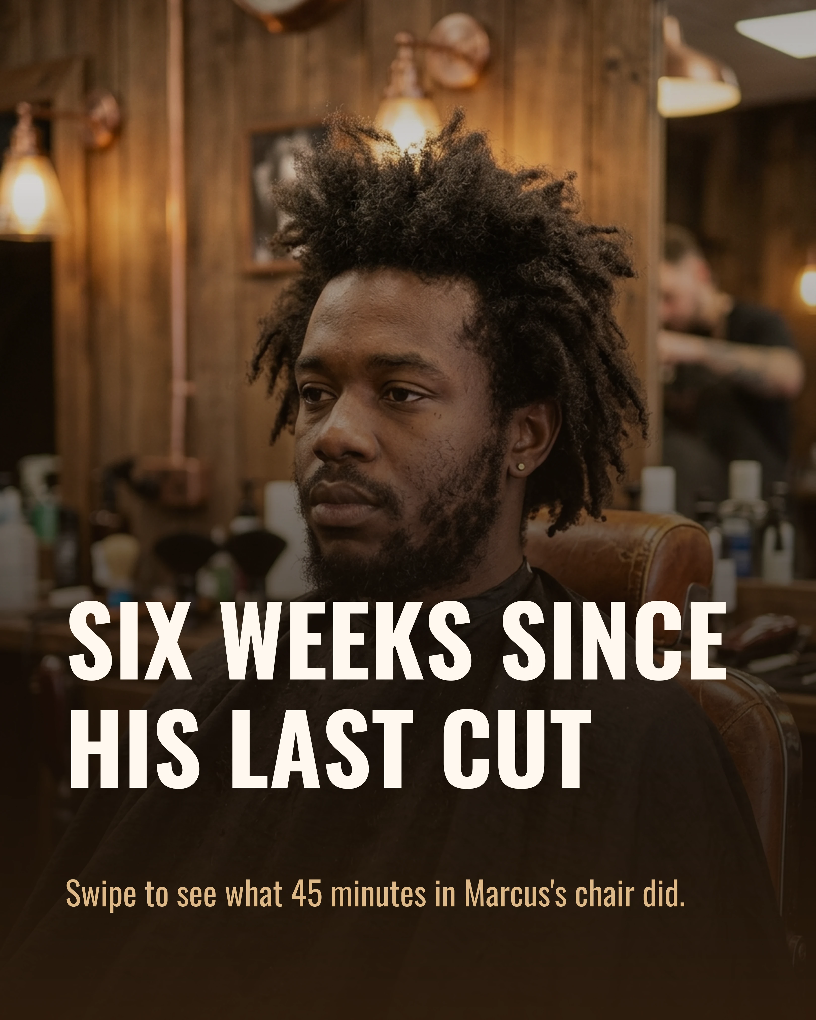
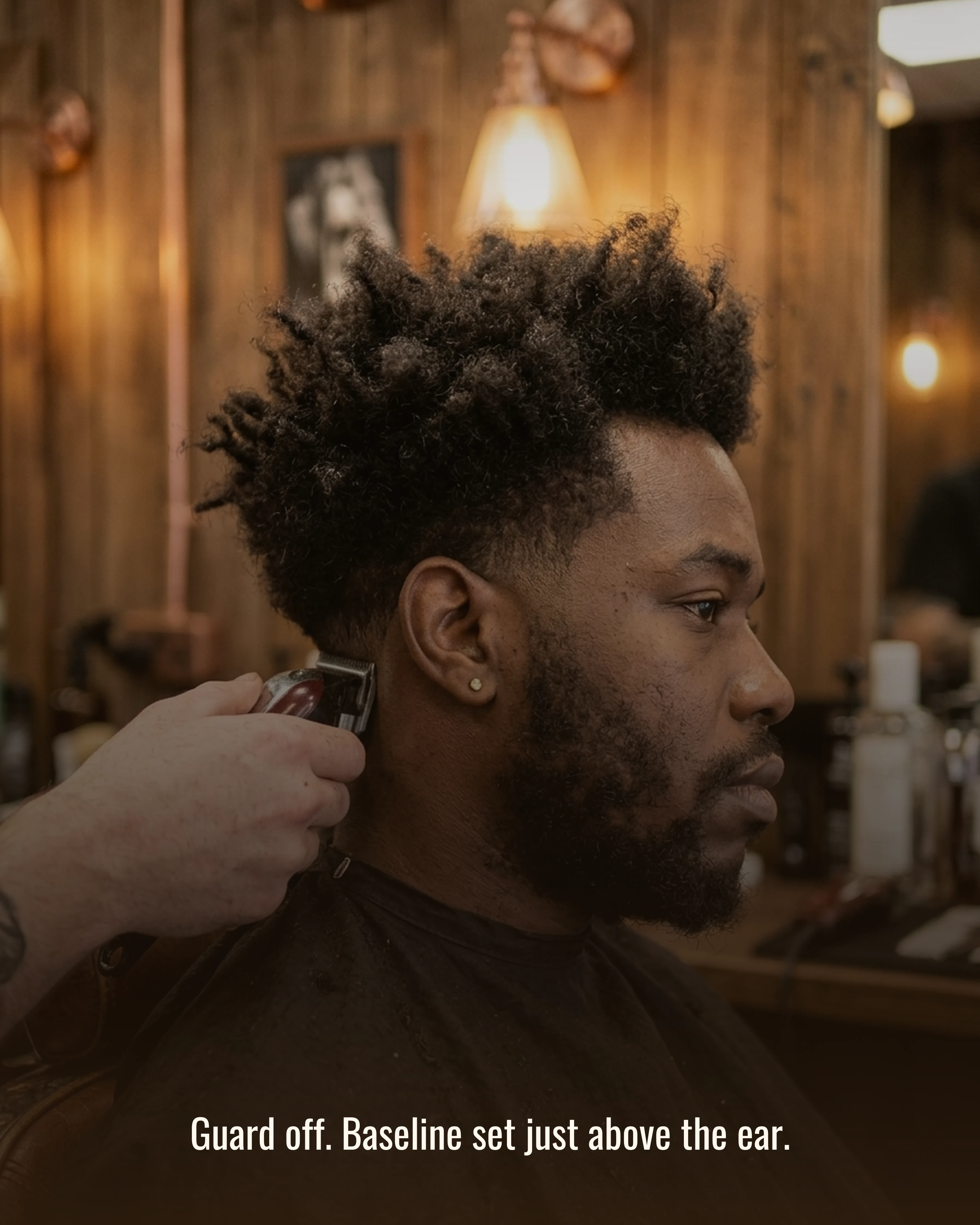
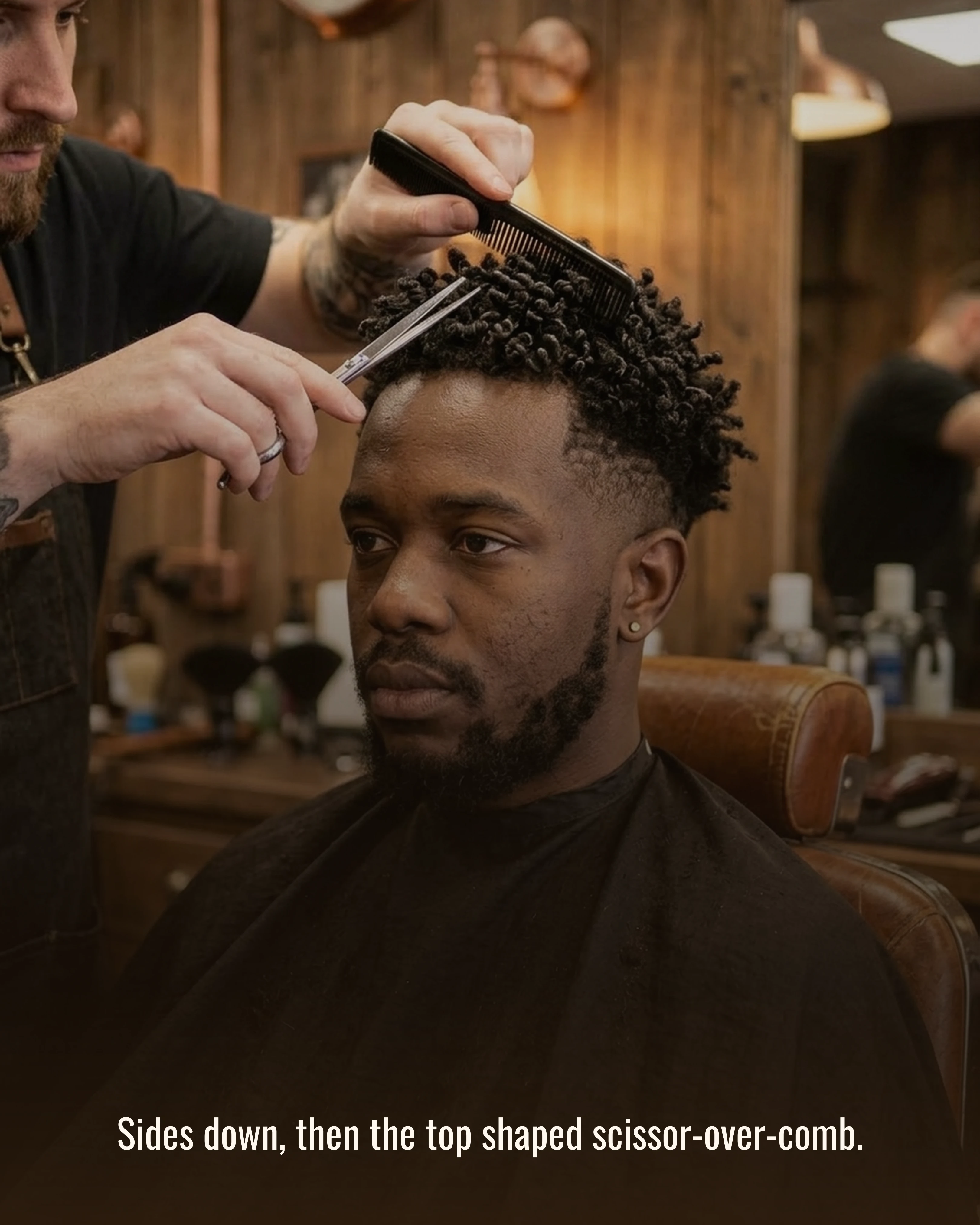
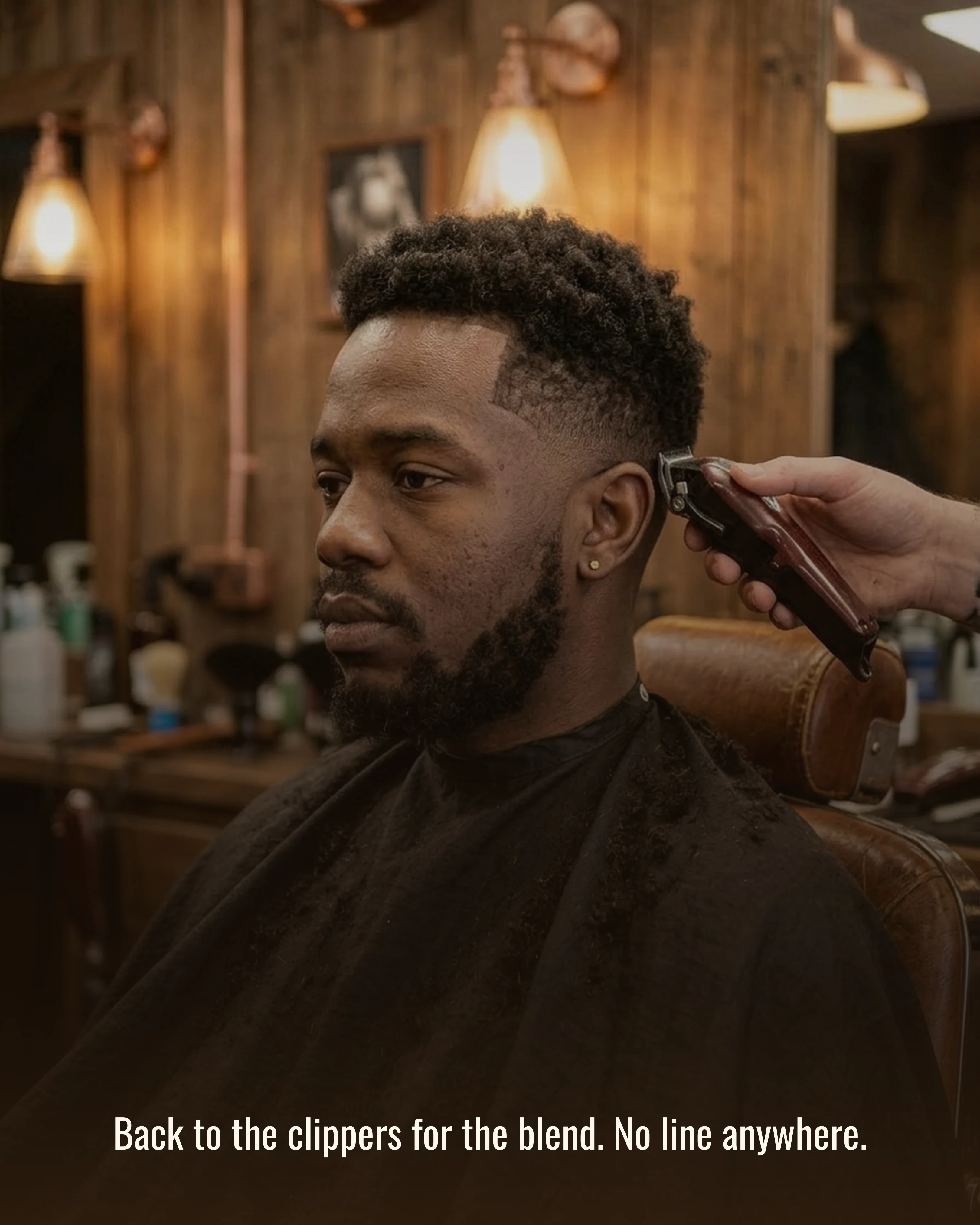
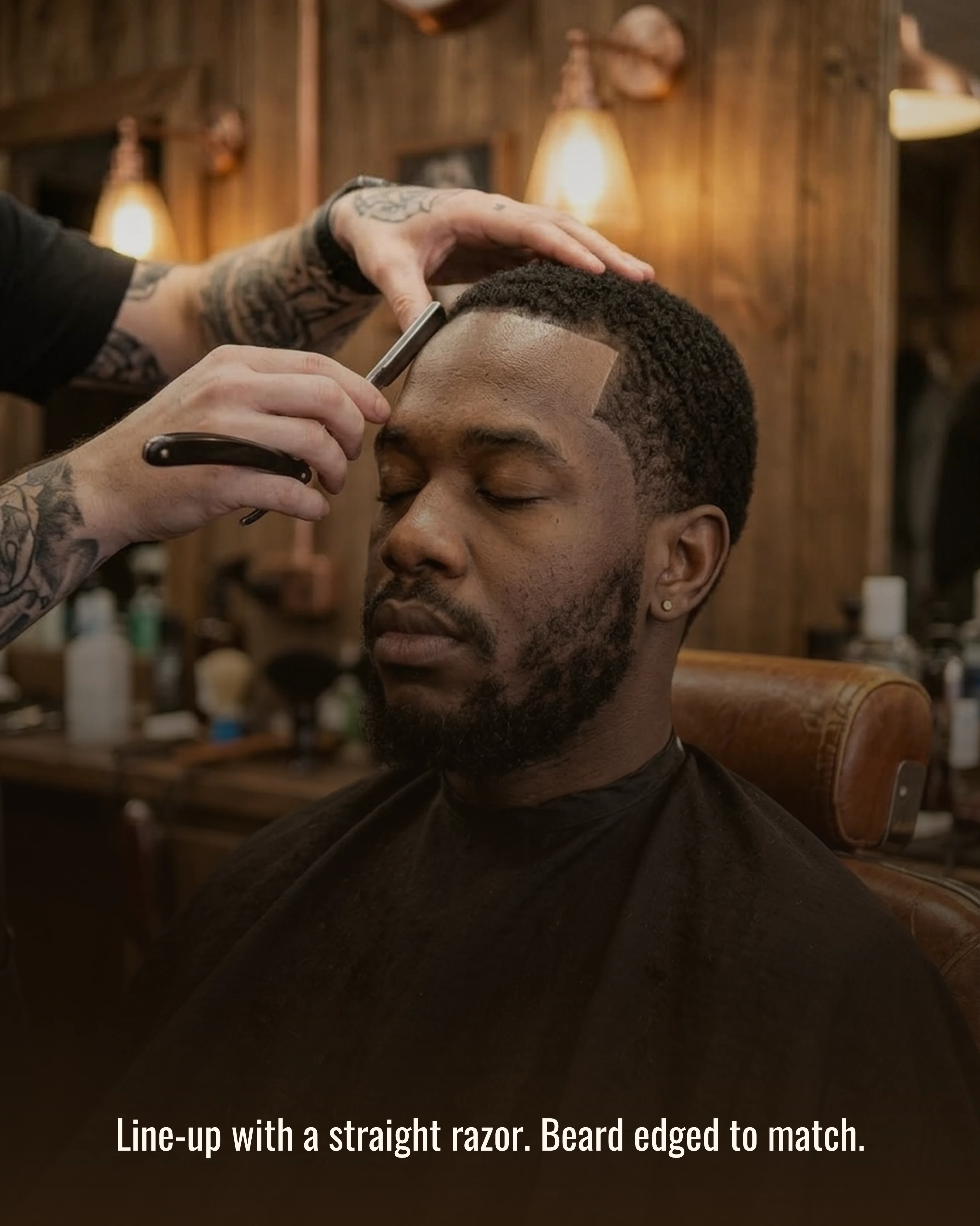
A few details that make this sequence work:
- One client, one chair, one light. If the lighting or angle changes between slides, the viewer starts wondering what else changed. Shoot every stage from roughly the same spot.
- Captions describe the step, not the skill. “Guard off. Baseline set just above the ear” tells the viewer what is happening. “Precision blending” tells them nothing.
- Put the price and time on the reveal. “45 minutes. Skin fade, line-up and beard, £38” removes the two questions that stop someone booking.
- End on one ask. Book this week, where, and when you are open. No second call to follow, no “tag a friend” on top.
Always get the client’s permission before posting their face, and ask whether they are happy to be tagged.
The remaining five ideas carry one representative slide each, so the article stays readable rather than turning into a gallery. Each one would be built out to seven or eight slides as a real post.
2. The Price List (Listicle)
The most-requested information in any barber’s messages is the price, and many shops still make people ask. A carousel price list does the job properly: one service per slide with what is included and how long it takes, plus the rules people always ask about (kids’ prices, student discounts, card or cash, what happens if you are late).
The cover slide can be the full menu at a glance, with the detail on the slides that follow. It is also the post you pin to the top of your profile, because it answers the first question every new follower has.
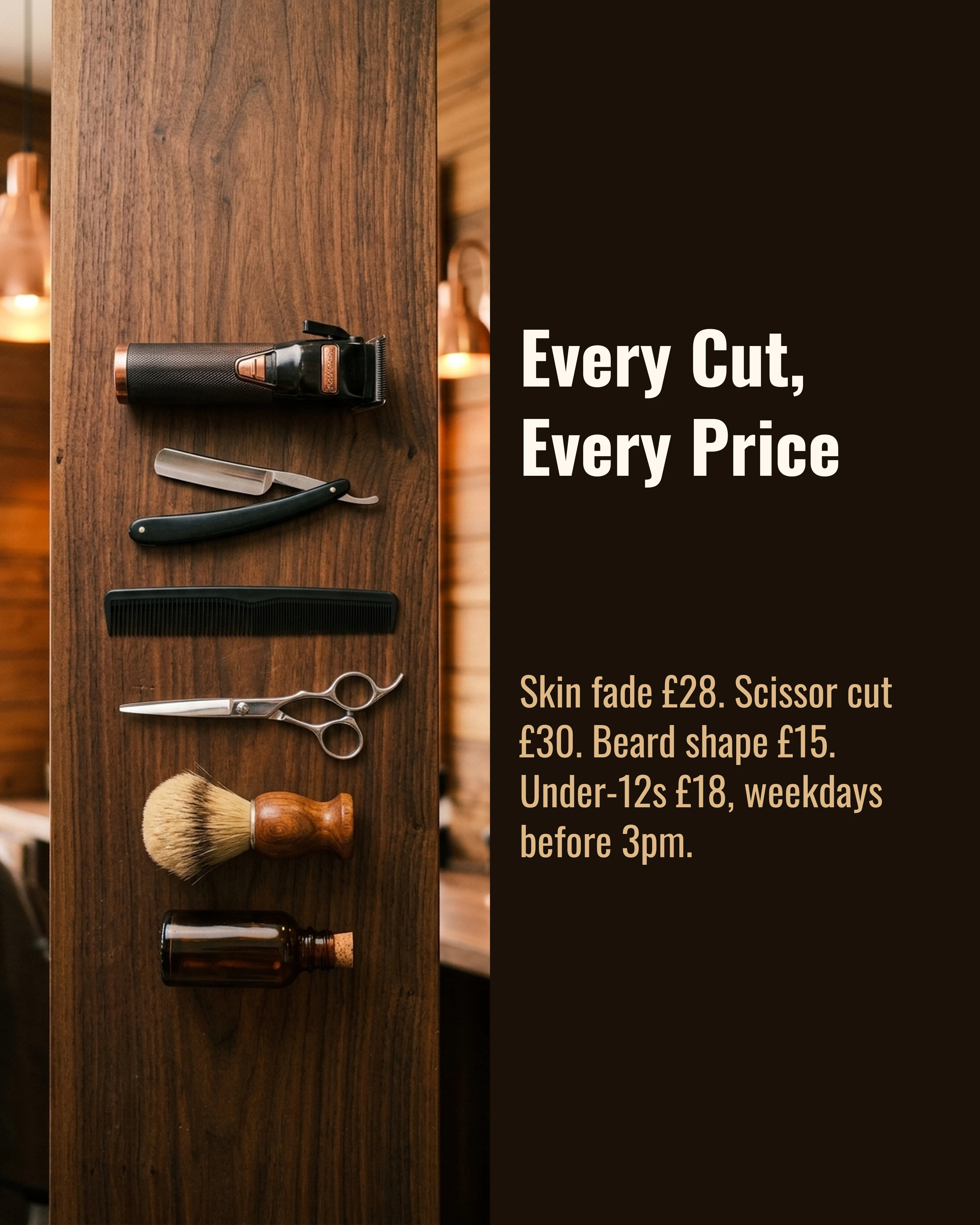
Example slides for the full post: the overview above, then “Skin Fade, £28 (40 minutes)”, “Beard Shape, £15”, “Kids’ Cuts, Weekdays Only” and a closing slide that points to the booking link.
3. “Fades Grow Out Badly” and Other Myths (Myth vs Fact)
Every barber hears the same half-truths in the chair: fades look terrible after a week, you need a cut every fortnight, washing your hair every day is fine, beard oil makes a beard grow faster. A Myth vs Fact carousel lets you correct them politely, one per slide.
This format also works as quiet proof of skill. The slide below answers the grow-out myth with a photo of a real fade at three weeks, which says more about the quality of the blend than any fresh-cut photo could.
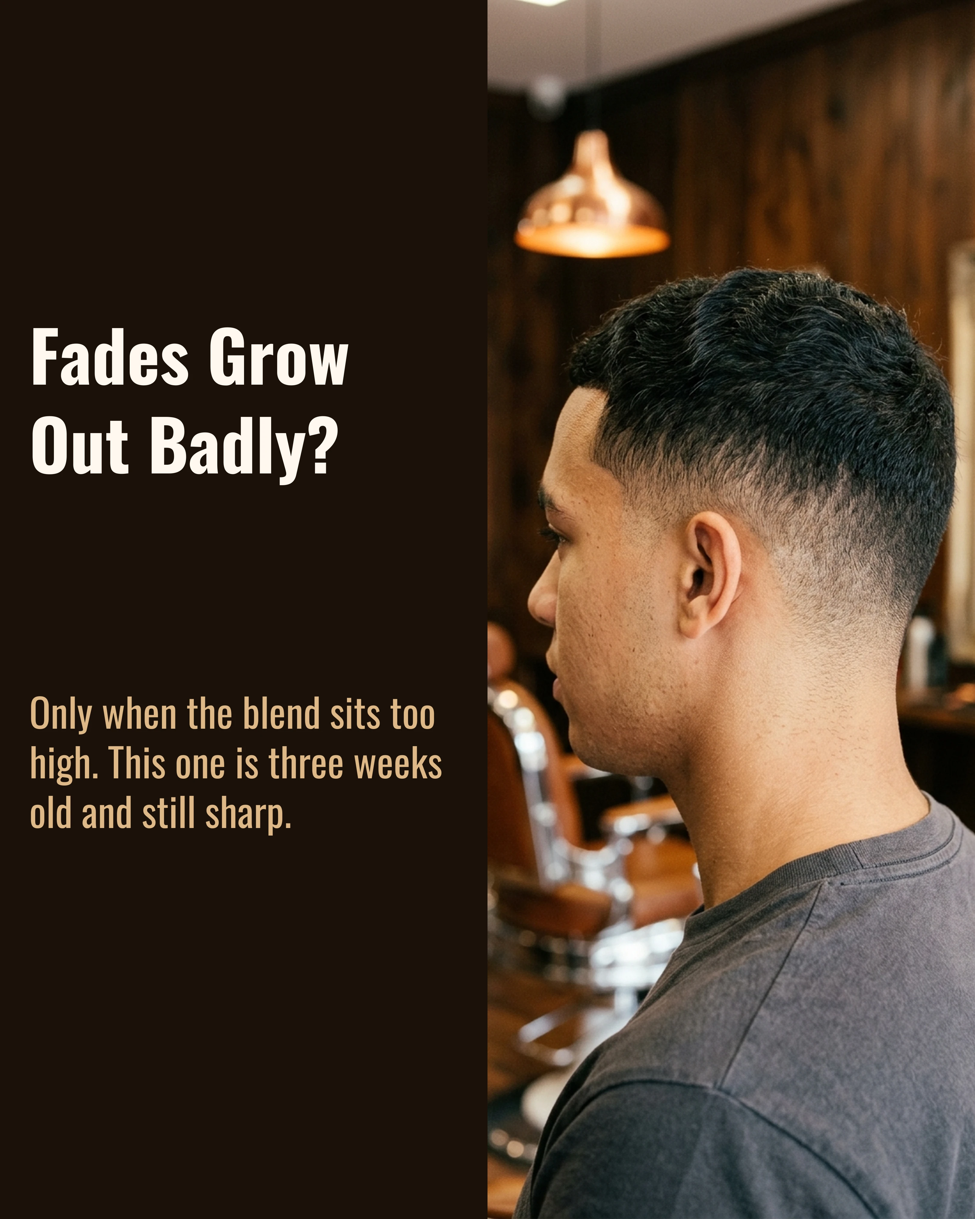
Example slides for the full post: “Fades Grow Out Badly?”, “You Need a Cut Every Two Weeks?”, “Beard Oil Makes It Grow?”, “Short Back and Sides Is One Cut?”, each with a one-line fact and a photo that backs it up.
4. Taper or Fade? (This or That)
Customers regularly sit down and ask for a fade when they mean a taper, or the reverse, and both of you only find out when it is too late. A This or That carousel sets them side by side: what each one is, how it looks from the back, how it grows out, and who it suits.
The payoff is fewer awkward moments in the chair and customers who arrive knowing what to ask for. It also gets saved and sent to friends, which is how a local shop picks up new faces.
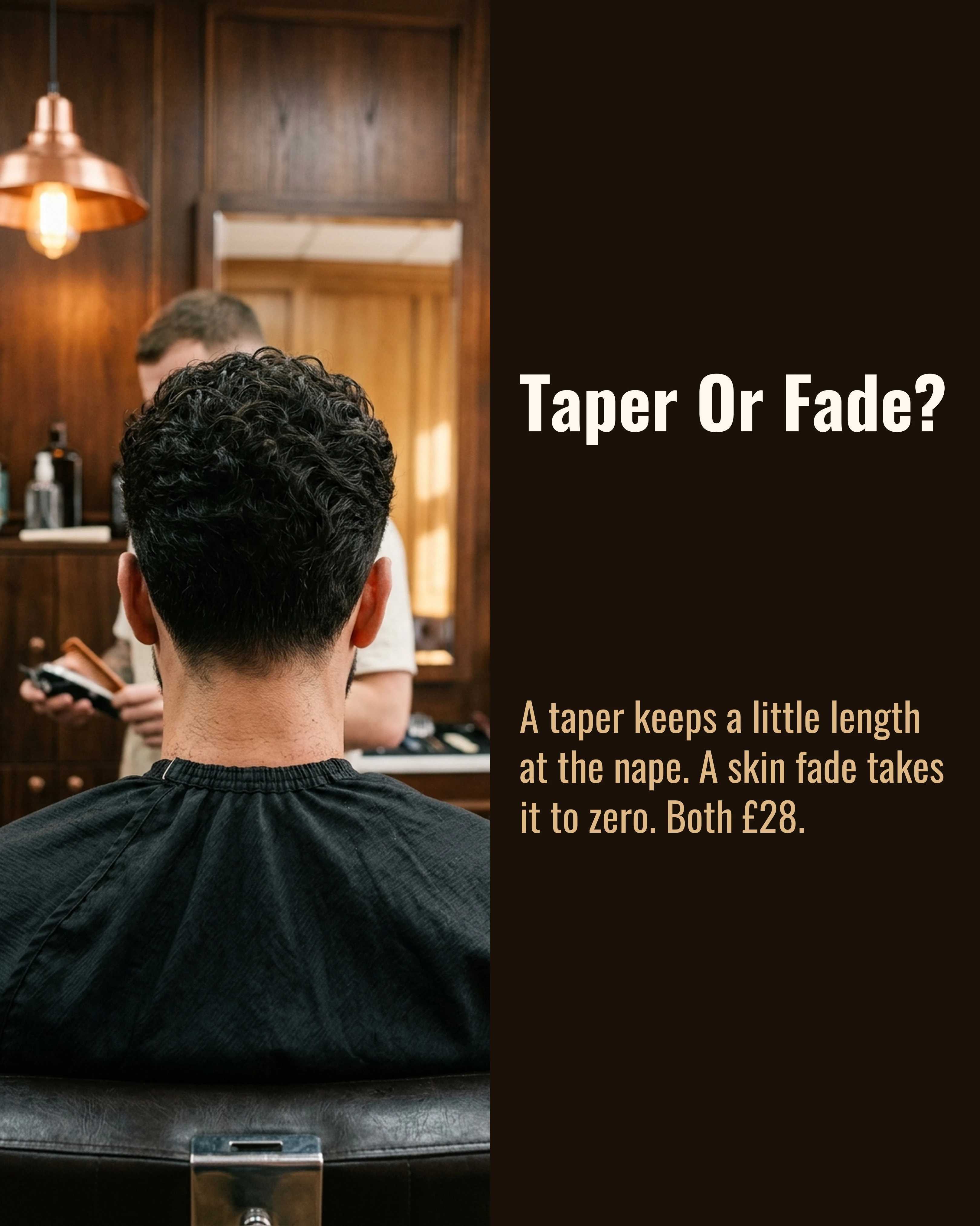
Example slides for the full post: “Taper Or Fade?” as above, then the neckline from behind for each, “Low, Mid or High Fade?”, “Squared or Tapered Neckline?”, and a closing slide asking people to screenshot the one they want and bring it in.
5. Meet the Barber (Storytelling)
People are loyal to a barber more than to a shop. An introduction carousel for each person on your team gives new customers a reason to book a specific chair: how long they have been cutting, what they are best at, which days they work, and one personal detail that makes them a person rather than a name on a booking page.
Keep it short and specific. “Curly tops and beard sculpts, late till 9pm Thursdays” is more useful than “passionate about the craft.”
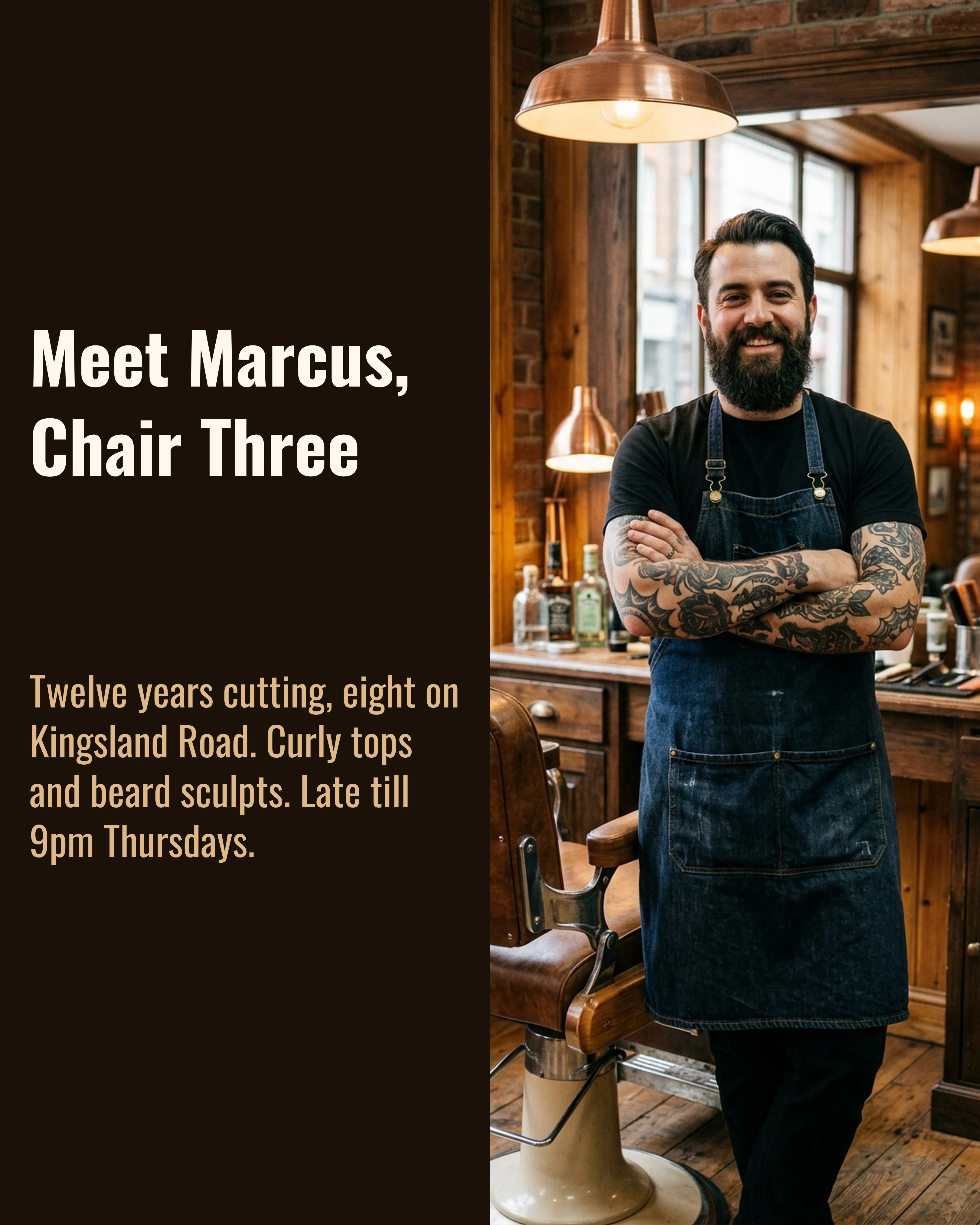
Example slides for the full post: the introduction, “Where He Trained”, “The Cut He Gets Asked For Most”, three of his recent cuts, and a closing slide linking straight to his calendar.
6. Skip the Saturday Queue (Problem-Agitate-Solution)
Every shop has a rush and a lull. Saturdays are packed, Tuesday mornings are quiet. A Problem-Agitate-Solution carousel names the problem (the long Saturday wait), makes it concrete (standing around for an hour on your day off), and offers the fix (come in midweek, or book ahead for Saturdays).
It spreads demand across the week, and it tells customers you respect their time. Update it whenever your hours change.
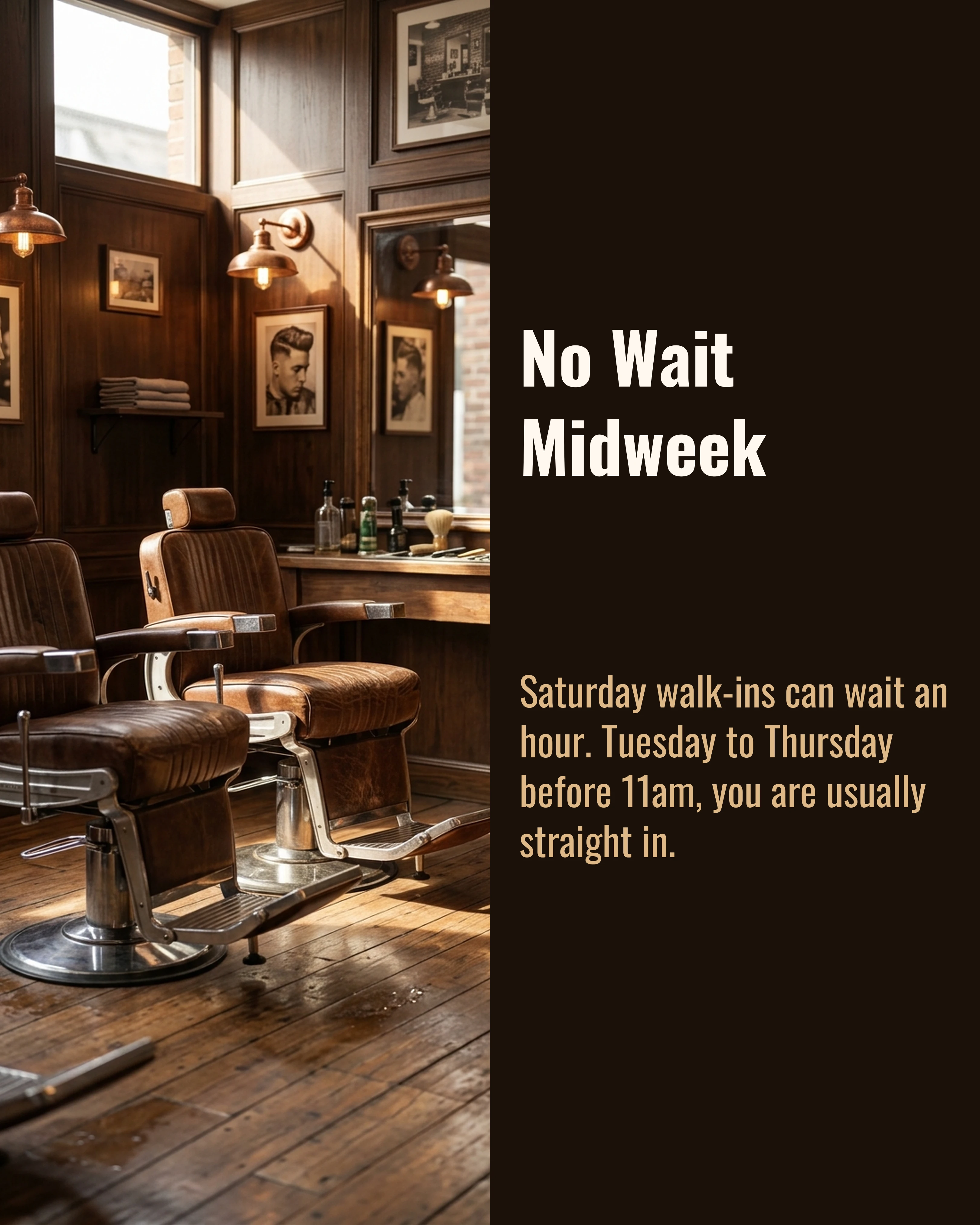
Example slides for the full post: “Saturday, 11am: An Hour’s Wait”, “No Wait Midweek” as above, the quietest hours for each day, how to book online, and a closing slide with the link.
Palette and Style for Barbershop Content
Match the palette to the shop, not to a trend. A traditional shop with wood, leather and warm bulbs suits the Warm palette used throughout this article: dark brown backgrounds with tan and copper accents pick up the chairs and the lighting, so the photo and the text panel read as one image. A modern shop in concrete, black and chrome suits Slate or Midnight, which keep the focus on the cut against cool, dark tones.
Use a second palette only for the closing slide. The transformation above runs on Warm and switches to Coral for the booking ask. The red lifts it off the brown middles and nods to the barber’s pole without looking like a sale flyer.
For type, condensed and confident works best. Oswald, Bebas Neue and Archivo all hold up on a phone and suit the trade. Avoid script fonts and vintage “est. 19XX” lettering on slides. They look fine on a shop sign and are hard to read at thumbnail size.
A few habits that make a barber feed look professional:
- Shoot every cut in the same spot, with the same light, from the same angles (front, side, back).
- Put prices and times on the slides. It saves a message every time.
- Name the barber on every transformation, so customers can book the person whose work they liked.
- Keep headlines short. If it does not fit on two lines, cut words.
How Carousel Helps Between Clients
You are going to build these posts on your phone, in the gap between one client leaving and the next sitting down. Carousel turns a few photos and a line of notes into structured slides in a few minutes, with Before-After-Bridge, Listicle, Myth vs Fact, This or That, Storytelling and Problem-Agitate-Solution frameworks built in, which covers all six ideas in this guide. Stick to one palette and font, save your logo and handle as a brand kit once, and every post, from a full fade transformation to a quick price update, looks like it came from the same shop.
Key Takeaways
- A single fresh-cut photo proves you can cut. It does not answer price, time, wait or “which barber,” which is what stops people booking.
- The full fade transformation is your flagship post. Same client, same chair, same light, from overgrown to finished, with the price on the reveal.
- Put your prices, quiet hours and barber introductions in carousels. They get saved, shared and pinned.
- Use Myth vs Fact and This or That for the questions you answer in the chair every day.
- Pick one palette that matches the shop, switch only for the closing slide, and use condensed, legible type.