How to Make an AI Carousel That Doesn't Look AI-Generated
How to Make an AI Carousel That Doesn’t Look AI-Generated
On July 30, 2026, LinkedIn added a “Seems like AI slop” button to posts and comments. Users can now flag content that reads as machine-written, and those reports feed the detection models LinkedIn uses to decide what to show. TechCrunch broke the story, 404 Media confirmed it in their own tests, and Forbes reported LinkedIn’s product chief calling the problem a “top priority.”
That is a meaningful shift. Looking AI-generated used to be an aesthetic complaint. It is now a distribution risk, with a button attached.
The awkward part is that AI is genuinely useful for carousels. It gets you from blank slide to draft in seconds, which is the hardest part of publishing consistently. The problem is not that you used a model. The problem is that the default output of every tool in this category converges on the same handful of looks, and readers have learned to recognize them.
This guide is about closing that gap: keeping the speed, losing the tell.
Why AI Carousels All Look the Same
Three things collapse independently made carousels into one visual style.
Layout defaults. Most generators offer a small set of layouts and apply them in a fixed rotation. Type a topic, get a title card, five centered text cards, and a CTA. It works, which is exactly why everyone ships it.
Safe typography. The same handful of geometric sans fonts appear everywhere because they are legible at any size and never look wrong. Never looking wrong is not the same as looking like you.
Rhetorical tics. Models have habits: the three-word title with a colon, the em-dash pivot mid-sentence, the closing line that restates the opening as a rule. Any one of them is fine. All of them stacked across eight slides is a signature.
A designer on X recently described the fix as an “LLM reset” — the design equivalent of a CSS reset, stripping the conventions the model applies without being asked before you build anything on top. That framing is right. You are not fighting the AI. You are clearing its defaults before you start.
Six Changes That Break the Pattern
1. Set brand tokens before you generate anything
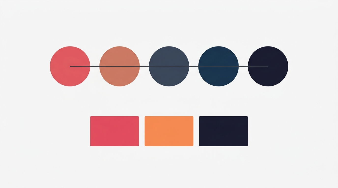
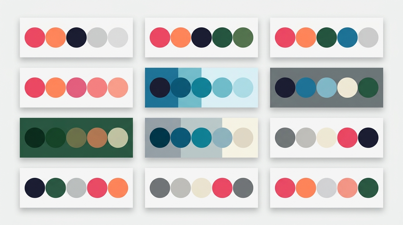
The single biggest tell is a palette nobody chose. Decide five colors and use them everywhere: a background, a surface, a primary text color, a secondary, and one accent you use sparingly. Semantic roles beat picking a color per slide, because they force consistency across posts rather than within one. Our guide to semantic color palettes covers how to assign them.
Once those tokens exist, every generated slide inherits them. The AI writes the words; the brand decides how they look.
2. Vary the layout deliberately
A real carousel does not use the same layout eight times. It opens with a dominant image, moves into structured text, breaks the rhythm somewhere in the middle, and closes on something visually distinct.
Pick three layouts and rotate them with intent: one for the cover, one for the body, one for the close. That single decision does more for perceived craft than any amount of prompt engineering.
3. Choose a typeface with an opinion
Geometric sans is the safe default and reads as such. Choosing a face with some character — a slab like Bitter, an editorial serif like Lora, a condensed display face like Oswald for headlines — costs nothing and instantly stops looking generated. Keep body copy plain and legible; put the personality in the headline. The typography guide has pairings that work at carousel sizes.
4. Rewrite the first and last line of every slide
If you only edit two things per slide, edit these. Openers and closers are where model habits cluster. Replace the abstract framing with a specific one: a number, a date, a place, a name, a price. “Most brands struggle with consistency” becomes “We reprinted the labels three times in 2024.”
Specificity is the cheapest anti-AI signal available, and it happens to make the post better regardless.
5. Use your own photographs where the post allows it
A real photo of a real thing is difficult to fake and instantly grounding. It does not need to be good photography. A phone shot of the actual workshop, the actual product, the actual whiteboard beats a polished generated image for credibility.
Where you do use generated imagery, keep it consistent with your palette so it reads as part of a composition rather than a stock drop-in.
6. Leave something imperfect
Perfect symmetry, perfectly even text lengths, and perfectly balanced slide counts all read as machine output. A slide that is deliberately shorter than the others, an aside, a note in a different weight — these are the marks of someone making decisions.
What a Branded AI-Assisted Carousel Looks Like
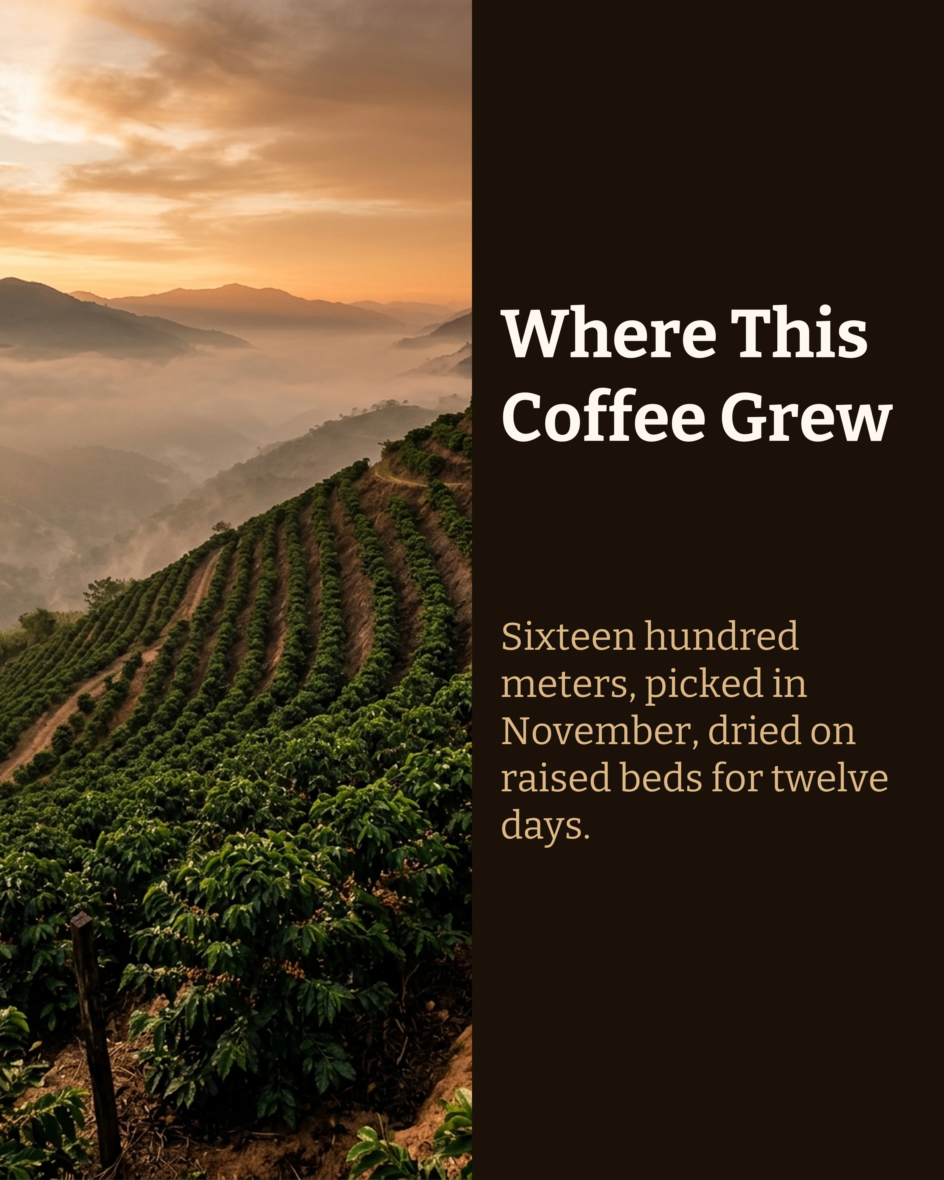
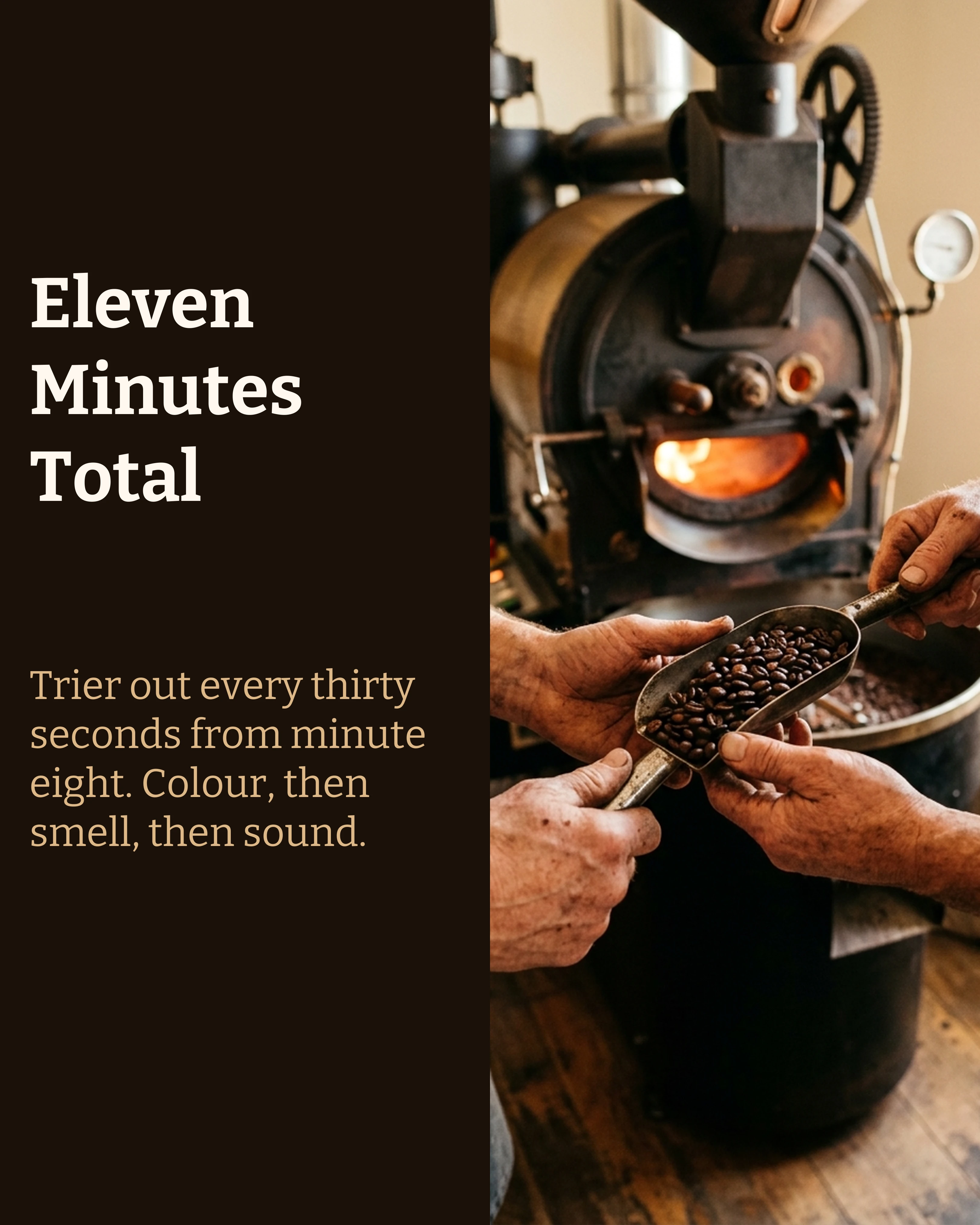
Below is a seven-slide post from an independent coffee roastery. The copy was drafted fast, then edited for specifics: a distance, a temperature, a weight, a first name. The palette is one warm brand set carried across every slide, and the typeface is a slab rather than the default geometric sans.
Nothing about it announces that a model was involved, because the decisions that shape how it reads were all made by a human.

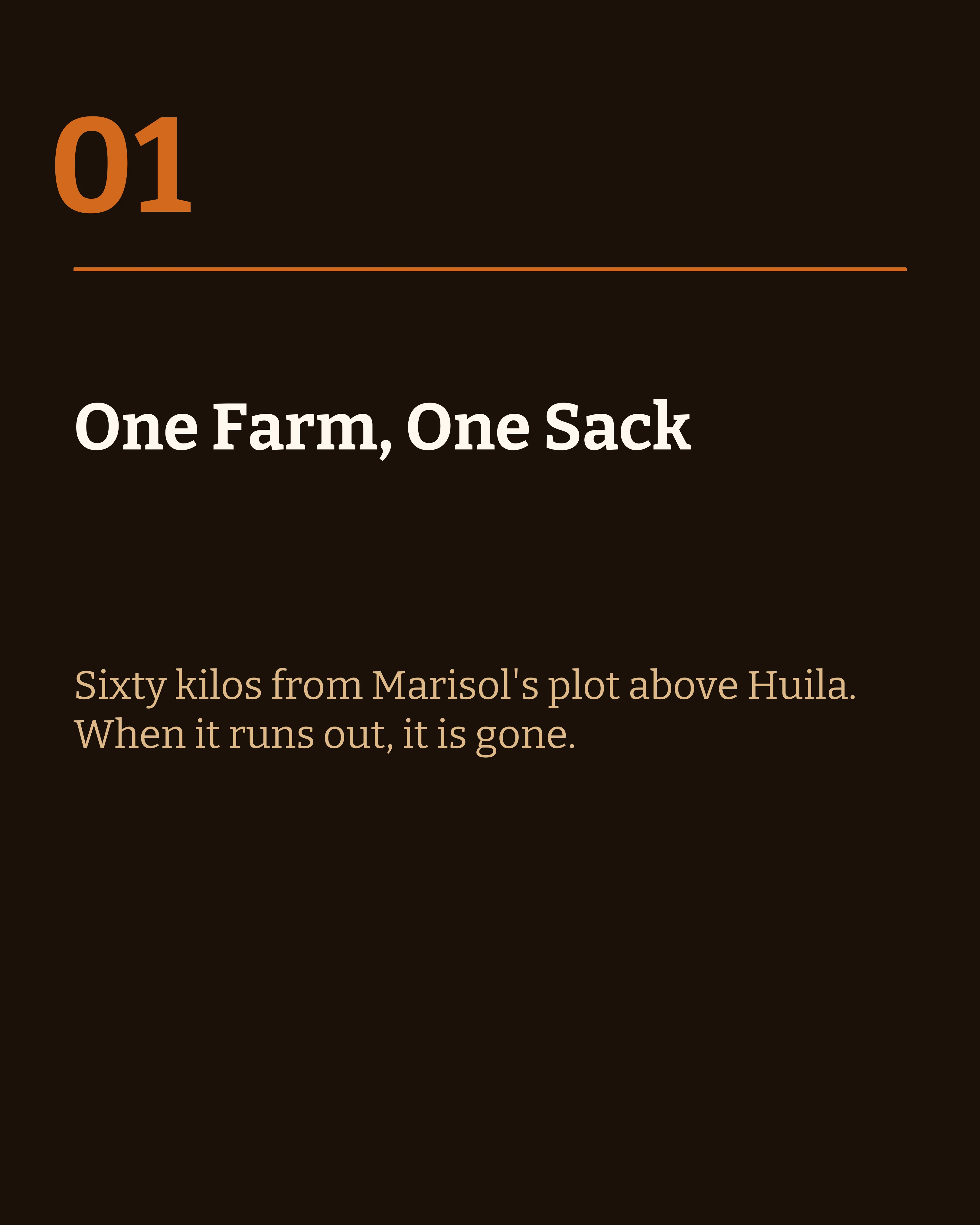
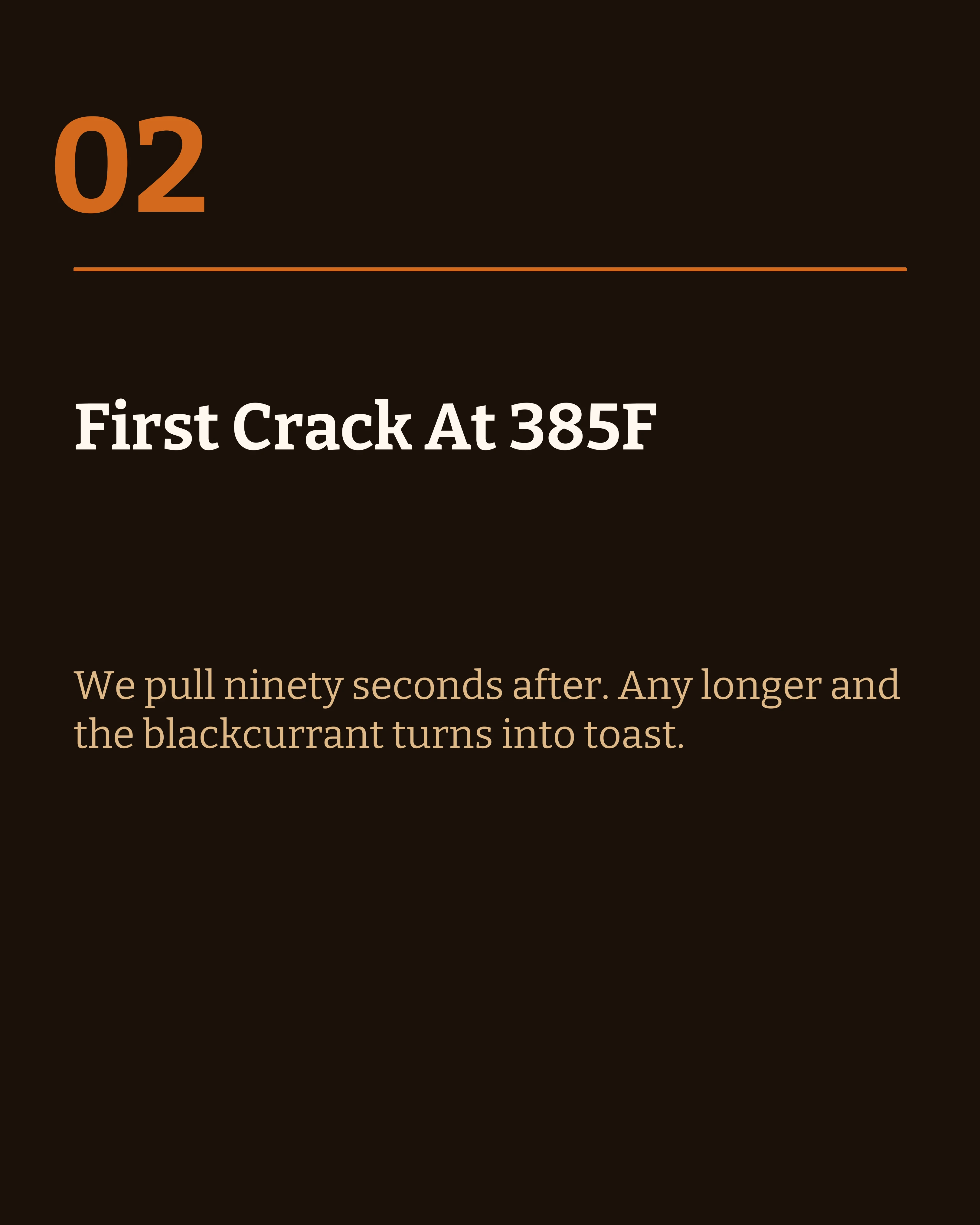
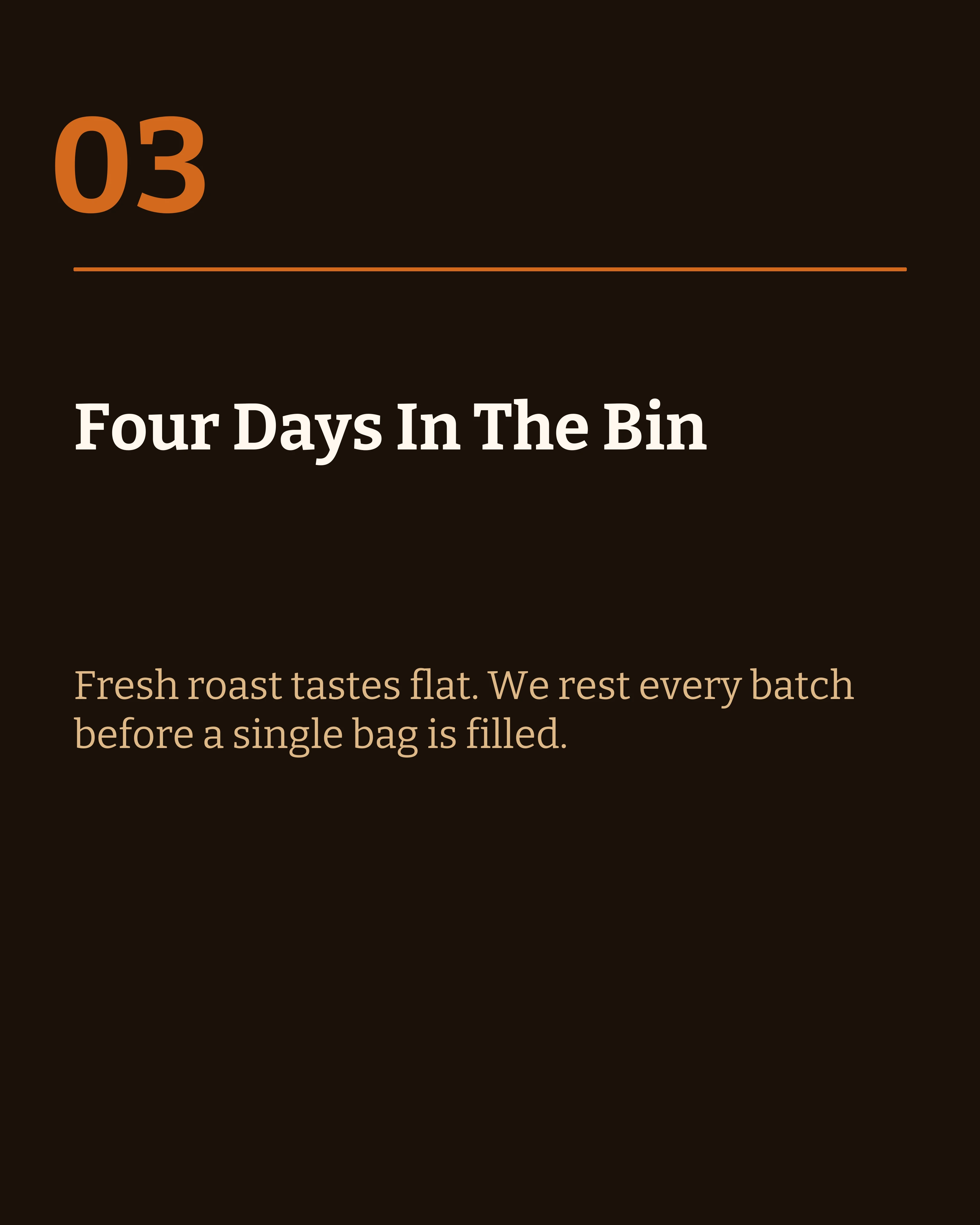
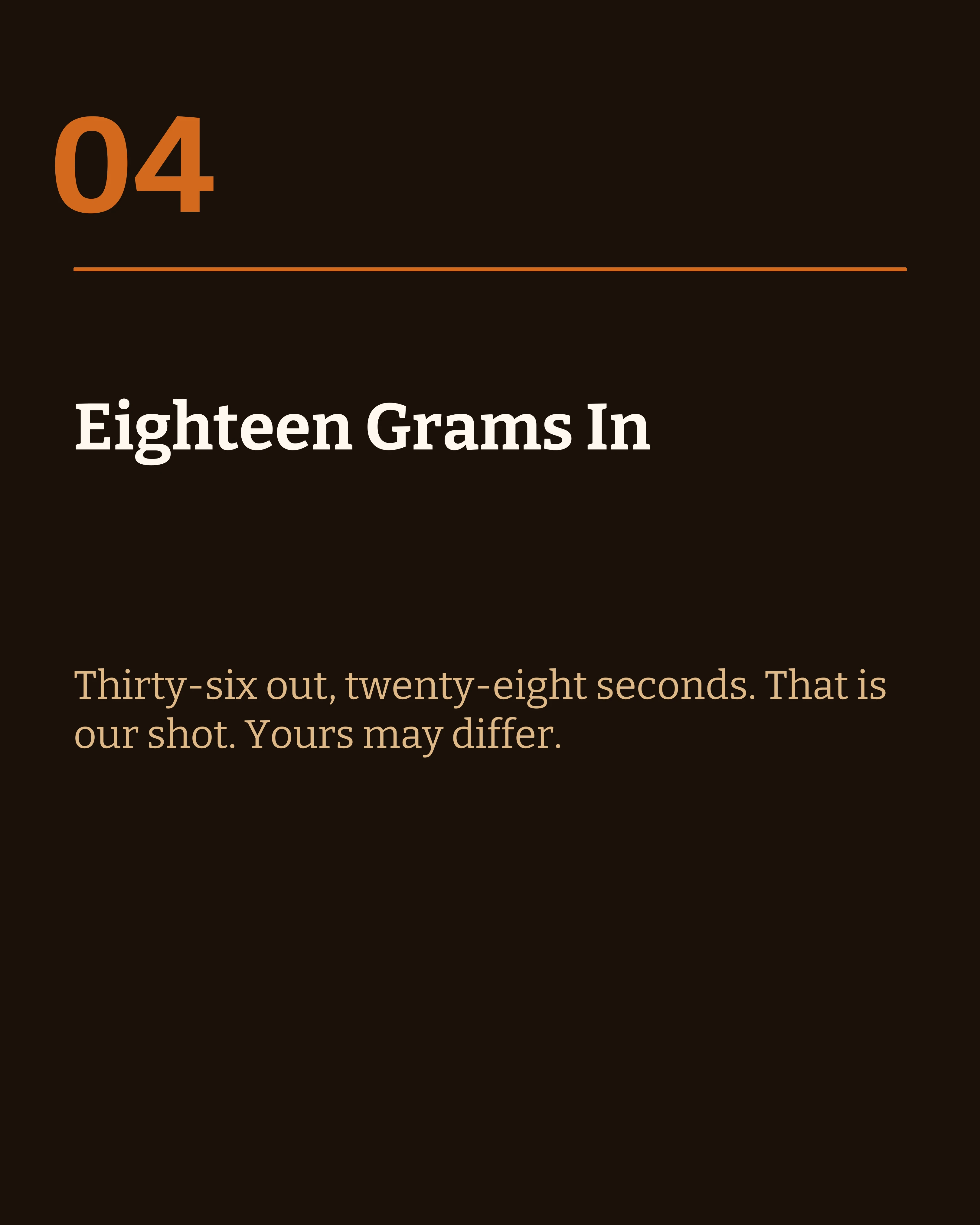
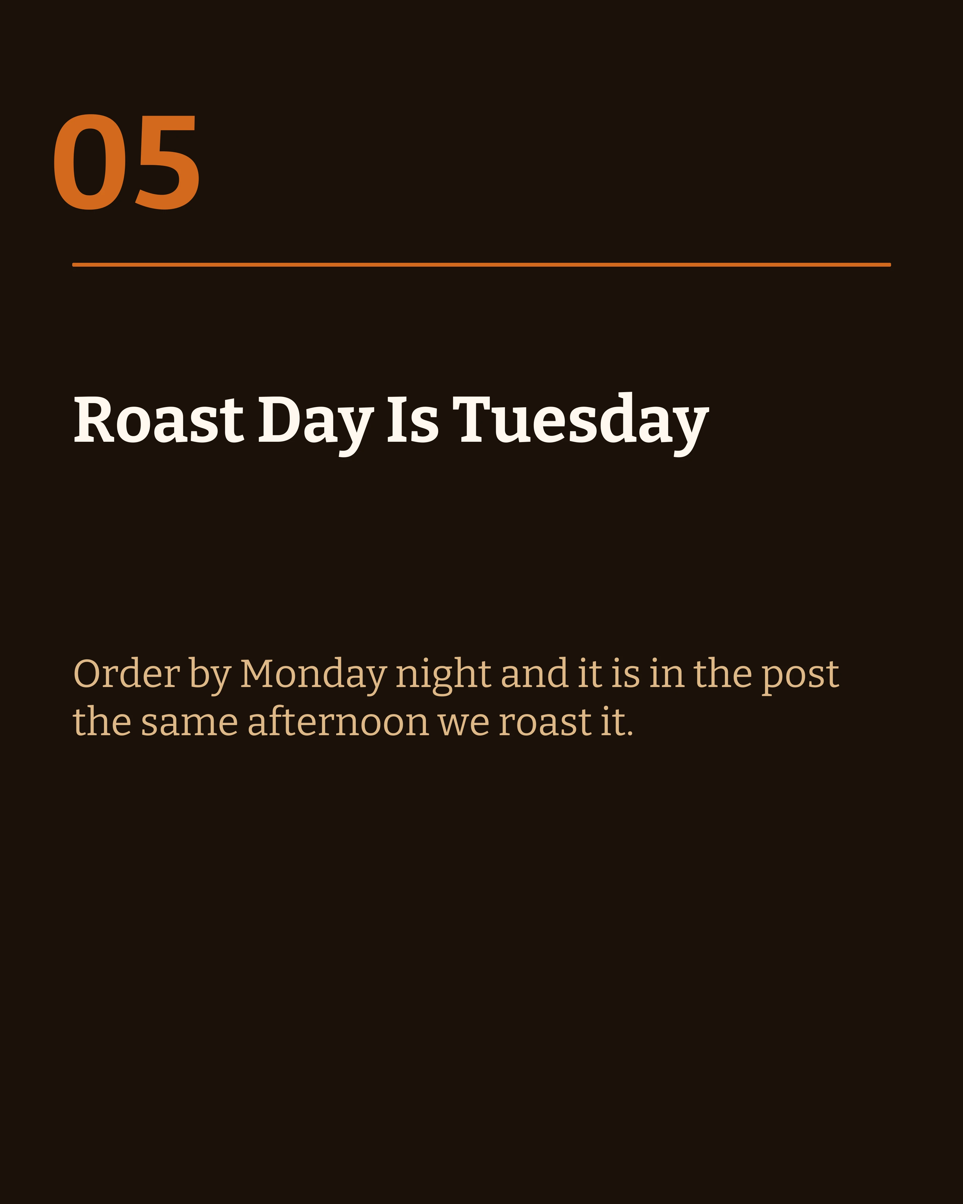

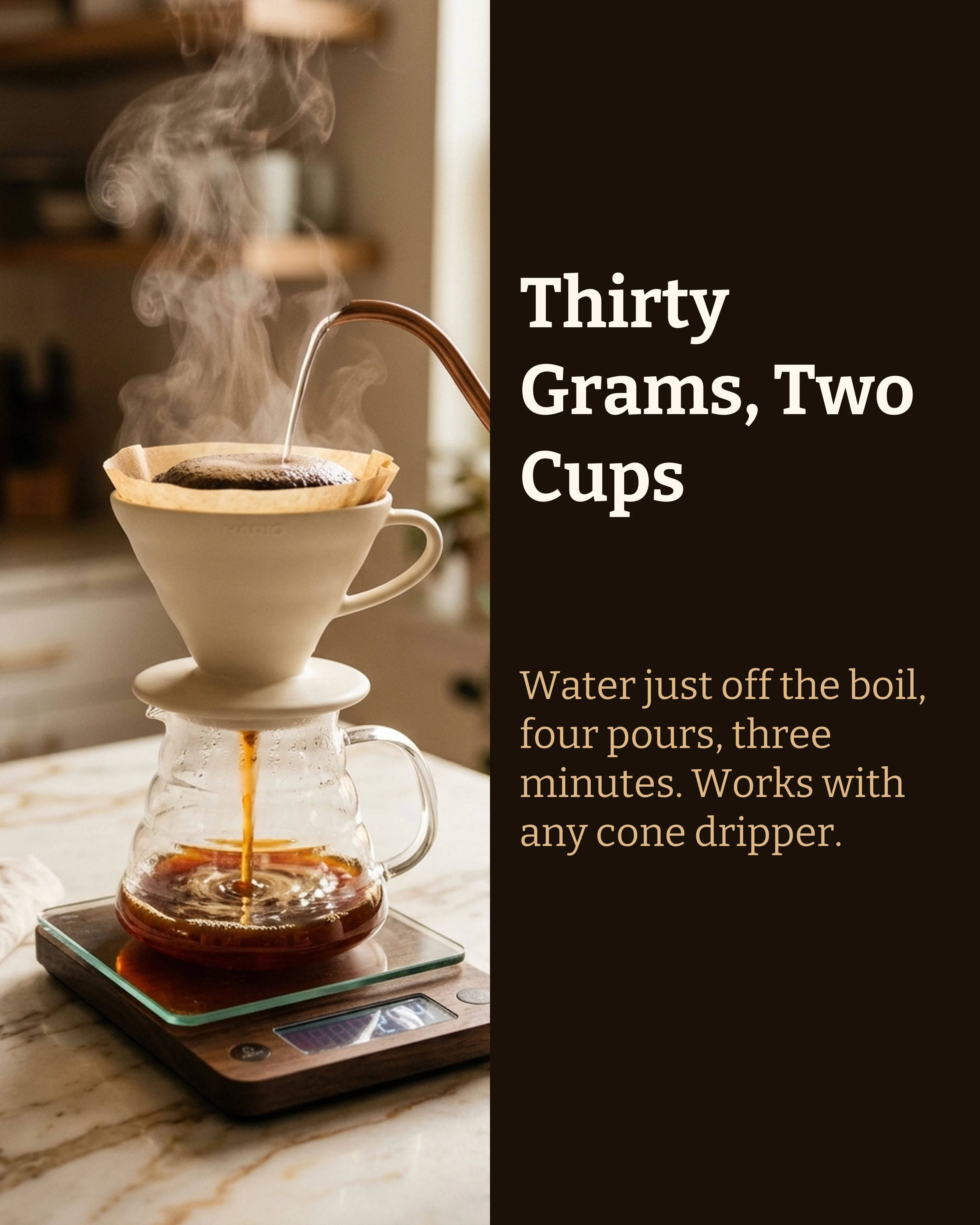
The same brand tokens applied to a different layout produce slides that still read as one account. This is what layout variance looks like in practice — three different compositions, one identity.
The Metadata Nobody Mentions
There is a second, less visible layer to this. Generated images and text increasingly carry machine-readable provenance.
Google confirmed in August 2026 that while Gemini’s visible watermark became optional, “invisible SynthID watermarks and C2PA metadata are still being used for transparency” — they stay embedded whether or not anything appears on screen. Anthropic began weaving an imperceptible, machine-readable signal into text from models released on or after August 2, 2026, and it survives copy and paste.
This does not mean you should avoid AI. It means honesty is the only stable strategy. Content that is genuinely yours in substance — your data, your photographs, your specifics, your judgment — is not threatened by a provenance tag on a draft. Content that is entirely machine-produced and presented as personal is exposed by it eventually.
How Carousel Handles This
Carousel uses AI for the part that stalls people — turning notes into structured slide copy — while keeping the design decisions on your side of the line. Save a brand kit once and every generated slide inherits your palette and typeface. Ten templates across informative and visual layouts mean rotating compositions inside a single post is a choice rather than a workaround, and the AI image generation takes your palette hex codes so generated imagery sits in the same composition as the text panel rather than fighting it.
The workflow it encourages is the one this article argues for: generate the draft, then make it yours.
Key Takeaways
- LinkedIn shipped an AI slop report button on July 30, 2026, and those reports train its detection. The generic look now carries distribution risk.
- The tell is not the AI, it is the defaults: fixed layouts, safe fonts, and abstract phrasing.
- Set brand tokens first so every generated slide inherits your palette instead of a stock one.
- Rotate at least three layouts within a post: cover, body, close.
- Rewrite the first and last line of every slide, and replace abstractions with numbers, names, and dates.
- Real photographs of real things are the hardest signal to fake and the easiest to obtain.
- Provenance metadata is now embedded by default in major models, so plan on being transparent rather than undetectable.
Ready to make carousels that look like yours? Download Carousel — free on the App Store.
Create your first carousel in 60 seconds — free
Pick a template, paste your text, export. It's that simple. No design skills needed.
Download Carousel